4. Unidimensional numeric data and their empirical distribution
This open-access textbook is, and will remain, freely available for everyone’s enjoyment (also in PDF; a paper copy can also be ordered). It is a non-profit project. Although available online, it is a whole course, and should be read from the beginning to the end. Refer to the Preface for general introductory remarks. Any bug/typo reports/fixes are appreciated. Make sure to check out Deep R Programming [36] too.
Our data wrangling adventure starts the moment we get access to loads of data points representing some measurements, such as industrial sensor readings, patient body measures, employee salaries, city sizes, etc.
For instance, consider the heights of adult females (in centimetres) in the longitudinal study called National Health and Nutrition Examination Survey (NHANES) conducted by the US Centres for Disease Control and Prevention.
heights = np.genfromtxt("https://raw.githubusercontent.com/gagolews/" +
    "teaching-data/master/marek/nhanes_adult_female_height_2020.txt")
Let’s preview a few observations:
heights[:6]  # the first six values
## array([160.2, 152.7, 161.2, 157.4, 154.6, 144.7])
This is an example of quantitative (numeric) data. They are in the form of a series of numbers. It makes sense to apply various mathematical operations on them, including subtraction, division, taking logarithms, comparing, and so forth.
Most importantly, here, all the observations are independent of each other. Each value represents a different person. Our data sample consists of 4 221 points on the real line: a bag of points whose actual ordering does not matter. We depicted them in Figure 4.1. However, we see that merely looking at the raw numbers themselves tells us nothing. They are too plentiful.
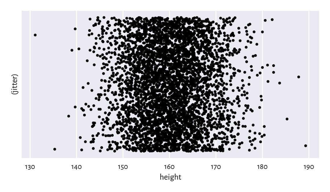
Figure 4.1 The heights dataset is comprised of independent points on the real line. We added some jitter on the y-axis for dramatic effects only.
This is why we are interested in studying a multitude of methods that can bring some insight into the reality behind the numbers. For example, inspecting their distribution.
4.1. Creating vectors in numpy
In this chapter, we introduce the ways to create numpy vectors, which are an efficient data structure for storing and operating on numeric data.
numpy [48] is an open-source add-on for numerical computing written by Travis Oliphant and other developers in 2005. Still, the project has a much longer history and stands on the shoulders of many giants (e.g., concepts from the APL and Fortran languages).
numpy implements multidimensional arrays similar to those available in R, S, GNU Octave, Scilab, Julia, Perl (via Perl Data Language), and some numerical analysis libraries such as LAPACK, GNU GSL, etc.
Many other Python packages discussed in this book are built on top of numpy, including: scipy [97], pandas [66], and scikit-learn [75]. This is why we will study it in such a great detail. In particular, whatever we learn about vectors will be beautifully transferable to the case of processing columns in data frames[1].
It is customary to import the numpy package under the np alias:
import numpy as np
Our code can now refer to the objects defined therein as
np.spam, np.bacon, or np.spam.
4.1.1. Enumerating elements
One way to create a vector is by calling the numpy.array function:
x = np.array([10, 20, 30, 40, 50, 60])
x
## array([10, 20, 30, 40, 50, 60])
Here, the vector elements were specified by means of an ordinary list. Ranges and tuples can also be used as content providers. The earnest readers are encouraged to check it now themselves.
A vector of length (size) \(n\) is often used to represent a point in an \(n\)-dimensional space (for example, GPS coordinates of a place on Earth assume \(n=2\)) or \(n\) readings of some one-dimensional quantity (e.g., recorded heights of \(n\) people). The said length can either be read using the previously-mentioned len function:
len(x)
## 6
A vector is a one-dimensional array. Accordingly, its shape is stored
as a tuple of length 1 (the number of dimensions is given by querying
x.ndim).
x.shape
## (6,)
We can therefore fetch its length also by accessing x.shape[0].
On a side note, matrices – two-dimensional arrays discussed
in Chapter 7 - will be of shape like
(number_of_rows, number_of_columns).
Important
Recall that Python lists, e.g., [1, 2, 3], represent simple sequences of
objects of any kind.
Their use cases are very broad, which is both an advantage
and something quite the opposite.
Vectors in numpy are like lists, but on steroids.
They are powerful in scientific computing
because of the underlying assumption
that each object they store is of the same type[2].
In most scenarios,
we will be dealing with vectors of logical values, integers, and
floating-point numbers. Thanks to this, a wide range of
methods for performing the most popular mathematical operations could have
been defined.
And so, above we created a sequence of integers:
x.dtype  # data type
## dtype('int64')
To show that other element types are also available, we can convert it
to a vector with elements of the type float:
x.astype(float)  # or np.array(x, dtype=float)
## array([10., 20., 30., 40., 50., 60.])
Let’s emphasise this vector is printed differently from its int-based
counterpart: note the decimal separators. Furthermore:
np.array([True, False, False, True])
## array([ True, False, False,  True])
gives a logical vector, for the array constructor detected that the common
type of all the elements is bool. Also:
np.array(["spam", "spam", "bacon", "spam"])
## array(['spam', 'spam', 'bacon', 'spam'], dtype='<U5')
yields an array of strings in Unicode (i.e., capable of storing any character in any alphabet, emojis, mathematical symbols, etc.), each of no more than five[3] code points in length.
4.1.2. Arithmetic progressions
numpy’s arange is similar to the built-in range function, but outputs a vector:
np.arange(0, 10, 2)  # from 0 to 10 (exclusive) by 2
## array([0, 2, 4, 6, 8])
numpy.linspace creates a sequence of equidistant points on the linear scale in a given interval:
np.linspace(0, 1, 5)  # from 0 to 1 (inclusive), 5 equispaced values
## array([0.  , 0.25, 0.5 , 0.75, 1.  ])
Call help(np.linspace)
or help("numpy.linspace")
to study the meaning of the endpoint argument.
Find the same documentation page on the numpy project’s
website.
Another way is to use your favourite search engine such as
DuckDuckGo and query “linspace site:numpy.org”[4].
Always remember to gather information from first-hand sources.
You should become a frequent visitor to this page (and similar
ones). In particular, every so often it is advisable to check out for
significant updates at https://numpy.org/news.
4.1.3. Repeating values
numpy.repeat repeats each given value a specified number of times:
np.repeat(3, 6)  # six 3s
## array([3, 3, 3, 3, 3, 3])
np.repeat([1, 2], 3)  # three 1s, three 2s
## array([1, 1, 1, 2, 2, 2])
np.repeat([1, 2], [3, 5])  # three 1s, five 2s
## array([1, 1, 1, 2, 2, 2, 2, 2])
In the last case, every element from the list passed as the first argument was repeated the corresponding number of times, as defined by the second argument.
numpy.tile, on the other hand, repeats a whole sequence with recycling:
np.tile([1, 2], 3)  # repeat [1, 2] three times
## array([1, 2, 1, 2, 1, 2])
Notice the difference between the above
and the result of numpy.repeat([1, 2], 3).
See also[5] numpy.zeros and numpy.ones for some specialised versions of the foregoing functions.
4.1.4. numpy.r_ (*)
numpy.r_ gives perhaps the most flexible means for creating vectors involving quite a few of the aforementioned scenarios, albeit its syntax is quirky. For example:
np.r_[1, 2, 3, np.nan, 5, np.inf]
## array([ 1.,  2.,  3., nan,  5., inf])
Here, nan stands for a not-a-number and is used as a placeholder
for missing values (discussed in Section 15.1)
or wrong results,
such as the square root of \(-1\) in the domain of reals.
The inf object, on the other hand, denotes the infinity, \(\infty\).
We can think of it as a value that is too large to be
represented in the set of floating-point numbers.
We see that numpy.r_ uses square brackets instead of round ones. This is smart for we mentioned in Section 3.2.2 that slices (`:`) can only be created inside the index operator. And so:
np.r_[0:10:2]  # like np.arange(0, 10, 2)
## array([0, 2, 4, 6, 8])
What is more, numpy.r_ accepts the following syntactic sugar:
np.r_[0:1:5j]  # like np.linspace(0, 1, 5)
## array([0.  , 0.25, 0.5 , 0.75, 1.  ])
Here, 5j does not have its literal meaning (a complex number).
By an arbitrary convention, and only in this context,
it designates the output length of the sequence to be generated.
Could the numpy authors do that? Well, they could, and they did.
End of story.
We can also combine many types of sequences into one:
np.r_[1, 2, [3]*2, 0:3, 0:3:3j]
## array([1. , 2. , 3. , 3. , 0. , 1. , 2. , 0. , 1.5, 3. ])
4.1.5. Generating pseudorandom variates
The automatically-attached numpy.random module defines many functions to generate pseudorandom numbers. We will be discussing the reason for our using the pseudo prefix in Section 6.4, so now let’s only take note of a way to sample from the uniform distribution on the unit interval:
np.random.rand(5)  # five pseudorandom observations in [0, 1]
## array([0.49340194, 0.41614605, 0.69780667, 0.45278338, 0.84061215])
and to pick a few values from a given set with replacement (selecting the same value multiple times is allowed):
np.random.choice(np.arange(1, 10), 20)  # replace=True
## array([7, 7, 4, 6, 6, 2, 1, 7, 2, 1, 8, 9, 5, 5, 9, 8, 1, 2, 6, 6])
4.1.6. Loading data from files
We will usually be reading whole heterogeneous tabular datasets using pandas.read_csv, being the topic we shall cover in Chapter 10. It is worth knowing, though, that arrays with elements of the same type can be read efficiently from text files (e.g., CSV) using numpy.genfromtxt. The code chunk at the beginning of this chapter serves as an example.
Read the
population_largest_cities_unnamed dataset
directly from GitHub
(click Raw to get access to its contents
and use the URL you were redirected to, not the original one).
4.2. Some mathematical notation
Mathematically, we will be denoting a number sequence like:
where \(x_i\) is its \(i\)-th element, and \(n\) is its length (size).
Using the programming syntax,
\(x_i\) is x[i-1] (because the first element is at index 0),
and \(n\) corresponds to len(x) or,
equivalently, x.shape[0].
The bold font (hopefully clearly visible) is to emphasise that \(\boldsymbol{x}\) is not an atomic entity (\(x\)), but rather a collection of items. For brevity, instead of writing “let \(\boldsymbol{x}\) be a real-valued sequence of length \(n\)”, we can state “let \(\boldsymbol{x}\in\mathbb{R}^n\)”. Here:
the “\(\in\)” symbol stands for “is in” or “is a member of”,
\(\mathbb{R}\) denotes the set of real numbers (the very one that includes, \(0\), \(-358745.2394\), \(42\) and \(\pi\), amongst uncountably many others), and
\(\mathbb{R}^n\) is the set of real-valued sequences of length \(n\) (i.e., \(n\) such numbers considered at a time); e.g., \(\mathbb{R}^2\) includes pairs such as \((1, 2)\), \((\pi/3, \sqrt{2}/2)\), and \((1/3, 10^{3})\).
Overall, if \(\boldsymbol{x}\in \mathbb{R}^n\), then we often say that \(\boldsymbol{x}\) is a sequence of \(n\) numbers, a (numeric) \(n\)-tuple, an \(n\)-dimensional real vector, a point in an \(n\)-dimensional real space, or an element of a real \(n\)-space, etc. In many contexts, they are synonymic (although, mathematically, the devil is in the detail).
Note
Mathematical notation is pleasantly abstract (general) in the sense that \(\boldsymbol{x}\) can be anything, e.g., data on the incomes of households, sizes of the largest cities in some country, or heights of participants in some longitudinal study. At first glance, such a representation of objects from the so-called real world might seem overly simplistic, especially if we wish to store information on very complex entities. Nonetheless, in most cases, expressing them as vectors (i.e., establishing a set of numeric attributes that best describe them in a task at hand) is not only natural but also perfectly sufficient for achieving whatever we aim for.
Consider the following problems:
How would you represent patients in a medical clinic (for the purpose of conducting a research study in dietetics and sport sciences)?
How would you represent cars in an insurance company’s database (to determine how much drivers should pay annually for the mandatory policy)?
How would you represent students in a university (to grant them scholarships)?
In each case, list a few numeric features that best describe the reality at hand. On a side note, descriptive (categorical, qualitative) labels can always be encoded as numbers, e.g., female = 1, male = 2, but this will be the topic of Chapter 11.
By \(x_{(i)}\) (notice the bracket[6]) we denote the \(i\)-th order statistic, that is, the \(i\)-th smallest value in \(\boldsymbol{x}\). In particular, \(x_{(1)}\) is the sample minimum and \(x_{(n)}\) is the maximum. Here is the same in Python:
x = np.array([5, 4, 2, 1, 3])  # just an example
x_sorted = np.sort(x)
x_sorted[0], x_sorted[-1]  # the minimum and the maximum
## (1, 5)
To avoid the clutter of notation, in certain formulae (e.g., in the definition of the type-7 quantiles in Section 5.1.1.3), we will be assuming that \(x_{(0)}\) is the same as \(x_{(1)}\) and \(x_{(n+1)}\) is equivalent to \(x_{(n)}\).
4.3. Inspecting the data distribution with histograms
Histograms are one of the most intuitive tools for depicting the empirical distribution of a data sample. We will be drawing them using the classic plotting library matplotlib [54] (originally developed by John D. Hunter). Let’s import it under its traditional alias:
import matplotlib.pyplot as plt
4.3.1. heights: A bell-shaped distribution
Let’s draw a histogram of the heights dataset;
see Figure 4.2.
counts, bins, __not_important = plt.hist(heights, bins=11,
    color="lightgray", edgecolor="black")
plt.ylabel("Count")
plt.show()
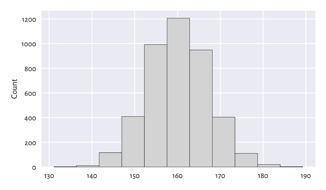
Figure 4.2 A histogram of the heights dataset: the empirical distribution is nicely bell-shaped.
The data were split into 11 bins. Then, they were plotted so that the bar heights are proportional to the number of observations falling into each of the 11 intervals. The bins are non-overlapping, adjacent to each other, and of equal lengths. We can read their coordinates by looking at the bottom side of each rectangular bar. For example, circa 1200 observations fall into the interval [158, 163] (more or less) and roughly 400 into [168, 173] (approximately). To get more precise information, we can query the return objects:
bins  # 12 interval boundaries; give 11 bins
## array([131.1       , 136.39090909, 141.68181818, 146.97272727,
##        152.26363636, 157.55454545, 162.84545455, 168.13636364,
##        173.42727273, 178.71818182, 184.00909091, 189.3       ])
counts  # the corresponding 11 counts
## array([   2.,   11.,  116.,  409.,  992., 1206.,  948.,  404.,  110.,
##          20.,    3.])
This distribution is nicely symmetrical around about 160 cm. Traditionally, we are used to saying that it is in the shape of a bell. The most typical (normal, common) observations are somewhere in the middle, and the probability mass decreases quickly on both sides.
As a matter of fact, in Chapter 6, we will model this dataset using a normal distribution and obtain an excellent fit. In particular, we will mention that observations outside the interval [139, 181] are very rare (probability less than 1%; via the \(3\sigma\) rule, i.e., expected value ± 3 standard deviations).
4.3.2. income: A right-skewed distribution
For some of us, a normal distribution is often a prototypical one: we might expect (wishfully think) that many phenomena enjoy similar regularities. And that is approximately the case[7], e.g., in standardised testing (IQ and other ability scores or personality traits), physiology (the above heights), or when quantifying physical objects’ attributes with not-so-precise devices (distribution of measurement errors). We might be tempted to think now that everything is normally distributed, but this is very much untrue.
Consider another dataset. Figure 4.3 depicts the distribution of a simulated[8] sample of disposable income of 1 000 randomly chosen UK households, in British Pounds, for the financial year ending 2020.
income = np.genfromtxt("https://raw.githubusercontent.com/gagolews/" +
    "teaching-data/master/marek/uk_income_simulated_2020.txt")
plt.hist(income, bins=20, color="lightgray", edgecolor="black")
plt.ylabel("Count")
plt.show()
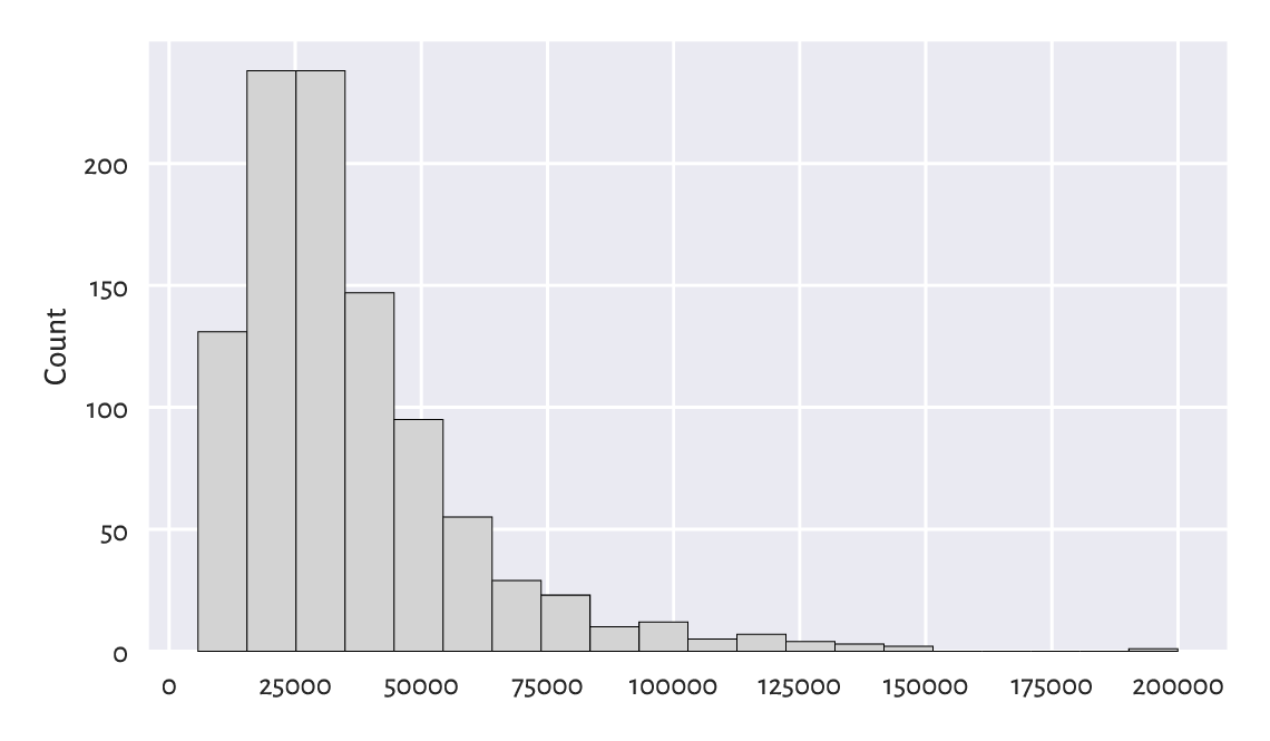
Figure 4.3 A histogram of the income dataset: the distribution is right-skewed.
We notice that the probability density quickly increases, reaches its peak at around £15 500–£35 000, and then slowly goes down. We say that it has a long tail on the right, or that it is right- or positive-skewed. Accordingly, there are several people earning a decent amount of money. It is quite a non-normal distribution. Most people are rather unwealthy: their income is way below the typical per-capita revenue (being the average income for the whole population).
In Section 6.3.1, we will note that such a distribution is frequently encountered in biology and medicine, social sciences, or technology. For instance, the number of sexual partners or weights of humans are believed to be aligned this way.
Note
Looking at Figure 4.3, we might have taken note of the relatively higher bars, as compared to their neighbours, at c. £100 000 and £120 000. Even though we might be tempted to try to invent a story about why there can be some difference in the relative probability mass, we ought to refrain from it. As our data sample is small, they might merely be due to some natural variability (Section 6.4.4). Of course, there might be some reasons behind it (theoretically), but we cannot read this only by looking at a single histogram. In other words, a histogram is a tool that we use to identify some rather general features of the data distribution (like the overall shape), not the specifics.
There is also the
nhanes_adult_female_weight_2020
dataset in our data repository, giving the weights
(in kilograms) of the NHANES study participants.
Draw its histogram. Does its shape resemble the
income or heights distribution more?
4.3.3. How many bins?
Unless some stronger assumptions about the data distribution are made, choosing the right number of bins is more art than science:
too many will result in a rugged histogram,
too few might cause us to miss some important details.
Figure 4.4 illustrates this.
plt.subplot(1, 2, 1)  # one row, two columns; the first plot
plt.hist(income, bins=5, color="lightgray", edgecolor="black")
plt.ylabel("Count")
plt.subplot(1, 2, 2)  # one row, two columns; the second plot
plt.hist(income, bins=200, color="lightgray", edgecolor="black")
plt.ylabel(None)
plt.show()
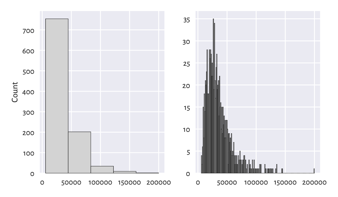
Figure 4.4 Too few and too many histogram bins (the income dataset).
For example, in the histogram with five bins, we miss the information that the c. £20 000 income is more popular than the c. £10 000 one. (as given by the first two bars in Figure 4.3). On the other hand, the histogram with 200 bins seems to be too fine-grained already.
Important
Usually, the “truth” is probably somewhere in-between. When preparing histograms for publication (e.g., in a report or on a webpage), we might be tempted to think “one must choose one and only one bin count”. In fact, we do not have to (despite that some will complain about it). Remember that it is we who are responsible for the data’s being presented in the most unambiguous a fashion possible. Providing two or three histograms can sometimes be a much better idea.
Further, we should be aware that someone might want to trick us by choosing the number of bins that depict the reality in a good light, when the object matter is slightly more nuanced. For instance, the histogram on the left side of Figure 4.4 hides the poorest households inside the first bar: the first income bracket is very wide. If we cannot request access to the original data, the best we can do is to simply ignore such a data visualisation instance and warn others not to trust it. A true data scientist must be sceptical.
Also, note that in the right histogram, we exactly know what is the income of the wealthiest person. From the perspective of privacy, this might be a bit unsensitive.
The documentation of matplotlib.pyplot.hist
states that the bins argument is passed to
numpy.histogram_bin_edges
to determine the intervals into which our data are to be split.
numpy.histogram uses the same function, but
it returns the corresponding bin counts without plotting them.
counts, bins = np.histogram(income, 20)
counts
## array([131, 238, 238, 147,  95,  55,  29,  23,  10,  12,   5,   7,   4,
##          3,   2,   0,   0,   0,   0,   1])
bins
## array([  5750.  ,  15460.95,  25171.9 ,  34882.85,  44593.8 ,  54304.75,
##         64015.7 ,  73726.65,  83437.6 ,  93148.55, 102859.5 , 112570.45,
##        122281.4 , 131992.35, 141703.3 , 151414.25, 161125.2 , 170836.15,
##        180547.1 , 190258.05, 199969.  ])
Thus, there are 238 observations both in the [15 461, 25 172) and [25 172, 34 883) intervals.
Note
A table of ranges and the corresponding counts can be effective for data reporting. It is more informative and takes less space than a series of raw numbers, especially if we present them like in the table below.
income bracket [£1000s] |
count |
|---|---|
0–20 |
236 |
20–40 |
459 |
40–60 |
191 |
60–80 |
64 |
80–100 |
26 |
100–120 |
11 |
120–140 |
10 |
140–160 |
2 |
160–180 |
0 |
180–200 |
1 |
Reporting data in tabular form can also increase the privacy of the subjects (making subjects less identifiable, which is good) or hide some uncomfortable facts (which is not so good; “there are ten people in our company earning more than £200 000 p.a.” – this can be as much as £10 000 000, but shush).
Find out how we can provide the matplotlib.pyplot.hist and numpy.histogram functions with custom bin breaks. Plot a histogram where the bin edges are 0, 20 000, 40 000, etc. (just like in the above table). Also let’s highlight the fact that bins do not have to be of equal sizes: set the last bin to [140 000, 200 000].
(*) There are quite a few heuristics
to determine the number of bins automagically,
see numpy.histogram_bin_edges for a few formulae.
Check out how different values of the bins argument
(e.g., "sturges", "fd") affect the histogram shapes
on both income and heights datasets.
Each has its limitations, none is perfect, but some might be a sensible
starting point for further fine-tuning.
We will get back to the topic of manual data binning in Section 11.1.4.
4.3.4. peds: A bimodal distribution (already binned)
Here are the December 2019 hourly average pedestrian counts near the Southern Cross Station in Melbourne:
peds = np.genfromtxt("https://raw.githubusercontent.com/gagolews/" +
    "teaching-data/master/marek/southern_cross_station_peds_2019_dec.txt")
peds
## array([  31.22580645,   18.38709677,   11.77419355,    8.48387097,
##           8.58064516,   58.70967742,  332.93548387, 1121.96774194,
##        2061.87096774, 1253.41935484,  531.64516129,  502.35483871,
##         899.06451613,  775.        ,  614.87096774,  825.06451613,
##        1542.74193548, 1870.48387097,  884.38709677,  345.83870968,
##         203.48387097,  150.4516129 ,  135.67741935,   94.03225806])
This time, data have already been binned by somebody else. Consequently, we cannot use matplotlib.pyplot.hist to depict them. Instead, we can rely on a more low-level function, matplotlib.pyplot.bar; see Figure 4.5.
plt.bar(np.arange(24)+0.5, width=1, height=peds,
    color="lightgray", edgecolor="black")
plt.xticks([0, 6, 12, 18, 24])
plt.show()
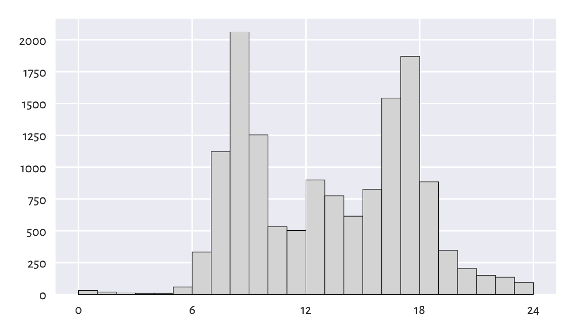
Figure 4.5 A histogram of the peds dataset: a bimodal (trimodal?) distribution.
This is an example of a bimodal (or even trimodal) distribution. There is a morning peak and an evening peak (and some analysts probably would distinguish a lunchtime one too).
4.3.5. matura: A bell-shaped distribution (almost)
Figure 4.6 depicts a histogram of another interesting dataset which also comes in a presummarised form. It gives the distribution of the 2019 Matura exam (secondary school exit diploma) scores in Poland (in %) – Polish literature[9] at the basic level.
matura = np.genfromtxt("https://raw.githubusercontent.com/gagolews/" +
    "teaching-data/master/marek/matura_2019_polish.txt")
plt.bar(np.arange(0, 71), width=1, height=matura,
    color="lightgray", edgecolor="black")
plt.show()
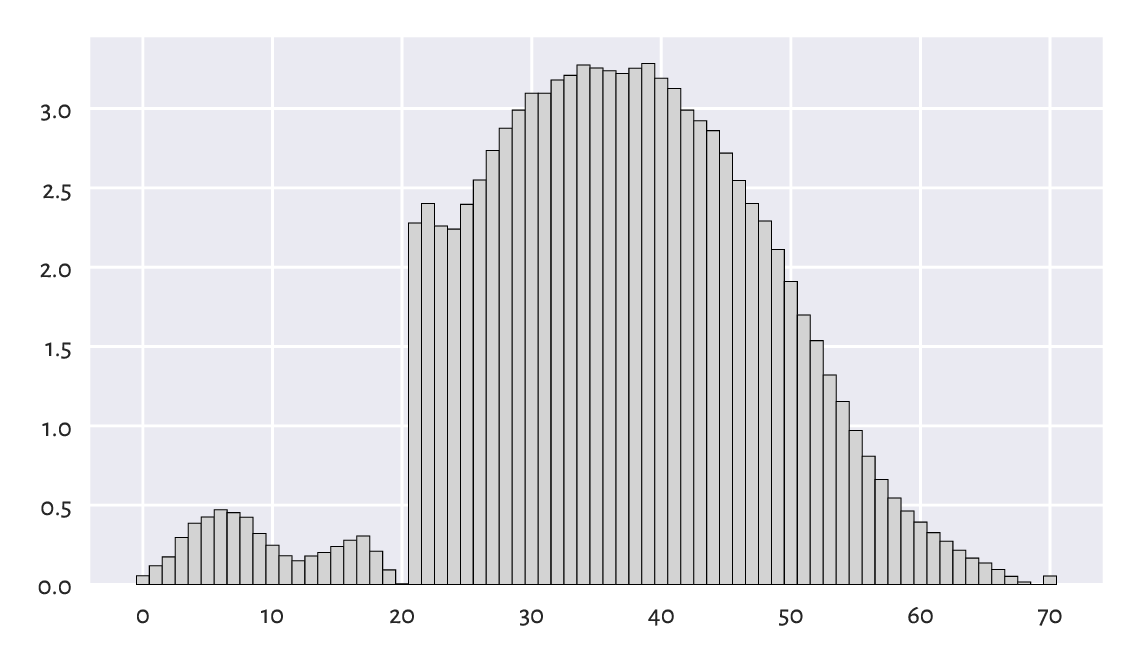
Figure 4.6 A histogram of the matura dataset: a bell-shaped distribution… almost.
We probably expected the distribution to be bell-shaped. However, it is clear that someone tinkered with it. Still, knowing that:
the examiners are good people: we teachers love our students,
20 points were required to pass,
50 points were given for an essay and beauty is in the eye of the beholder,
it all starts to make sense. Without graphically depicting this dataset, we would not know that some anomalies occurred: some students got a “lucky” pass grade.
4.3.6. marathon (truncated – fastest runners): A left-skewed distribution
Next, let’s consider the 37th Warsaw Marathon (2015) results.
marathon = np.genfromtxt("https://raw.githubusercontent.com/gagolews/" +
    "teaching-data/master/marek/37_pzu_warsaw_marathon_mins.txt")
Here are the top five gun times (in minutes):
marathon[:5]  # preview the first five (data are already sorted increasingly)
## array([129.32, 130.75, 130.97, 134.17, 134.68])
Figure Figure 4.7 gives the histogram for the participants who finished the 42.2 km run in less than three hours, i.e., a truncated version of this dataset (more information about subsetting vectors using logical indexers will be given in Section 5.4).
plt.hist(marathon[marathon < 180], color="lightgray", edgecolor="black")
plt.ylabel("Count")
plt.show()
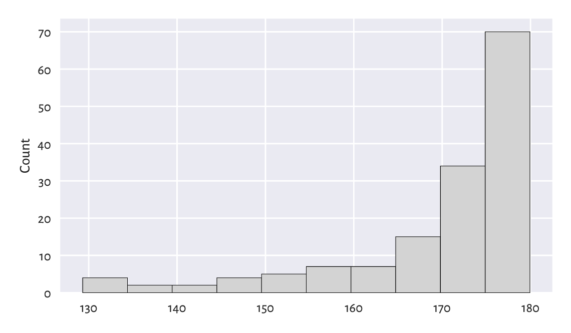
Figure 4.7 A histogram of a truncated version of the marathon dataset: the distribution is left-skewed.
We revealed that the data are highly left-skewed. This was not unexpected. There are only a few elite runners in the game, but, boy, are they fast. Yours truly wishes his personal best would be less than 180 minutes someday. We shall see. Running is fun, and so is walking; why not take a break for an hour and go outside?
Plot the histogram of the untruncated (complete) version of this dataset.
4.3.7. Log-scale and heavy-tailed distributions
Consider the dataset on the populations of US cities in 2000:
cities = np.genfromtxt("https://raw.githubusercontent.com/gagolews/" +
    "teaching-data/master/other/us_cities_2000.txt")
Let’s focus only on the cities whose population is not less than 10 000 (another instance of truncating, this time on the other side of the distribution). Even though they constitute roughly 14% of all the US settlements, they are home to as much as about 84% of all the US citizens.
large_cities = cities[cities >= 10000]
len(large_cities) / len(cities)
## 0.13863320820692138
np.sum(large_cities) / np.sum(cities)  # more on aggregation functions later
## 0.8351248599553305
Here are the populations of the five largest cities (can we guess which ones are they?):
large_cities[-5:]  # preview last five – data are sorted increasingly
## array([1517550., 1953633., 2896047., 3694742., 8008654.])
The histogram is depicted in Figure 4.8.
plt.hist(large_cities, bins=20, color="lightgray", edgecolor="black")
plt.ylabel("Count")
plt.show()
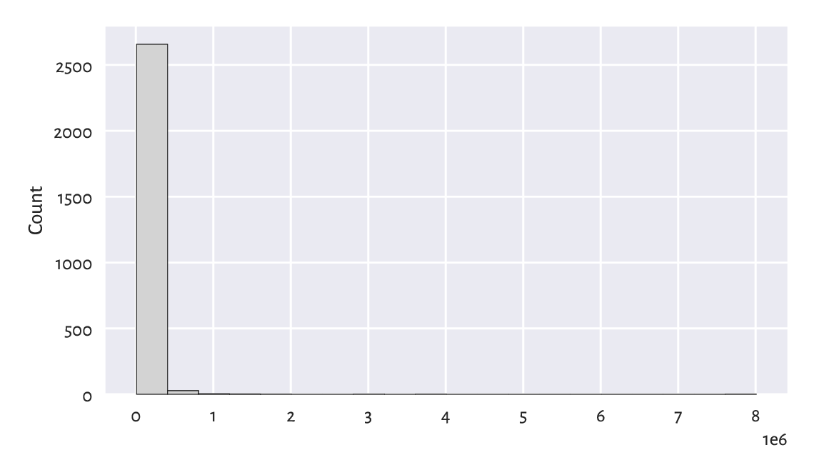
Figure 4.8 A histogram of the large_cities dataset: the distribution is extremely heavy-tailed.
The histogram is virtually unreadable because the distribution is
not just right-skewed; it is extremely heavy-tailed.
Most cities are small, and those that are crowded, such as New York,
are really enormous.
Had we plotted the whole dataset (cities instead of large_cities),
the results’ intelligibility would be even worse.
For this reason, we should rather draw such a distribution
on the logarithmic scale; see Figure 4.9.
logbins = np.geomspace(np.min(large_cities), np.max(large_cities), 21)
plt.hist(large_cities, bins=logbins, color="lightgray", edgecolor="black")
plt.xscale("log")
plt.ylabel("Count")
plt.show()
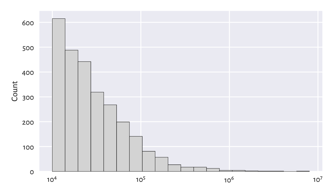
Figure 4.9 Another histogram of the same large_cities dataset: the distribution is right-skewed even on a logarithmic scale.
The log-scale causes the x-axis labels not to increase linearly anymore: it is no longer based on steps of equal sizes, giving 0, 1 000 000, 2 000 000, …, and so forth. Instead, the increases are now geometrical: 10 000, 100 000, 1 000 000, etc.
The current dataset enjoys a right-skewed distribution even on the logarithmic scale. Many real-world datasets behave alike; e.g., the frequencies of occurrences of words in books. On a side note, Chapter 6 will discuss the Pareto distribution family which yields similar histograms.
Note
(*) We relied on numpy.geomspace to generate bin edges manually:
np.round(np.geomspace(np.min(large_cities), np.max(large_cities), 21))
## array([  10001.,   13971.,   19516.,   27263.,   38084.,   53201.,
##          74319.,  103818.,  145027.,  202594.,  283010.,  395346.,
##         552272.,  771488., 1077717., 1505499., 2103083., 2937867.,
##        4104005., 5733024., 8008654.])
Due to the fact that the natural logarithm is the inverse of the exponential function and vice versa (compare Section 5.2), equidistant points on a logarithmic scale can also be generated as follows:
np.round(np.exp(
    np.linspace(
        np.log(np.min(large_cities)),
        np.log(np.max(large_cities)),
        21
)))
## array([  10001.,   13971.,   19516.,   27263.,   38084.,   53201.,
##          74319.,  103818.,  145027.,  202594.,  283010.,  395346.,
##         552272.,  771488., 1077717., 1505499., 2103083., 2937867.,
##        4104005., 5733024., 8008654.])
Draw the histogram of income on the logarithmic scale.
Does it resemble a bell-shaped distribution?
We will get back to this topic in Section 6.3.1.
4.3.8. Cumulative probabilities and the empirical cumulative distribution function
The histogram of the heights dataset in
Figure 4.2 revealed that,
amongst others, 28.6% (1 206 of 4 221) of women are approximately
160.2 ± 2.65 cm tall. However, sometimes we might be more concerned with
cumulative probabilities. Their interpretation is different;
from Figure 4.10, we can read that,
e.g., 80% of all women are no more than
roughly 166 cm tall (or that only 20% are taller than this height).
plt.hist(heights, bins=20, cumulative=True, density=True,
    color="lightgray", edgecolor="black")
plt.ylabel("Cumulative probability")
plt.show()
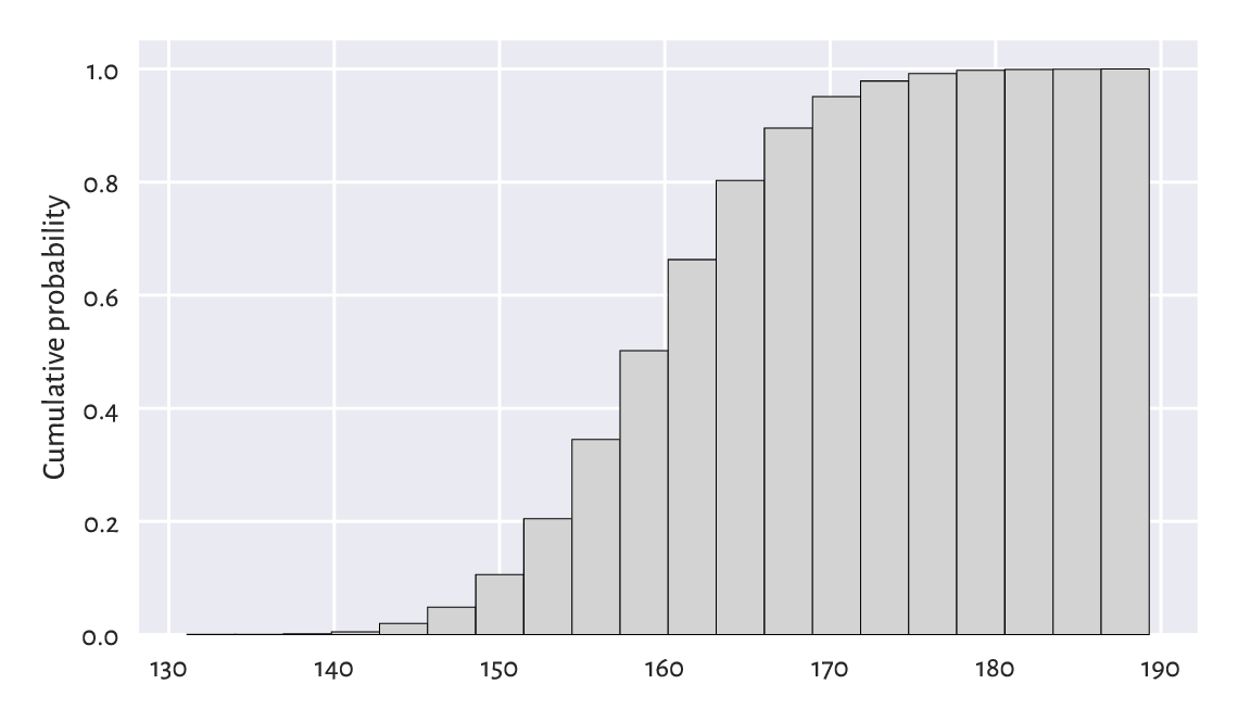
Figure 4.10 A cumulative histogram of the heights dataset.
Very similar is the plot of the empirical cumulative distribution function (ECDF), which for a sample \(\boldsymbol{x}=(x_1,\dots,x_n)\) we denote by \(\hat{F}_n\). And so, at any given point \(t\in\mathbb{R}\), \(\hat{F}_n(t)\) is a step function[10] that gives the proportion of observations in our sample that are not greater than \(t\):
We read \(|\{ i=1,\dots,n: x_i\le t \}|\) as the number of indexes like \(i\) such that the corresponding \(x_i\) is less than or equal to \(t\). Given the ordered inputs \(x_{(1)}< x_{(2)}< \dots< x_{(n)}\), we have:
Let’s underline the fact that drawing the ECDF does not involve binning; we only need to arrange the observations in an ascending order. Then, assuming that all observations are unique (there are no ties), the arithmetic progression \(1/n, 2/n, \dots, n/n\) is plotted against them; see Figure 4.11[11].
n = len(heights)
heights_sorted = np.sort(heights)
plt.plot(heights_sorted, np.arange(1, n+1)/n, drawstyle="steps-post")
plt.xlabel("$t$")  # LaTeX maths
plt.ylabel("$\\hat{F}_n(t)$, i.e., Prob(height $\\leq$ t)")
plt.show()
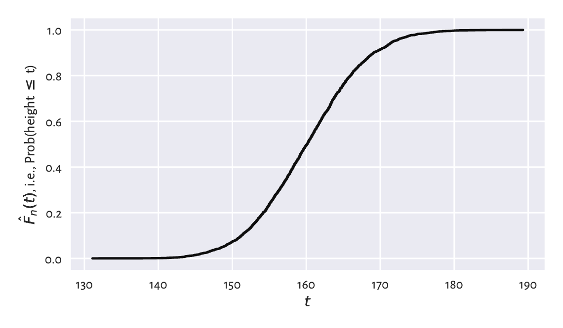
Figure 4.11 The empirical cumulative distribution function for the heights dataset.
Thus, for example, the height of 150 cm is not exceeded by 10% of the women.
Note
(*) Quantiles (which we introduce in Section 5.1.1.3) can be considered a generalised inverse of the ECDF.
4.4. Exercises
What is the difference between numpy.arange and numpy.linspace?
(*) What happens when we convert a logical vector to a numeric one using the astype method? And what about when we convert a numeric vector to a logical one? We will discuss that later, but you might want to check it yourself now.
Check what happens when we try to create a vector storing a mix of logical, integer, and floating-point values.
Answer the following questions:
What is a bell-shaped distribution?
What is a right-skewed distribution?
What is a heavy-tailed distribution?
What is a multi-modal distribution?
(*) When does logarithmic binning make sense?