16. Time series
This open-access textbook is, and will remain, freely available for everyone’s enjoyment (also in PDF; a paper copy can also be ordered). It is a non-profit project. Although available online, it is a whole course, and should be read from the beginning to the end. Refer to the Preface for general introductory remarks. Any bug/typo reports/fixes are appreciated. Make sure to check out Deep R Programming [36] too.
So far, we have been using numpy and pandas mostly for storing:
independent measurements, where each row gives, e.g., weight, height, … records of a different subject; we often consider these a sample of a representative subset of one or more populations, each recorded at a particular point in time;
data summaries to be reported in the form of tables or figures, e.g., frequency distributions giving counts for the corresponding categories or labels.
In this chapter, we will explore the most basic concepts related to the wrangling of time series, i.e., signals indexed by discrete time. Usually, a time series is a sequence of measurements sampled at equally spaced moments, e.g., a patient’s heart rate probed every second, daily average currency exchange rates, or highest yearly temperatures recorded in some location.
16.1. Temporal ordering and line charts
Consider the midrange[1] daily temperatures in degrees Celsius at the Spokane International Airport (Spokane, WA, US) between 1889-08-01 (the first observation) and 2021-12-31 (the last observation).
temps = np.genfromtxt("https://raw.githubusercontent.com/gagolews/" +
    "teaching-data/master/marek/spokane_temperature.txt")
Let’s preview the December 2021 data:
temps[-31:]  # last 31 days
## array([ 11.9,   5.8,   0.6,   0.8,  -1.9,  -4.4,  -1.9,   1.4,  -1.9,
##         -1.4,   3.9,   1.9,   1.9,  -0.8,  -2.5,  -3.6, -10. ,  -1.1,
##         -1.7,  -5.3,  -5.3,  -0.3,   1.9,  -0.6,  -1.4,  -5. ,  -9.4,
##        -12.8, -12.2, -11.4, -11.4])
Here are some data aggregates for the whole sample. First, the popular quantiles:
np.quantile(temps, [0, 0.25, 0.5, 0.75, 1])
## array([-26.9,   2.2,   8.6,  16.4,  33.9])
Then, the arithmetic mean and standard deviation:
np.mean(temps), np.std(temps)
## (8.990273958441021, 9.16204388619955)
A graphical summary of the data distribution is depicted in Figure 16.1.
plt.violinplot(temps, vert=False, showextrema=False)
plt.boxplot(temps, vert=False)
plt.show()
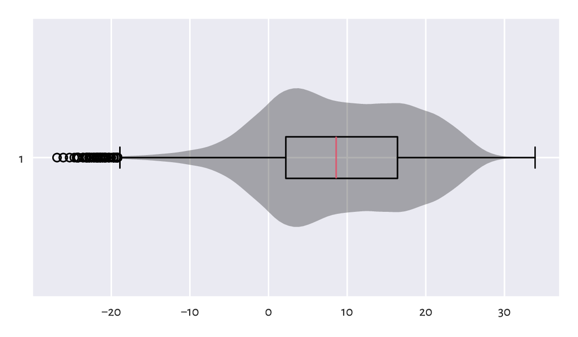
Figure 16.1 Distribution of the midrange daily temperatures in Spokane in the period 1889–2021. Observations are treated as a bag of unrelated items (temperature on a “randomly chosen day” in a version of planet Earth where there is no climate change).
When computing data aggregates or plotting histograms, the order of elements does not matter. Contrary to the case of the independent measurements, vectors representing time series do not have to be treated simply as mixed bags of unrelated items.
Important
In time series, for any given item \(x_i\), its neighbouring elements \(x_{i-1}\) and \(x_{i+1}\) denote the recordings occurring directly before and after it. We can use this temporal ordering to model how consecutive measurements depend on each other, describe how they change over time, forecast future values, detect seasonal and long-time trends, and so forth.
Figure 16.2 depicts the data for 2021, plotted as a function of time. What we see is often referred to as a line chart (line graph): data points are connected by straight line segments. There are some visible seasonal variations, such as, well, obviously, that winter is colder than summer. There is also some natural variability on top of seasonal patterns typical for the Northern Hemisphere.
plt.plot(temps[-365:])
plt.xticks([0, 181, 364], ["2021-01-01", "2021-07-01", "2021-12-31"])
plt.show()
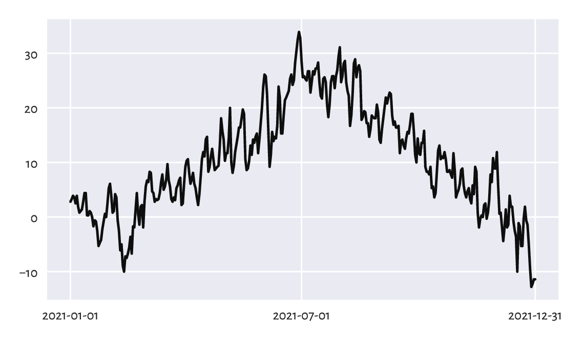
Figure 16.2 Line chart of midrange daily temperatures in Spokane for 2021.
16.2. Working with date-times and time-deltas
16.2.1. Representation: The UNIX epoch
numpy.datetime64 is a type to represent date-times.
Usually, we will be creating dates from strings. For instance:
d = np.array([
    "1889-08-01", "1970-01-01", "1970-01-02", "2021-12-31", "today"
], dtype="datetime64[D]")
d
## array(['1889-08-01', '1970-01-01', '1970-01-02', '2021-12-31',
##        '2026-01-20'], dtype='datetime64[D]')
Similarly with date-times:
dt = np.array(["1970-01-01T02:01:05", "now"], dtype="datetime64[s]")
dt
## array(['1970-01-01T02:01:05', '2026-01-20T09:29:53'],
##       dtype='datetime64[s]')
Important
Internally, date-times are represented as
the number of days or seconds
(datetime64[D] or datetime64[s]) since the UNIX Epoch,
1970-01-01T00:00:00 in the UTC time zone.
Let’s verify the preceding statement:
d.astype(int)
## array([-29372,      0,      1,  18992,  20473])
dt.astype(int)
## array([      7265, 1768901393])
When we think about it for a while, this is exactly what we expected.
(*) Compose a regular expression that extracts
all dates in the YYYY-MM-DD format from a
(possibly long) string and converts them to datetime64.
16.2.2. Time differences
Computing date-time differences (time-deltas) is possible thanks
to the numpy.timedelta64 objects:
d - np.timedelta64(1, "D")  # minus 1 Day
## array(['1889-07-31', '1969-12-31', '1970-01-01', '2021-12-30',
##        '2026-01-19'], dtype='datetime64[D]')
dt + np.timedelta64(12, "h")  # plus 12 hours
## array(['1970-01-01T14:01:05', '2026-01-20T21:29:53'],
##       dtype='datetime64[s]')
Also, numpy.arange (see also pandas.date_range) generates a sequence of equidistant date-times:
dates = np.arange("1889-08-01", "2022-01-01", dtype="datetime64[D]")
dates[:3]   # preview
## array(['1889-08-01', '1889-08-02', '1889-08-03'], dtype='datetime64[D]')
dates[-3:]  # preview
## array(['2021-12-29', '2021-12-30', '2021-12-31'], dtype='datetime64[D]')
16.2.3. Date-times in data frames
Dates and date-times can be emplaced in pandas data frames:
spokane = pd.DataFrame(dict(
    date=np.arange("1889-08-01", "2022-01-01", dtype="datetime64[D]"),
    temp=temps
))
spokane.head()
##         date  temp
## 0 1889-08-01  21.1
## 1 1889-08-02  20.8
## 2 1889-08-03  22.2
## 3 1889-08-04  21.7
## 4 1889-08-05  18.3
When we ask the date column
to become the data frame’s index (i.e., row labels),
we will be able select date ranges easily
with loc[...] and string slices
(refer to the manual of pandas.DateTimeIndex for more details).
spokane.set_index("date").loc["2021-12-25":, :].reset_index()
##         date  temp
## 0 2021-12-25  -1.4
## 1 2021-12-26  -5.0
## 2 2021-12-27  -9.4
## 3 2021-12-28 -12.8
## 4 2021-12-29 -12.2
## 5 2021-12-30 -11.4
## 6 2021-12-31 -11.4
Figure 16.3 depicts the temperatures in the last five years:
x = spokane.set_index("date").loc["2017-01-01":, "temp"].reset_index()
plt.plot(x.date, x.temp)
plt.show()
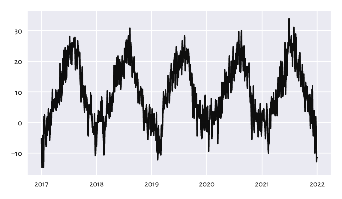
Figure 16.3 Line chart of midrange daily temperatures in Spokane for 2017–2021.
The pandas.to_datetime function can also
convert arbitrarily formatted date strings,
e.g., "MM/DD/YYYY" or "DD.MM.YYYY" to Series of
datetime64s.
dates = ["05.04.1991", "14.07.2022", "21.12.2042"]
dates = pd.Series(pd.to_datetime(dates, format="%d.%m.%Y"))
dates
## 0   1991-04-05
## 1   2022-07-14
## 2   2042-12-21
## dtype: datetime64[ns]
From the birth_dates dataset, select all people less than 18 years old
(as of the current day).
Several date-time functions and related properties can be referred to via the pandas.Series.dt accessor, which is similar to pandas.Series.str discussed in Chapter 14.
For instance, converting date-time objects to strings following custom format specifiers can be performed with:
dates.dt.strftime("%d.%m.%Y")
## 0    05.04.1991
## 1    14.07.2022
## 2    21.12.2042
## dtype: object
We can also extract different date or time fields, such as
date, time, year, month, day, dayofyear,
hour, minute, second, etc.
For example:
dates_ymd = pd.DataFrame(dict(
    year  = dates.dt.year,
    month = dates.dt.month,
    day   = dates.dt.day
))
dates_ymd
##    year  month  day
## 0  1991      4    5
## 1  2022      7   14
## 2  2042     12   21
The other way around, we should note that
pandas.to_datetime can convert data frames
with columns named year, month, day, etc., to date-time
objects:
pd.to_datetime(dates_ymd)
## 0   1991-04-05
## 1   2022-07-14
## 2   2042-12-21
## dtype: datetime64[ns]
Let’s extract the month and year parts of dates to compute the average monthly temperatures it the last 50 or so years:
x = spokane.set_index("date").loc["1970":, ].reset_index()
mean_monthly_temps = x.groupby([
    x.date.dt.year.rename("year"),
    x.date.dt.month.rename("month")
]).temp.mean().unstack()
mean_monthly_temps.head().round(1)  # preview
## month   1    2    3    4     5     6     7     8     9    10   11   12
## year
## 1970  -3.4  2.3  2.8  5.3  12.7  19.0  22.5  21.2  12.3  7.2  2.2 -2.4
## 1971  -0.1  0.8  1.7  7.4  13.5  14.6  21.0  23.4  12.9  6.8  1.9 -3.5
## 1972  -5.2 -0.7  5.2  5.6  13.8  16.6  20.0  21.7  13.0  8.4  3.5 -3.7
## 1973  -2.8  1.6  5.0  7.8  13.6  16.7  21.8  20.6  15.4  8.4  0.9  0.7
## 1974  -4.4  1.8  3.6  8.0  10.1  18.9  19.9  20.1  15.8  8.9  2.4 -0.8
Figure 16.4 depicts these data on a heat map. We rediscover the ultimate truth that winters are cold, whereas in the summertime the living is easy, what a wonderful world.
sns.heatmap(mean_monthly_temps)
plt.show()
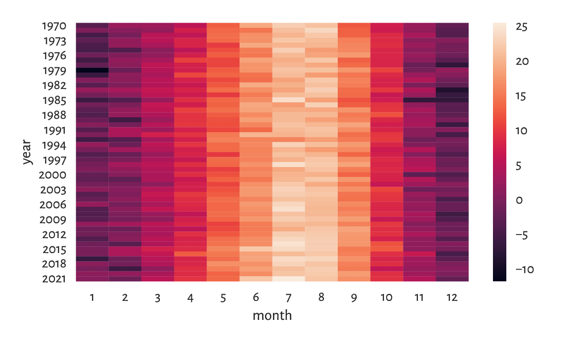
Figure 16.4 Average monthly temperatures.
16.3. Basic operations
16.3.1. Iterated differences and cumulative sums revisited
Recall from Section 5.5.1 the numpy.diff function and its almost-inverse, numpy.cumsum. The former can turn a time series into a vector of relative changes (deltas), \(\Delta_i=x_{i+1}-x_i\).
x = temps[-7:]  # last 7 days
x
## array([ -1.4,  -5. ,  -9.4, -12.8, -12.2, -11.4, -11.4])
The iterated differences (deltas) are:
d = np.diff(x)
d
## array([-3.6, -4.4, -3.4,  0.6,  0.8,  0. ])
For instance, between the second and the first day of the last week, the midrange temperature dropped by -3.6°C.
The other way around, here the cumulative sums of the deltas:
np.cumsum(d)
## array([ -3.6,  -8. , -11.4, -10.8, -10. , -10. ])
This turned deltas back to a shifted version of the original series. But we will need the first (root) observation therefrom to restore the dataset in full:
x[0] + np.append(0, np.cumsum(d))
## array([ -1.4,  -5. ,  -9.4, -12.8, -12.2, -11.4, -11.4])
Consider the euraud-20200101-20200630-no-na dataset
which lists daily EUR/AUD exchange rates in the first half of 2020 (remember
COVID-19?), with missing observations removed. Using numpy.diff,
compute the minimum, median, average, and maximum daily price changes.
Also, draw a box and whisker plot for these deltas.
(*) The exponential distribution family is sometimes used for the modelling of times between different events (deltas). It might be a sensible choice under the assumption that a system generates a constant number of events on average and that they occur independently of each other, e.g., for the times between requests to a cloud service during peak hours, wait times for the next pedestrian to appear at a crossing near the Southern Cross Station in Melbourne, or the amount of time it takes a bank teller to interact with a customer (there is a whole branch of applied mathematics called queuing theory that deals with this type of modelling).
An exponential family is identified by the scale parameter \(s > 0\), being at the same time its expected value. The probability density function of \(\mathrm{Exp}(s)\) is given for \(x\ge 0\) by:
and \(f(x)=0\) otherwise. We need to be careful: some textbooks choose the parametrisation by \(\lambda=1/s\) instead of \(s\). The scipy package also uses this convention.
Here is a pseudorandom sample where there are five events per minute on average:
np.random.seed(123)
l = 60/5  # 5 events per 60 seconds on average
d = scipy.stats.expon.rvs(size=1200, scale=l)
np.round(d[:8], 3)  # preview
## array([14.307,  4.045,  3.087,  9.617, 15.253,  6.601, 47.412, 13.856])
This gave us the wait times between the events, in seconds.
A natural sample estimator of the scale parameter is:
np.mean(d)
## 11.839894504211724
The result is close to what we expected, i.e., \(s=12\) seconds between the events.
We can convert the current sample to date-times
(starting at a fixed calendar date) as follows.
Note that we will measure the deltas in milliseconds so that we do not loose
precision; datetime64 is based on integers, not floating-point numbers.
t0 = np.array("2022-01-01T00:00:00", dtype="datetime64[ms]")
d_ms = np.round(d*1000).astype(int)  # in milliseconds
t = t0 + np.array(np.cumsum(d_ms), dtype="timedelta64[ms]")
t[:8]  # preview
## array(['2022-01-01T00:00:14.307', '2022-01-01T00:00:18.352',
##        '2022-01-01T00:00:21.439', '2022-01-01T00:00:31.056',
##        '2022-01-01T00:00:46.309', '2022-01-01T00:00:52.910',
##        '2022-01-01T00:01:40.322', '2022-01-01T00:01:54.178'],
##       dtype='datetime64[ms]')
t[-2:]  # preview
## array(['2022-01-01T03:56:45.312', '2022-01-01T03:56:47.890'],
##       dtype='datetime64[ms]')
As an exercise, let’s apply binning and count how many events occur in each hour:
b = np.arange(  # four 1-hour interval (five time points)
    "2022-01-01T00:00:00", "2022-01-01T05:00:00",
    1000*60*60,  # number of milliseconds in 1 hour
    dtype="datetime64[ms]"
)
np.histogram(t, bins=b)[0]
## array([305, 300, 274, 321])
We expect 5 events per second, i.e., 300 of them per hour. On a side note, from a course in statistics we know that for exponential inter-event times, the number of events per unit of time follows a Poisson distribution.
(*)
Consider the wait_times dataset
that gives the times between some consecutive events, in seconds.
Estimate the event rate per hour. Draw a histogram representing the number
of events per hour.
(*) Consider the btcusd_ohlcv_2021_dates
dataset which gives the daily BTC/USD exchange rates in 2021:
btc = pd.read_csv("https://raw.githubusercontent.com/gagolews/" +
    "teaching-data/master/marek/btcusd_ohlcv_2021_dates.csv",
    comment="#").loc[:, ["Date", "Close"]]
btc["Date"] = btc["Date"].astype("datetime64[s]")
btc.head(12)
##          Date      Close
## 0  2021-01-01  29374.152
## 1  2021-01-02  32127.268
## 2  2021-01-03  32782.023
## 3  2021-01-04  31971.914
## 4  2021-01-05  33992.430
## 5  2021-01-06  36824.363
## 6  2021-01-07  39371.043
## 7  2021-01-08  40797.609
## 8  2021-01-09  40254.547
## 9  2021-01-10  38356.441
## 10 2021-01-11  35566.656
## 11 2021-01-12  33922.961
Author a function that converts it to a lagged representation, being a convenient form for some machine learning algorithms.
Add the
Changecolumn that gives by how much the price changed since the previous day.Add the
Dircolumn indicating if the change was positive or negative.Add the
Lag1, …,Lag5columns which give theChanges in the five preceding days.
The first few rows of the resulting data frame should look like this (assuming we do not want any missing values):
##       Date Close   Change Dir     Lag1     Lag2    Lag3    Lag4    Lag5
## 2021-01-07 39371  2546.68 inc  2831.93  2020.52 -810.11  654.76 2753.12
## 2021-01-08 40798  1426.57 inc  2546.68  2831.93 2020.52 -810.11  654.76
## 2021-01-09 40255  -543.06 dec  1426.57  2546.68 2831.93 2020.52 -810.11
## 2021-01-10 38356 -1898.11 dec  -543.06  1426.57 2546.68 2831.93 2020.52
## 2021-01-11 35567 -2789.78 dec -1898.11  -543.06 1426.57 2546.68 2831.93
## 2021-01-12 33923 -1643.69 dec -2789.78 -1898.11 -543.06 1426.57 2546.68
In the sixth row (representing 2021-01-12),
Lag1 corresponds to Change on 2021-01-11,
Lag2 gives the Change on 2021-01-10, and so forth.
To spice things up, make sure your code can generate any number (as defined by another parameter to the function) of lagged variables.
16.3.2. Smoothing with moving averages
With time series it makes sense to consider processing whole batches of consecutive points as there is a time dependence between them. In particular, we can consider computing different aggregates inside rolling windows of a particular size. For instance, the \(k\)-moving average of a given sequence \((x_1, x_2, \dots, x_n)\) is a vector \((y_1, y_2, \dots, y_{n-k+1})\) such that:
i.e., the arithmetic mean of \(k\le n\) consecutive observations starting at \(x_i\).
For example, here are the temperatures in the last seven days of December 2011:
x = spokane.set_index("date").iloc[-7:, :]
x
##             temp
## date
## 2021-12-25  -1.4
## 2021-12-26  -5.0
## 2021-12-27  -9.4
## 2021-12-28 -12.8
## 2021-12-29 -12.2
## 2021-12-30 -11.4
## 2021-12-31 -11.4
The 3-moving (rolling) average:
x.rolling(3, center=True).mean().round(2)
##              temp
## date
## 2021-12-25    NaN
## 2021-12-26  -5.27
## 2021-12-27  -9.07
## 2021-12-28 -11.47
## 2021-12-29 -12.13
## 2021-12-30 -11.67
## 2021-12-31    NaN
We get, in this order: the mean of the first three observations; the mean of the second, third, and fourth items; then the mean of the third, fourth, and fifth; and so forth. Notice that the observations were centred in such a way that we have the same number of missing values at the start and end of the series. This way, we treat the first three-day moving average (the average of the temperatures on the first three days) as representative of the second day.
And now for something completely different; the 5-moving average:
x.rolling(5, center=True).mean().round(2)
##              temp
## date
## 2021-12-25    NaN
## 2021-12-26    NaN
## 2021-12-27  -8.16
## 2021-12-28 -10.16
## 2021-12-29 -11.44
## 2021-12-30    NaN
## 2021-12-31    NaN
Applying the moving average has the nice effect of smoothing out all kinds of broadly-conceived noise. To illustrate this, compare the temperature data for the last five years in Figure 16.3 to their averaged versions in Figure 16.5.
x = spokane.set_index("date").loc["2017-01-01":, "temp"]
x30 = x.rolling(30, center=True).mean()
x100 = x.rolling(100, center=True).mean()
plt.plot(x30, label="30-day moving average")
plt.plot(x100, "r--", label="100-day moving average")
plt.legend()
plt.show()
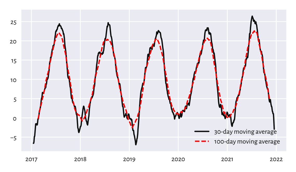
Figure 16.5 Line chart of 30- and 100-moving averages of the midrange daily temperatures in Spokane for 2017–2021.
(*) Other aggregation functions can be applied in rolling windows as well. Draw, in the same figure, the plots of the one-year moving minimums, medians, and maximums.
16.3.3. Detecting trends and seasonal patterns
Thanks to windowed aggregation, we can also detect general trends (when using longish windows). For instance, let’s compute the ten-year moving averages for the last 50-odd years’ worth of data:
x = spokane.set_index("date").loc["1970-01-01":, "temp"]
x10y = x.rolling(3653, center=True).mean()
Based on this, we can compute the detrended series:
xd = x - x10y
Seasonal patterns can be revealed by smoothening out the detrended version of the data, e.g., using a one-year moving average:
xd1y = xd.rolling(365, center=True).mean()
Figure 16.6 illustrates this.
plt.plot(x10y, label="trend")
plt.plot(xd1y, "r--", label="seasonal pattern")
plt.legend()
plt.show()
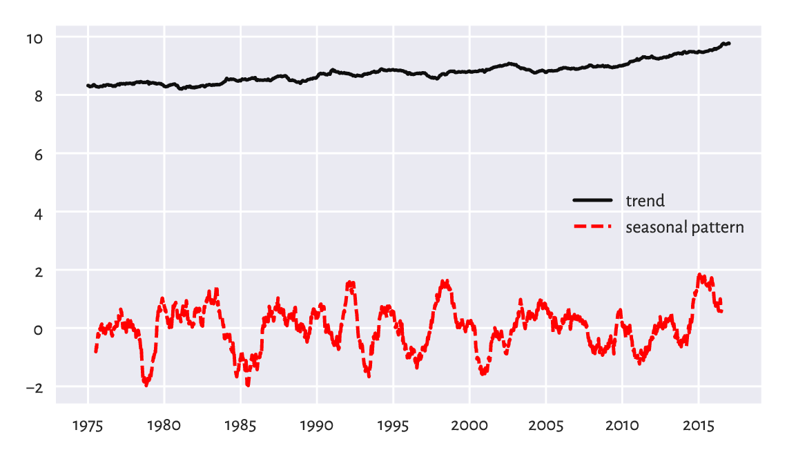
Figure 16.6 Trend and seasonal pattern for the Spokane temperatures in recent years.
Also, if we know the length of the seasonal pattern (in our case, 365-ish days), we can draw a seasonal plot, where we have a separate curve for each season (here: year) and where all the series share the same x-axis (here: the day of the year); see Figure 16.7.
cmap = plt.colormaps.get_cmap("coolwarm")
x = spokane.set_index("date").loc["1970-01-01":, :].reset_index()
for year in range(1970, 2022, 5):                     # selected years only
    y = x.loc[x.date.dt.year == year, :]
    plt.plot(y.date.dt.dayofyear, y.temp,
        c=cmap((year-1970)/(2021-1970)), alpha=0.3,
        label=year if year % 10 == 0 else None)
avex = x.temp.groupby(x.date.dt.dayofyear).mean()
plt.plot(avex.index, avex, "g-", label="Average")     # all years
plt.legend()
plt.xlabel("Day of year")
plt.ylabel("Temperature")
plt.show()
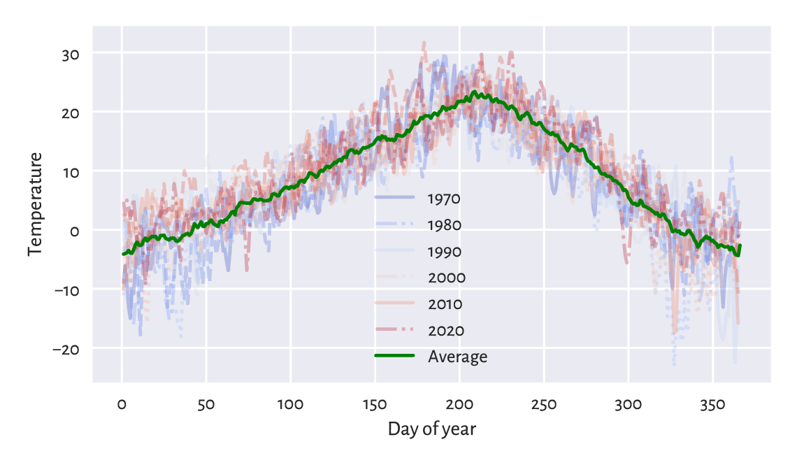
Figure 16.7 Seasonal plot: temperatures in Spokane vs the day of the year for 1970–2021.
Draw a similar plot for the whole data range, i.e., 1889–2021.
Try using pd.Series.dt.strftime with a custom formatter instead
of pd.Series.dt.dayofyear.
16.3.4. Imputing missing values
Missing values in time series can be imputed based on the information from the neighbouring non-missing observations. After all, it is usually the case that, e.g., today’s weather is “similar” to yesterday’s and tomorrow’s.
The most straightforward ways for dealing with missing values in time series are:
forward-fill – propagate the last non-missing observation,
backward-fill – get the next non-missing value,
linearly interpolate between two adjacent non-missing values – in particular, a single missing value will be replaced by the average of its neighbours.
The classic air_quality_1973 dataset gives some
daily air quality measurements in New York, between May and September 1973.
Let’s impute the first few observations in the solar radiation column:
air = pd.read_csv("https://raw.githubusercontent.com/gagolews/" +
    "teaching-data/master/r/air_quality_1973.csv",
    comment="#")
x = air.loc[:, "Solar.R"].iloc[:12]
pd.DataFrame(dict(
    original=x,
    ffilled=x.ffill(),
    bfilled=x.bfill(),
    interpolated=x.interpolate(method="linear")
))
##     original  ffilled  bfilled  interpolated
## 0      190.0    190.0    190.0    190.000000
## 1      118.0    118.0    118.0    118.000000
## 2      149.0    149.0    149.0    149.000000
## 3      313.0    313.0    313.0    313.000000
## 4        NaN    313.0    299.0    308.333333
## 5        NaN    313.0    299.0    303.666667
## 6      299.0    299.0    299.0    299.000000
## 7       99.0     99.0     99.0     99.000000
## 8       19.0     19.0     19.0     19.000000
## 9      194.0    194.0    194.0    194.000000
## 10       NaN    194.0    256.0    225.000000
## 11     256.0    256.0    256.0    256.000000
(*) With the air_quality_2018
dataset:
Based on the hourly observations, compute the daily mean PM2.5 measurements for Melbourne CBD and Morwell South.
For Melbourne CBD, if some hourly measurement is missing, linearly interpolate between the preceding and following non-missing data, e.g., a PM2.5 sequence of
[..., 10, NaN, NaN, 40, ...](you need to manually add theNaNrows to the dataset) should be transformed to[..., 10, 20, 30, 40, ...].For Morwell South, impute the readings with the averages of the records in the nearest air quality stations, which are located in Morwell East, Moe, Churchill, and Traralgon.
Present the daily mean PM2.5 measurements for Melbourne CBD and Morwell South on a single plot. The x-axis labels should be human-readable and intuitive.
For the Melbourne data, determine the number of days where the average PM2.5 was greater than in the preceding day.
Find five most air-polluted days for Melbourne.
16.3.5. Plotting multidimensional time series
Multidimensional time series stored in the form of an \(n\times m\) matrix are best viewed as \(m\) time series – possibly but not necessarily related to each other – all sampled at the same \(n\) points in time (e.g., \(m\) different stocks on \(n\) consecutive days).
Consider the currency exchange rates for the first half of 2020:
eurxxx = np.genfromtxt("https://raw.githubusercontent.com/gagolews/" +
    "teaching-data/master/marek/eurxxx-20200101-20200630-no-na.csv",
    delimiter=",")
eurxxx[:6, :]  # preview
## array([[1.6006 , 7.7946 , 0.84828, 4.2544 ],
##        [1.6031 , 7.7712 , 0.85115, 4.2493 ],
##        [1.6119 , 7.8049 , 0.85215, 4.2415 ],
##        [1.6251 , 7.7562 , 0.85183, 4.2457 ],
##        [1.6195 , 7.7184 , 0.84868, 4.2429 ],
##        [1.6193 , 7.7011 , 0.85285, 4.2422 ]])
This gives EUR/AUD (how many Australian Dollars we pay for 1 Euro), EUR/CNY (Chinese Yuans), EUR/GBP (British Pounds), and EUR/PLN (Polish Złotys), in this order. Let’s draw the four time series; see Figure 16.8.
dates = np.genfromtxt("https://raw.githubusercontent.com/gagolews/" +
    "teaching-data/master/marek/euraud-20200101-20200630-dates.txt",
    dtype="datetime64[s]")
labels = ["AUD", "CNY", "GBP", "PLN"]
styles = ["solid", "dotted", "dashed", "dashdot"]
for i in range(eurxxx.shape[1]):
    plt.plot(dates, eurxxx[:, i], ls=styles[i], label=labels[i])
plt.legend(loc="upper right", bbox_to_anchor=(1, 0.9))  # a bit lower
plt.show()
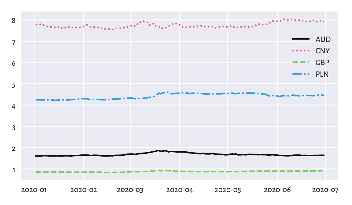
Figure 16.8 EUR/AUD, EUR/CNY, EUR/GBP, and EUR/PLN exchange rates in the first half of 2020.
Unfortunately, they are all on different scales. This is why the plot is not necessarily readable. It would be better to draw these time series on four separate plots (compare the trellis plots in Section 12.2.5).
Another idea is to depict the currency exchange rates relative to the prices on some day, say, the first one; see Figure 16.9.
for i in range(eurxxx.shape[1]):
    plt.plot(dates, eurxxx[:, i]/eurxxx[0, i],
        ls=styles[i], label=labels[i])
plt.legend()
plt.show()
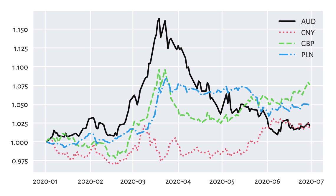
Figure 16.9 EUR/AUD, EUR/CNY, EUR/GBP, and EUR/PLN exchange rates relative to the prices on the first day.
This way, e.g., a relative EUR/AUD rate of c. 1.15 in mid-March means that if an Aussie bought some Euros on the first day, and then sold them three-ish months later, they would have 15% more wealth (the Euro become 15% stronger relative to AUD).
Based on the EUR/AUD and EUR/PLN records, compute and plot the AUD/PLN as well as PLN/AUD rates.
(*) Draw the EUR/AUD and EUR/GBP rates on a single plot, but where each series has its own y-axis.
(*) Draw the EUR/xxx rates for your favourite currencies over a larger period. Use data downloaded from the European Central Bank. Add a few moving averages. For each year, identify the lowest and the highest rate.
16.3.6. Candlestick plots (*)
Consider the BTC/USD data for 2021:
btcusd = np.genfromtxt("https://raw.githubusercontent.com/gagolews/" +
    "teaching-data/master/marek/btcusd_ohlcv_2021.csv",
    delimiter=",")
btcusd[:6, :4]  # preview (we skip the Volume column for readability)
## array([[28994.01 , 29600.627, 28803.586, 29374.152],
##        [29376.455, 33155.117, 29091.182, 32127.268],
##        [32129.408, 34608.559, 32052.316, 32782.023],
##        [32810.949, 33440.219, 28722.756, 31971.914],
##        [31977.041, 34437.59 , 30221.188, 33992.43 ],
##        [34013.613, 36879.699, 33514.035, 36824.363]])
This gives the open, high, low, and close (OHLC) prices on the 365 consecutive days, which is a common way to summarise daily rates.
The mplfinance (matplotlib-finance) package defines a few functions related to the plotting of financial data. Let’s briefly describe the well-known candlestick plot.
import mplfinance as mpf
dates = np.arange("2021-01-01", "2022-01-01", dtype="datetime64[D]")
mpf.plot(
    pd.DataFrame(
        btcusd,
        columns=["Open", "High", "Low", "Close", "Volume"]
    ).set_index(dates).iloc[:31, :],
    type="candle",
    returnfig=True
)
plt.show()
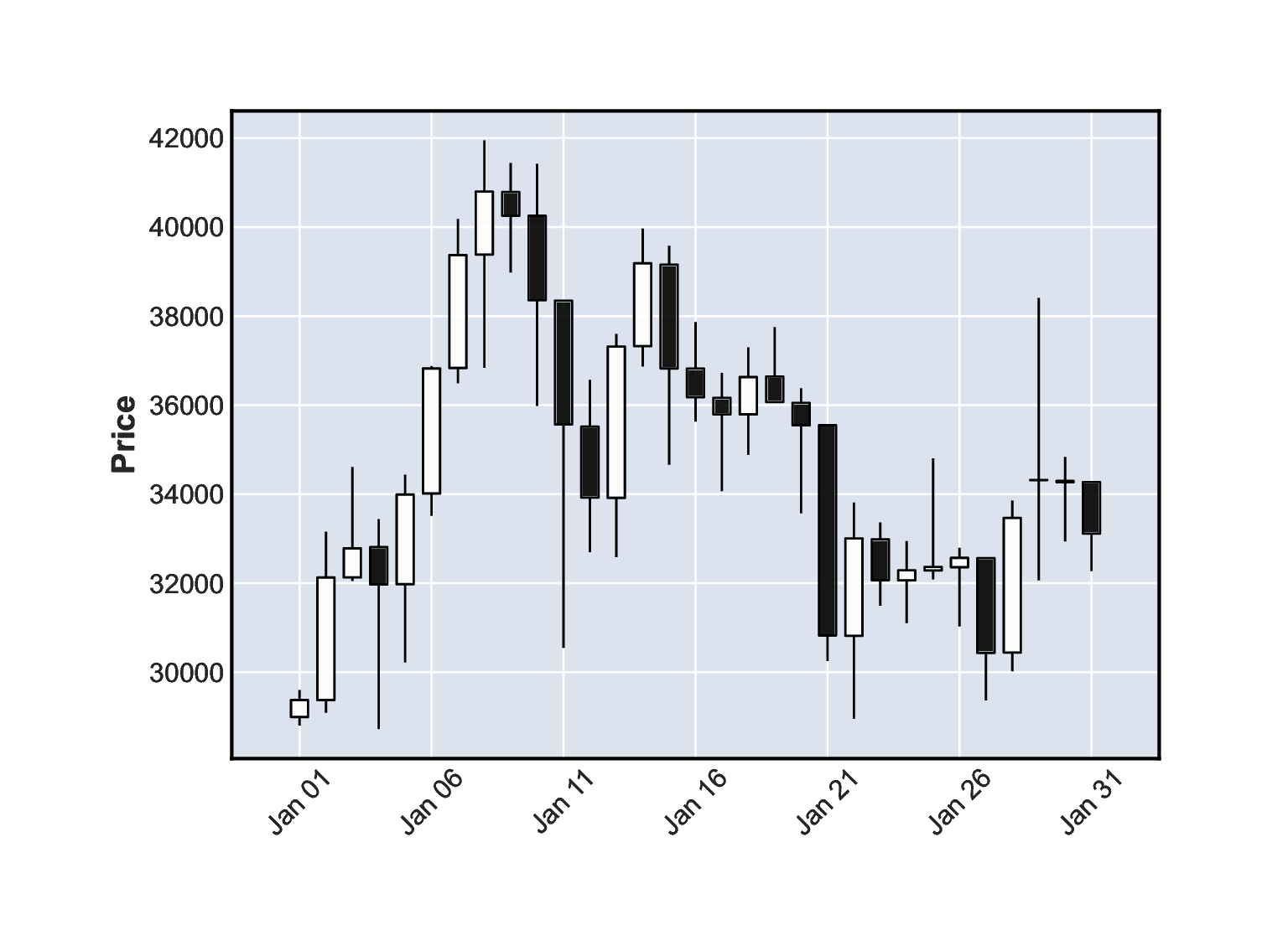
Figure 16.10 A candlestick plot for the BTC/USD exchange rates in January 2021.
Figure 16.10 depicts the January 2021 data. Let’s stress that it is not a box and whisker plot. The candlestick body denotes the difference in the market opening and the closing price. The wicks (shadows) give the range (high to low). White candlesticks represent bullish days – where the closing rate is greater than the opening one (uptrend). Black candles are bearish (decline).
Draw the BTC/USD rates for the entire year and add the 10-day moving averages.
(*) Draw a candlestick plot manually, without using the mplfinance package. Hint: matplotlib.pyplot.fill might be helpful.
(*) Using matplotlib.pyplot.fill_between add a semi-transparent polygon that fills the area bounded between the Low and High prices on all the days.
16.4. Further reading
Data science classically deals with information that is or can be represented in tabular form and where particular observations (which can be multidimensional) are usually independent from but still to some extent similar to each other. We often treat them as samples from different larger populations which we would like to describe or compare at some level of generality (think: health data on patients being subject to two treatment plans that we want to evaluate).
From this perspective, time series are distinct: there is some dependence observed in the time domain. For instance, a price of a stock that we observe today is influenced by what was happening yesterday. There might also be some seasonal patterns or trends under the hood. For a comprehensive introduction to forecasting; see [55, 74]. Also, for data of this kind, employing statistical modelling techniques (stochastic processes) can make a lot of sense; see, e.g., [90].
Signals such as audio, images, and video are different because structured randomness does not play a dominant role there (unless it is a noise that we would like to filter out). Instead, more interesting are the patterns occurring in the frequency (think: perceiving pitches when listening to music) or spatial (seeing green grass and sky in a photo) domain.
Signal processing thus requires a distinct set of tools, e.g., Fourier analysis and finite impulse response (discrete convolution) filters. This course obviously cannot be about everything (also because it requires some more advanced calculus skills that we did not assume the reader to have at this time); but see, e.g., [87, 89].
Nevertheless, keep in mind that these are not completely independent domains. For example, we can extract various features of audio signals (e.g., overall loudness, timbre, and danceability of each recording in a large song database) and then treat them as tabular data to be analysed using the techniques described in this course. Moreover, machine learning (e.g., convolutional neural networks) algorithms may also be used for tasks such as object detection on images or optical character recognition; see, e.g., [44].
16.5. Exercises
Assume we have a time series with \(n\) observations. What is a \(1\)- and an \(n\)-moving average? Which one is smoother, a \((0.01n)\)- or a \((0.1n)\)- one?
What is the UNIX Epoch?
How can we recreate the original series when we are given its numpy.diff-transformed version?
(*) In your own words, describe the key elements of a candlestick plot.