9. Exploring relationships between variables
This open-access textbook is, and will remain, freely available for everyone’s enjoyment (also in PDF; a paper copy can also be ordered). It is a non-profit project. Although available online, it is a whole course, and should be read from the beginning to the end. Refer to the Preface for general introductory remarks. Any bug/typo reports/fixes are appreciated. Make sure to check out Deep R Programming [36] too.
Recall that in Section 7.4, we performed some graphical exploratory analysis of the body measures recorded by the National Health and Nutrition Examination Survey:
body = np.genfromtxt("https://raw.githubusercontent.com/gagolews/" +
    "teaching-data/master/marek/nhanes_adult_female_bmx_2020.csv",
    delimiter=",")[1:, :]  # skip the first row (column names)
body[:6, :]  # preview: the first six rows, all columns
## array([[ 97.1, 160.2,  34.7,  40.8,  35.8, 126.1, 117.9],
##        [ 91.1, 152.7,  33.5,  33. ,  38.5, 125.5, 103.1],
##        [ 73. , 161.2,  37.4,  38. ,  31.8, 106.2,  92. ],
##        [ 61.7, 157.4,  38. ,  34.7,  29. , 101. ,  90.5],
##        [ 55.4, 154.6,  34.6,  34. ,  28.3,  92.5,  73.2],
##        [ 62. , 144.7,  32.5,  34.2,  29.8, 106.7,  84.8]])
body.shape
## (4221, 7)
We already know that \(n=4221\) adult female participants are described by seven different numerical features, in this order:
body_columns = np.array([
    "weight",      # weight (kg)
    "height",      # standing height (cm)
    "arm len.",    # upper arm length (cm)
    "leg len.",    # upper leg length (cm)
    "arm circ.",   # arm circumference (cm)
    "hip circ.",   # hip circumference (cm)
    "waist circ."  # waist circumference (cm)
])
The data in different columns are somewhat related to each other. Figure 7.4 indicates that higher hip circumferences tend to occur together with higher arm circumferences, and that the latter metric does not really tell us much about heights. In this chapter, we discuss ways to describe the possible relationships between variables.
9.1. Measuring correlation
Let’s explore some basic means for measuring (expressing as a single number) the degree of association between two features.
9.1.1. Pearson linear correlation coefficient
The Pearson linear correlation coefficient is given by:
with \(s_x, s_y\) denoting the standard deviations and \(\bar{x}, \bar{y}\) being the means of the two sequences \(\boldsymbol{x}=(x_1,\dots,x_n)\) and \(\boldsymbol{y}=(y_1,\dots,y_n)\), respectively.
\(r\) is the mean of the pairwise products[1] of the standardised versions of two vectors. It is a normalised measure of how they vary together (co-variance). Here is how we can compute it manually on two example vectors:
x = body[:, 4]  # arm circumference
y = body[:, 5]  # hip circumference
x_std = (x-np.mean(x))/np.std(x)  # z-scores for x
y_std = (y-np.mean(y))/np.std(y)  # z-scores for y
np.mean(x_std*y_std)
## 0.8680627457873239
And here is the built-in function that implements the same formula:
scipy.stats.pearsonr(x, y)[0]  # the function returns more than we need
## 0.8680627457873241
Important
The properties of Pearson’s \(r\) include:
\(r(\boldsymbol{x}, \boldsymbol{y}) = r(\boldsymbol{y}, \boldsymbol{x})\) (it is symmetric);
\(|r(\boldsymbol{x}, \boldsymbol{y})| \le 1\) (it is bounded from below by \(-1\) and from \(above\) by 1);
\(r(\boldsymbol{x}, \boldsymbol{y})=1\) if and only if \(\boldsymbol{y}=a\boldsymbol{x}+b\) for some \(a>0\) and any \(b\) (it reaches the maximum when one variable is an increasing affine function of the other one; their graph forms an ascending line);
\(r(\boldsymbol{x}, -\boldsymbol{y})=-r(\boldsymbol{x}, \boldsymbol{y})\) (negative scaling (reflection) of one variable changes its sign);
\(r(\boldsymbol{x}, a\boldsymbol{y}+b)=r(\boldsymbol{x}, \boldsymbol{y})\) for any \(a>0\) and \(b\) (it is invariant to translation and scaling of inputs, as long as it does not change the sign of elements).
To help develop some intuitions, let’s illustrate a few noteworthy correlations using a helper function that draws a scatter plot and prints out Pearson’s \(r\) (and Spearman’s \(\rho\) discussed in Section 9.1.4; let’s ignore it by then):
def plot_corr(x, y, axes_eq=False):
    r = scipy.stats.pearsonr(x, y)[0]
    rho = scipy.stats.spearmanr(x, y)[0]
    plt.plot(x, y, "o")
    plt.title(f"$r = {r:.3}$, $\\rho = {rho:.3}$",
        fontdict=dict(fontsize=10))
    if axes_eq: plt.axis("equal")
9.1.1.1. Perfect linear correlation
The aforementioned properties imply that \(r(\boldsymbol{x}, \boldsymbol{y})=-1\) if and only if \(\boldsymbol{y}=a\boldsymbol{x}+b\) for some \(a<0\) and any \(b\) (reaches the minimum when variables are decreasing affine functions of one another). Furthermore, a variable is trivially perfectly correlated with itself, \(r(\boldsymbol{x}, \boldsymbol{x})=1\). Consequently, we get perfect linear correlation (-1 or 1) when one variable is a scaled and shifted version of the other variable; see Figure 9.1.
x = np.random.rand(100)
plt.subplot(1, 2, 1); plot_corr(x, -0.5*x+3,  axes_eq=True)  # negative slope
plt.subplot(1, 2, 2); plot_corr(x,    3*x+10, axes_eq=True)  # positive slope
plt.show()
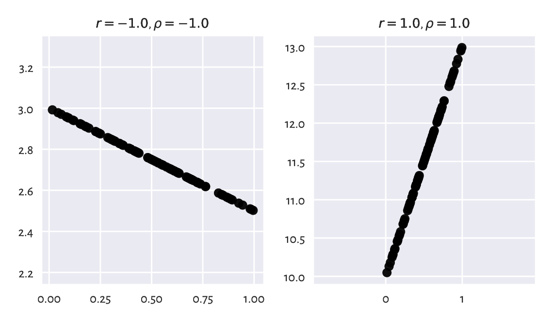
Figure 9.1 Perfect linear correlation (negative and positive).
Important
A negative correlation means that when one variable increases, the other one decreases, and vice versa (like in: weight vs expected life span).
9.1.1.2. Strong linear correlation
Next, if two variables are approximately affine functions of one another, the correlations will be close to -1 or 1. The degree of association goes towards 0 as the linear relationship becomes less articulated; see Figure 9.2.
plt.figure(figsize=(plt.rcParams["figure.figsize"][0], )*2)  # width=height
x = np.random.rand(100)      # random x (whatever)
y = 0.5*x                    # y is a linear function of x
e = np.random.randn(len(x))  # random Gaussian noise (expected value 0)
plt.subplot(2, 2, 1); plot_corr(x, y)         # original y
plt.subplot(2, 2, 2); plot_corr(x, y+0.05*e)  # some noise added to y
plt.subplot(2, 2, 3); plot_corr(x, y+0.1*e)   # more noise
plt.subplot(2, 2, 4); plot_corr(x, y+0.25*e)  # even more noise
plt.show()
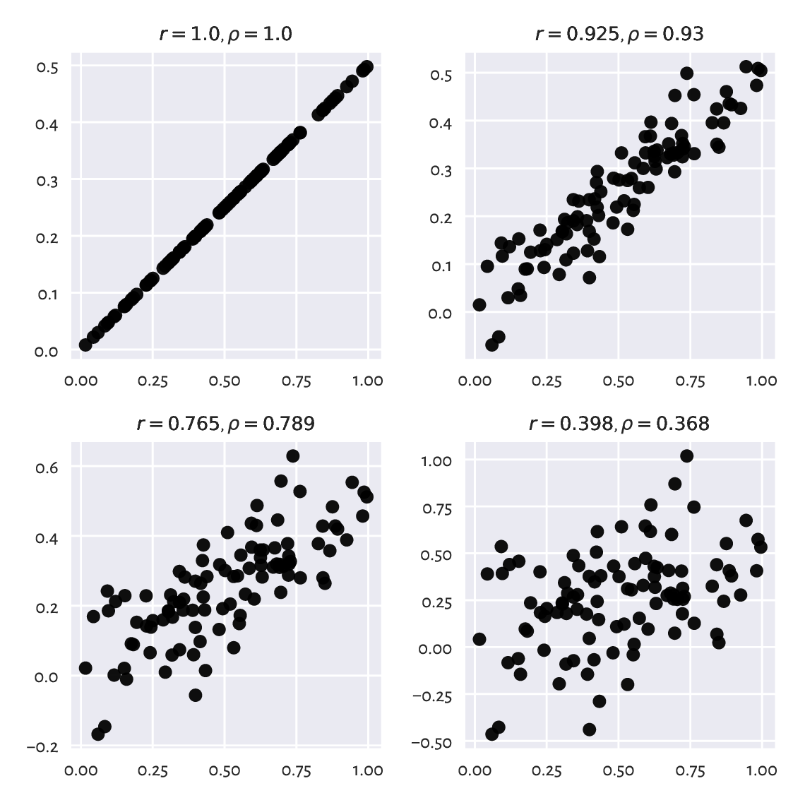
Figure 9.2 Linear correlation coefficients for data on a line, but with different amounts of noise.
Recall that the arm and hip circumferences enjoy high-ish positive degree of linear correlation (\(r\simeq 0.868\)). Their scatter plot (Figure 7.4) looks somewhat similar to one of the cases depicted here.
Draw a series of similar plots but for the case of negatively correlated point pairs, e.g., \(y=-2x+5\).
Important
As a rule of thumb, a linear correlation coefficient of 0.9 or more (or -0.9 or less) is fairly strong. Closer to -0.8 and 0.8, we should already start being sceptical about two variables’ possibly being linearly correlated. Some statisticians are more lenient; in particular, it is not uncommon in the social sciences to consider 0.6 a decent degree of correlation, but this is like building your evidence-base on sand. No wonder why some fields are suffering from a reproducibility crisis these days (albeit there are beautiful exceptions to this general observation).
If the dataset at hand does not give us too strong an evidence, it is our ethical duty to refrain from making unjustified claims. We must not mislead the recipients of our data analysis exercises. Still, it can sometimes be interesting to discover that some factors popularly conceived as dependent are actually not correlated, for this is an instance of myth-busting.
9.1.1.3. No linear correlation does not imply independence
For two independent variables, we expect the correlation coefficient to be approximately equal to 0. Nevertheless, correlations close to 0 do not necessarily mean that two variables are unrelated. Pearson’s \(r\) is a linear correlation coefficient, so we are quantifying only[2] these types of relationships; see Figure 9.3 for an illustration.
plt.figure(figsize=(plt.rcParams["figure.figsize"][0], )*2)  # width=height
plt.subplot(2, 2, 1)
plot_corr(x, np.random.rand(100))  # independent (not correlated)
plt.subplot(2, 2, 2)
plot_corr(x, (2*x-1)**2-1)         # quadratic dependence
plt.subplot(2, 2, 3)
plot_corr(x, np.abs(2*x-1))        # absolute value
plt.subplot(2, 2, 4)
plot_corr(x, np.sin(10*np.pi*x))   # sine
plt.show()
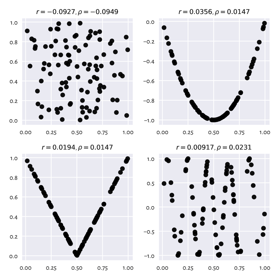
Figure 9.3 Are all of the variable pairs really uncorrelated?
9.1.1.4. False correlations
What is more, sometimes we can fall into the trap of false correlations. This happens when data are actually functionally dependent, the relationship is not affine, but the points are aligned not far from a line; see Figure 9.4 for some examples.
plt.figure(figsize=(plt.rcParams["figure.figsize"][0], )*2)  # width=height
plt.subplot(2, 2, 1)
plot_corr(x, np.sin(0.6*np.pi*x))  # sine
plt.subplot(2, 2, 2)
plot_corr(x, np.log(x+1))          # logarithm
plt.subplot(2, 2, 3);
plot_corr(x, np.exp(x**2))         # exponential of square
plt.subplot(2, 2, 4)
plot_corr(x, 1/(x/2+0.2))          # reciprocal
plt.show()
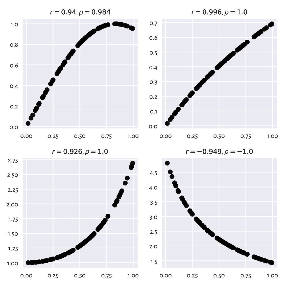
Figure 9.4 Example nonlinear relationships that look like linear, at least to Pearson’s \(r\).
A single measure cannot be perfect: we are trying to compress \(n\) data points into a single number here. It is obvious that many different datasets, sometimes remarkably diverse, will yield the same correlation degree.
Furthermore, even truly independent variables might return significant Pearson’s \(r\). Especially in datasets with many columns and very few observations, it will be possible to find paradoxical pairs of variables that our naïve tool will report as correlated. Tyler Vigen’s Spurious Correlations project documents numerous hilarious instances of this kind, such as Divorce rates in the United Kingdom vs Disney movies released (\(r=0.93\)) or Number of G***le searches for Why do I have green poop vs Pirate attacks globally (\(r=0.853\)). For every (small) feature, there is something that correlates with it.
(*) Two independent, normally distributed samples, each of length \(n\), yield Pearson’s \(r\) which is approximately normally distributed with expectation \(0\) and standard deviation \(1/\sqrt{n-3}\). Compute the probability of drawing an independent pair of samples that yields \(|r|>0.6\) for \(n=10\), \(25\), and \(100\).
9.1.1.5. Correlation is not causation
A high correlation degree (either positive or negative) does not mean that there is any causal relationship between the two variables. We cannot say that having large arm circumference affects hip size or vice versa. There might be some latent variable that influences these two (e.g., maybe also related to weight?).
Quite often, medical advice is formulated based on correlations and similar association-measuring tools. We are expected to know how to interpret them, as it is never a true cause-effect relationship; rather, it is all about detecting common patterns in larger populations. For instance, in “obesity increases the likelihood of lower back pain and diabetes” we do not say that one necessarily implies another or that if you are not overweight, there is no risk of getting the two said conditions. It might also work the other way around, as lower back pain may lead to less exercise and then weight gain. Reality is complex. Find similar patterns in sets of health conditions.
Note
Correlation analysis can aid in constructing regression models, where we would like to identify a transformation that expresses a variable as a function of one or more other features. For instance, when we say that \(y\) can be modelled approximately by \(ax+b\), regression analysis can identify the best matching \(a\) and \(b\) coefficients; see Section 9.2.3 for more details.
9.1.2. Correlation heat map
Calling numpy.corrcoef(body, rowvar=False)
determines the linear correlation
coefficients between all pairs of variables in our dataset.
We can depict them nicely on a heat map based
on a fancified call to matplotlib.pyplot.imshow.
def corrheatmap(R, labels):
    """
    Draws a correlation heat map, given:
    * R - matrix of correlation coefficients for all variable pairs,
    * labels - list of column names
    """
    assert R.shape[0] == R.shape[1] and R.shape[0] == len(labels)
    k = R.shape[0]

    # plot the heat map using a custom colour palette
    # (correlations are in [-1, 1])
    plt.imshow(R, cmap=plt.colormaps.get_cmap("RdBu"), vmin=-1, vmax=1)

    # add text labels
    for i in range(k):
        for j in range(k):
            plt.text(i, j, f"{R[i, j]:.2f}", ha="center", va="center",
                color="black" if np.abs(R[i, j])<0.5 else "white")

    plt.xticks(np.arange(k), labels=labels, rotation=30)
    plt.tick_params(axis="x", which="both",
        labelbottom=True, labeltop=True, bottom=False, top=False)

    plt.yticks(np.arange(k), labels=labels)
    plt.tick_params(axis="y", which="both",
        labelleft=True, labelright=True, left=False, right=False)

    plt.grid(False)
See Figure 9.5 for the plot.
plt.figure(figsize=(plt.rcParams["figure.figsize"][0], )*2)  # width=height
R = np.corrcoef(body, rowvar=False)
order = [4, 5, 6, 0, 2, 1, 3]  # chiefly for aesthetics
corrheatmap(R[np.ix_(order, order)], body_columns[order])
plt.show()
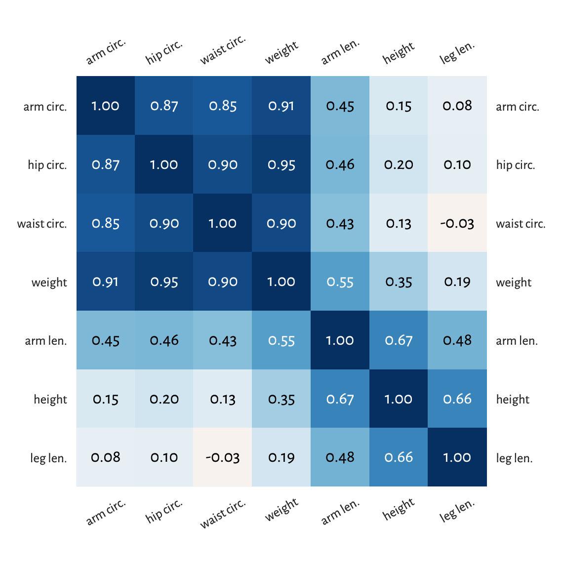
Figure 9.5 A correlation heat map.
Notice that we ordered[3] the columns to reveal some naturally occurring variable clusters: for instance, arm, hip, waist circumference, and weight are all strongly correlated.
Of course, we have 1.0s on the main diagonal because a variable is trivially correlated with itself. This heat map is symmetric which is due to the property \(r(\boldsymbol{x}, \boldsymbol{y}) = r(\boldsymbol{y}, \boldsymbol{x})\).
(*) To fetch the row and column index of the most correlated pair of variables (either positively or negatively), we should first take the upper (or lower) triangle of the correlation matrix (see numpy.triu or numpy.tril) to ignore the irrelevant and repeating items:
Ru = np.triu(np.abs(R), 1)
np.round(Ru, 2)
## array([[0.  , 0.35, 0.55, 0.19, 0.91, 0.95, 0.9 ],
##        [0.  , 0.  , 0.67, 0.66, 0.15, 0.2 , 0.13],
##        [0.  , 0.  , 0.  , 0.48, 0.45, 0.46, 0.43],
##        [0.  , 0.  , 0.  , 0.  , 0.08, 0.1 , 0.03],
##        [0.  , 0.  , 0.  , 0.  , 0.  , 0.87, 0.85],
##        [0.  , 0.  , 0.  , 0.  , 0.  , 0.  , 0.9 ],
##        [0.  , 0.  , 0.  , 0.  , 0.  , 0.  , 0.  ]])
and then find the location of the maximum:
pos = np.unravel_index(np.argmax(Ru), Ru.shape)
pos  # (row, column)
## (0, 5)
body_columns[ list(pos) ]  # indexing by a tuple has a different meaning
## array(['weight', 'hip circ.'], dtype='<U11')
Weight and hip circumference is the most strongly correlated pair.
Note that numpy.argmax returns an index in the flattened (unidimensional) array. We had to use numpy.unravel_index to convert it to a two-dimensional one.
(*) Use seaborn.heatmap to draw the correlation heat map.
9.1.3. Linear correlation coefficients on transformed data
Pearson’s coefficient can also be applied on nonlinearly transformed versions of variables, e.g., logarithms (remember incomes?), squares, square roots, etc.
Let’s consider an excerpt from the 2020 CIA World Factbook, where we have country-level data on gross domestic product per capita (based on purchasing power parity) and life expectancy at birth.
world = np.genfromtxt("https://raw.githubusercontent.com/gagolews/" +
    "teaching-data/master/marek/world_factbook_2020_subset1.csv",
    delimiter=",")[1:, :]  # skip the first row (column names)
world[:6, :]  # preview
## array([[ 2000. ,    52.8],
##        [12500. ,    79. ],
##        [15200. ,    77.5],
##        [11200. ,    74.8],
##        [49900. ,    83. ],
##        [ 6800. ,    61.3]])
Figure 9.6 depicts these data on a scatter plot.
plt.subplot(1, 2, 1)
plot_corr(world[:, 0], world[:, 1])
plt.xlabel("per capita GDP PPP")
plt.ylabel("life expectancy (years)")
plt.subplot(1, 2, 2)
plot_corr(np.log(world[:, 0]), world[:, 1])
plt.xlabel("log(per capita GDP PPP)")
plt.yticks()
plt.show()
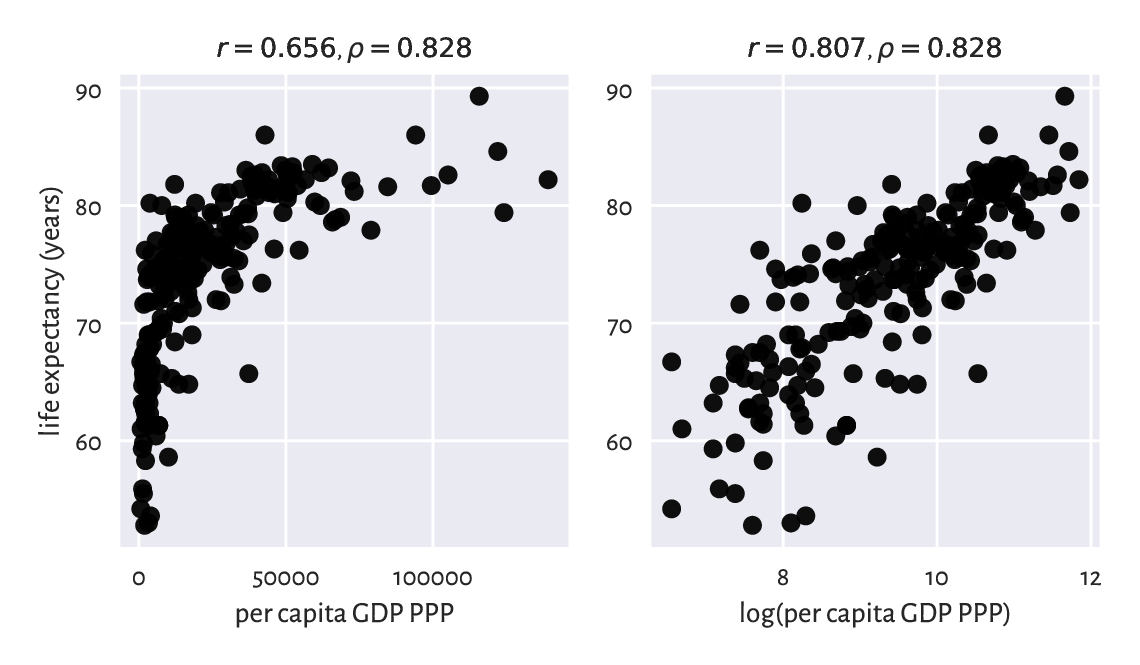
Figure 9.6 Scatter plots for life expectancy vs gross domestic product (purchasing power parity) on linear (left) and log-scale (right).
If we compute Pearson’s \(r\) between these two, we will note that the degree of linear correlation is rather small:
scipy.stats.pearsonr(world[:, 0], world[:, 1])[0]
## 0.656471945486374
However, already the logarithm of GDP is more strongly linearly correlated with life expectancy:
scipy.stats.pearsonr(np.log(world[:, 0]), world[:, 1])[0]
## 0.8066505089380016
which means that modelling our data via \(\boldsymbol{y}=a \log\boldsymbol{x}+b\) could be an idea worth considering.
9.1.4. Spearman rank correlation coefficient
Sometimes we might be keen on measuring the degree of any kind of monotonic correlation – to what extent one variable is an increasing or decreasing function of another one (linear, logarithmic, quadratic over the positive domain, etc.). In such a scenario, the Spearman rank correlation coefficient is frequently used:
which is[4] the Pearson linear coefficient computed over vectors of the corresponding ranks of all the elements in \(\boldsymbol{x}\) and \(\boldsymbol{y}\) (denoted by \(R(\boldsymbol{x})\) and \(R(\boldsymbol{y})\), respectively). Hence, the two following calls are equivalent:
scipy.stats.spearmanr(world[:, 0], world[:, 1])[0]
## 0.8275220380818622
scipy.stats.pearsonr(
    scipy.stats.rankdata(world[:, 0]),
    scipy.stats.rankdata(world[:, 1])
)[0]
## 0.8275220380818619
Let’s point out that this measure is invariant to monotone transformations of the input variables (up to the sign). This is because they do not change the observations’ ranks (or only reverse them).
scipy.stats.spearmanr(np.log(world[:, 0]), -np.sqrt(world[:, 1]))[0]
## -0.8275220380818622
We included the \(\rho\)s in all the outputs generated by our plot_corr function. Review all the preceding figures.
Apply numpy.corrcoef
and scipy.stats.rankdata (with the appropriate axis argument)
to compute the Spearman correlation matrix for all the variable
pairs in body. Draw it on a heat map.
(*) Draw the scatter plots of the ranks of each column
in the world and body datasets.
9.2. Regression tasks (*)
Assume we are given a training/reference set of \(n\) points in an \(m\)-dimensional space represented as a matrix \(\mathbf{X}\in\mathbb{R}^{n\times m}\) and a set of \(n\) corresponding numeric outcomes \(\boldsymbol{y}\in\mathbb{R}^n\). Regression aims to find a function between the \(m\) independent/explanatory/predictor variables and a chosen dependent/response/predicted variable that can be applied on any test point \(\boldsymbol{x}'\in\mathbb{R}^m\):
and which approximates the reference outcomes in a usable way.
9.2.1. K-nearest neighbour regression (*)
A straightforward approach to regression relies on aggregating the reference outputs that are associated with a few nearest neighbours of the point \(\boldsymbol{x}'\) tested; compare Section 8.4.4.
In \(k\)-nearest neighbour regression, for a fixed \(k\ge 1\) and any given \(\boldsymbol{x}'\in\mathbb{R}^m\), \(\hat{y}=f(\boldsymbol{x}')\) is computed as follows.
Find the indices \(N_k(\boldsymbol{x}')=\{i_1,\dots,i_k\}\) of the \(k\) points from \(\mathbf{X}\) closest to \(\boldsymbol{x}'\), i.e., ones that fulfil for all \(j\not\in\{i_1,\dots,i_k\}\):
\[ \|\mathbf{x}_{i_1,\cdot}-\boldsymbol{x}'\| \le\dots\le \| \mathbf{x}_{i_k,\cdot} -\boldsymbol{x}' \| \le \| \mathbf{x}_{j,\cdot} -\boldsymbol{x}' \|. \]Return the arithmetic mean of \((y_{i_1},\dots,y_{i_k})\) as the result.
Here is a straightforward implementation
that generates the predictions for each point in X_test:
def knn_regress(X_test, X_train, y_train, k):
    t = scipy.spatial.KDTree(X_train.reshape(-1, 1))
    i = t.query(X_test.reshape(-1, 1), k)[1]  # indices of NNs
    y_nn_pred = y_train[i]  # corresponding reference outputs
    return np.mean(y_nn_pred, axis=1)
For example, let’s express weight (the first column) as a function
of hip circumference (the sixth column) in the body dataset:
We can also model the life expectancy at birth in different countries
(world dataset) as a function of their GDP per capita (PPP):
Both are instances of the simple regression problem, i.e., where there is only one independent variable (\(m=1\)). We can easily create its appealing visualisation by means of the following function:
def knn_regress_plot(x, y, K, num_test_points=1001):
    """
    x - 1D vector - reference inputs
    y - 1D vector - corresponding outputs
    K - numbers of near neighbours to test
    num_test_points - number of points to test at
    """
    plt.plot(x, y, "o", alpha=0.1)
    _x = np.linspace(x.min(), x.max(), num_test_points)
    for k in K:
        _y = knn_regress(_x, x, y, k)  # see above
        plt.plot(_x, _y, label=f"$k={k}$")
    plt.legend()
Figure 9.7 depicts the fitted functions for a few different \(k\)s.
plt.subplot(1, 2, 1)
knn_regress_plot(body[:, 5], body[:, 0], [5, 25, 100])
plt.xlabel("hip circumference")
plt.ylabel("weight")

plt.subplot(1, 2, 2)
knn_regress_plot(world[:, 0], world[:, 1], [5, 25, 100])
plt.xlabel("per capita GDP PPP")
plt.ylabel("life expectancy (years)")

plt.show()
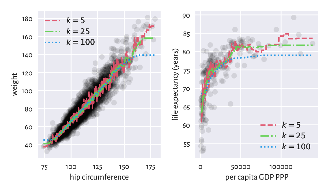
Figure 9.7 \(k\)-nearest neighbour regression curves for example datasets. The greater the \(k\), the more coarse-grained the approximation.
We obtained a smoothened version of the original dataset. The fact that we do not reproduce the reference data points in an exact manner is reflected by the (figurative) error term in the above equations. Its role is to emphasise the existence of some natural data variability; after all, one’s weight is not purely determined by their hip size and life is not all about money.
For small \(k\) we adapt to the data points more closely. This can be worthwhile unless data are very noisy. The greater the \(k\), the smoother the approximation at the cost of losing fine detail and restricted usability at the domain boundaries (here: in the left and right part of the plots).
Usually, the number of neighbours is chosen by trial and error (just like the number of bins in a histogram; compare Section 4.3.3).
Note
(**) Some methods use weighted arithmetic means for aggregating the \(k\) reference outputs, with weights inversely proportional to the distances to the neighbours (closer inputs are considered more important).
Also, instead of few nearest neighbours, we can easily compose some form of fixed-radius search regression, by simply replacing \(N_k(\boldsymbol{x}')\) with \(B_r(\boldsymbol{x}')\); compare Section 8.4.4. Yet, note that this way we might make the function undefined in sparsely populated regions of the domain.
9.2.2. From data to (linear) models (*)
Unfortunately, to generate predictions for new data points, \(k\)-nearest neighbours regression requires that the training sample is available at all times. It does not synthesise or simplify the inputs; instead, it works as a kind of a black box. If we were to provide a mathematical equation for the generated prediction, it would be disgustingly long and obscure.
In such cases, to emphasise that \(f\) is dependent on the training sample, we sometimes use the more explicit notation \(f(\boldsymbol{x}' | \mathbf{X}, \boldsymbol{y})\) or \(f_{\mathbf{X}, \boldsymbol{y}}(\boldsymbol{x}')\).
In many contexts we might prefer creating a data model instead, in the form of an easily interpretable mathematical function. A simple yet still flexible choice tackles regression problems via affine maps of the form:
or, in matrix multiplication terms:
where \(\mathbf{c}=[c_1\ c_2\ \cdots\ c_m]\) and \(\mathbf{x}=[x_1\ x_2\ \cdots\ x_m]\).
For \(m=1\), the above simply defines a straight line, which we traditionally denote by:
i.e., where we mapped \(x_1 \mapsto x\), \(c_1 \mapsto a\) (slope), and \(c_2 \mapsto b\) (intercept).
For \(m>1\), we obtain different hyperplanes (high-dimensional generalisations of the notion of a plane).
Important
A separate intercept term “\(+c_{m+1}\)” in the defining equation can be cumbersome. We will thus restrict ourselves to linear maps like:
but where we can possibly have an explicit constant-1 component somewhere inside \(\mathbf{x}\). For instance:
Together with \(\mathbf{c} = [c_1\ c_2\ \cdots\ c_m\ c_{m+1}]\), as trivially \(c_{m+1}\cdot 1=c_{m+1}\), this new setting is equivalent to the original one.
Without loss of generality, from now on we assume that \(\mathbf{x}\) is \(m\)-dimensional, regardless of its having a constant-1 inside or not.
9.2.3. Least squares method (*)
A linear model is uniquely[5] encoded using only the coefficients \(c_1,\dots,c_m\). To find them, for each point \(\mathbf{x}_{i,\cdot}\) from the input (training) set, we typically desire the predicted value:
to be as close to the corresponding reference \(y_i\) as possible.
There are many measures of closeness, but the most popular one[6] uses the notion of the sum of squared residuals (true minus predicted outputs):
which is a function of \(\boldsymbol{c}=(c_1,\dots,c_m)\) (for fixed \(\mathbf{X},\mathbf{y}\)).
The least squares solution to the stated linear regression problem will be defined by the coefficient vector \(\boldsymbol{c}\) that minimises the SSR. Based on what we said about matrix multiplication, this is equivalent to solving the optimisation task:
because \(\hat{\mathbf{y}}=\mathbf{c} \mathbf{X}^T\) gives the predicted values as a row vector (the diligent readers are encouraged to check that on a piece of paper now), \(\mathbf{r}=\mathbf{y}-\hat{\mathbf{y}}\) computes all the \(n\) residuals, and \(\mathbf{r}\mathbf{r}^T\) gives their sum of squares.
The method of least squares is one of the simplest and most natural approaches to regression analysis (curve fitting). Its theoretical foundations (calculus…) were developed more than 200 years ago by Gauss and then were polished by Legendre.
Note
(*) Had the points lain on a hyperplane exactly (the interpolation problem), \(\mathbf{y} = \mathbf{c} \mathbf{X}^T\) would have an exact solution, equivalent to solving the linear system of equations \(\mathbf{y}-\mathbf{c} \mathbf{X}^T =\mathbf{0}\). However, in our setting we assume that there might be some measurement errors or other discrepancies between the reality and the theoretical model. To account for this, we are trying to solve a more general problem of finding a hyperplane for which \(\|\mathbf{y}-\mathbf{c} \mathbf{X}^T\|^2\) is as small as possible.
This optimisation task can be solved analytically (compute the partial derivatives of SSR with respect to each \(c_1,\dots,c_m\), equate them to 0, and solve a simple system of linear equations). This spawns \(\mathbf{c} = \mathbf{y} \mathbf{X} (\mathbf{X}^T \mathbf{X})^{-1}\), where \(\mathbf{A}^{-1}\) is the inverse of a matrix \(\mathbf{A}\), i.e., the matrix such that \(\mathbf{A} \mathbf{A}^{-1}=\mathbf{A}^{-1} \mathbf{A} =\mathbf{I}\); compare numpy.linalg.inv. As inverting larger matrices directly is not too robust numerically, we would rather rely on a more specialised algorithm.
The undermentioned scipy.linalg.lstsq function provides a fairly numerically stable (yet, see Section 9.2.9) procedure that is based on the singular value decomposition of the model matrix.
Let’s go back to the NHANES study excerpt and express weight (the first column) as function of hip circumference (the sixth column) again, but this time using an affine map of the form[7]:
The design (model) matrix \(\mathbf{X}\) and the reference \(\boldsymbol{y}\)s are:
x_original = body[:, [5]]     # a column vector
X_train = x_original**[1, 0]  # hip circumference, 1s
y_train = body[:, 0]          # weight
We used the vectorised exponentiation operator to convert each \(x_i\) (the \(i\)-th hip circumference) to a pair \(\mathbf{x}_{i,\cdot}=(x_i^1, x_i^0) = (x_i, 1)\), which is a nice trick to append a column of \(1\)s to a matrix. This way, we included the intercept term in the model (as discussed in Section 9.2.2). Here is a preview:
preview_indices = [4, 5, 6, 8, 12, 13]
X_train[preview_indices, :]
## array([[ 92.5,   1. ],
##        [106.7,   1. ],
##        [ 96.3,   1. ],
##        [102. ,   1. ],
##        [ 94.8,   1. ],
##        [ 97.5,   1. ]])
y_train[preview_indices]
## array([55.4, 62. , 66.2, 77.2, 64.2, 56.8])
Let’s determine the least squares solution to our regression problem:
import scipy.linalg
res = scipy.linalg.lstsq(X_train, y_train)
That’s it. The optimal coefficients vector (the one that minimises the SSR) is:
c = res[0]
c
## array([  1.3052463 , -65.10087248])
The estimated model is:
The model is nicely interpretable. For instance, as hip circumference increases, we expect the weights to be greater and greater. As we said before, it does not mean that there is some causal relationship between the two (for instance, there can be some latent variables that affect both of them). Instead, there is some general tendency regarding how the data align in the sample space. For instance, that the “best guess” (according to the current model – there can be many; see below) weight for a person with hip circumference of 100 cm is 65.4 kg. Thanks to such models, we might get more insight into certain phenomena, or find some proxies for different variables (especially if measuring them directly is tedious, costly, dangerous, etc.).
Important
What we have performed above is an instance of machine learning. The machine (the equation \(y=ax+b\)) is controlled by two parameters (memory; \(a, b\)). We have learnt their best values based on the knowledge about the world we had (the inputs \(x\) and the desired outputs \(y\)). Thus, this term is really an obscure marketing slogan designed to impress (or confuse) the laypeople.
Let’s determine the predicted weights for all of the participants:
y_pred = c @ X_train.T
np.round(y_pred[preview_indices], 2)  # preview
## array([55.63, 74.17, 60.59, 68.03, 58.64, 62.16])
The scatter plot and the fitted regression line in Figure 9.8 indicates a fair fit but, of course, there is some natural variability.
plt.plot(x_original, y_train, "o", alpha=0.1)  # scatter plot
_x = np.array([x_original.min(), x_original.max()]).reshape(-1, 1)
_y = c @ (_x**[1, 0]).T
plt.plot(_x, _y, "r-")  # a line that goes through the two extreme points
plt.xlabel("hip circumference")
plt.ylabel("weight")
plt.show()
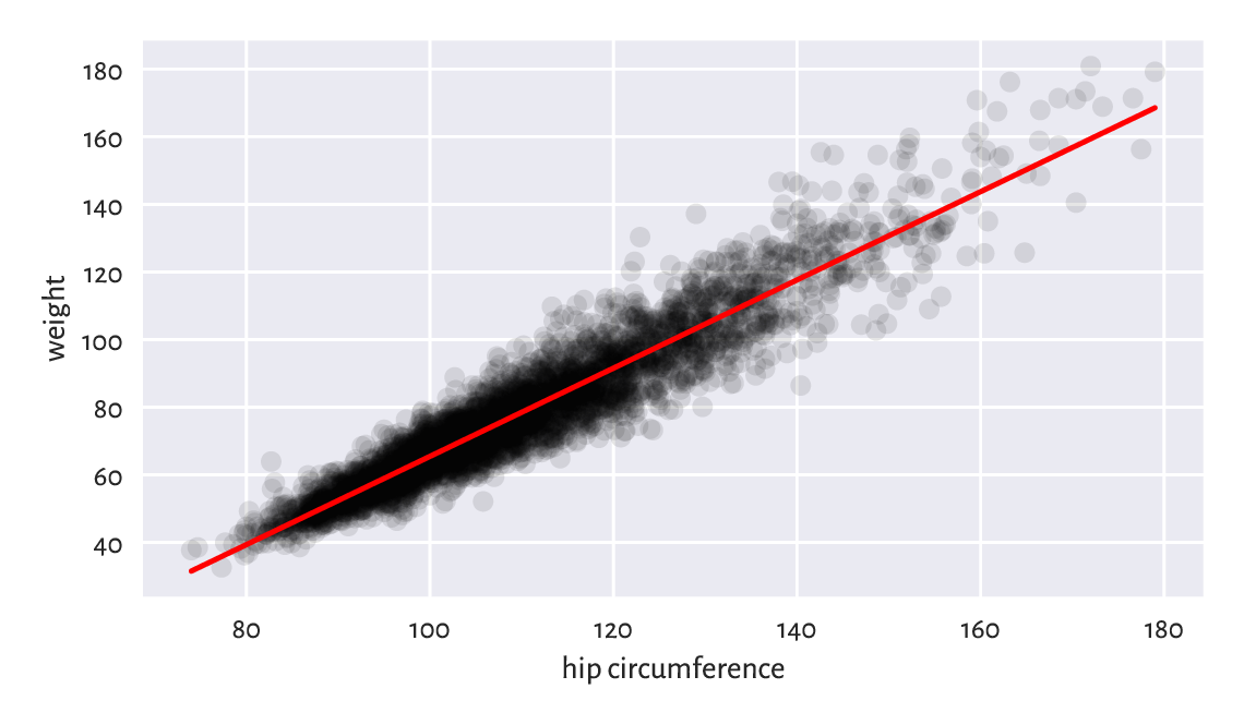
Figure 9.8 The least squares line for weight vs hip circumference.
The Anscombe quartet is a famous example dataset, where we have four pairs of variables that have almost identical means, variances, and linear correlation coefficients. Even though they can be approximated by the same straight line, their scatter plots are vastly different. Reflect upon this toy example.
9.2.4. Analysis of residuals (*)
The residuals (i.e., the estimation errors – what we expected vs what we got), for the chosen six observations are visualised in Figure 9.9.
r = y_train - y_pred  # residuals
np.round(r[preview_indices], 2)  # preview
## array([ -0.23, -12.17,   5.61,   9.17,   5.56,  -5.36])
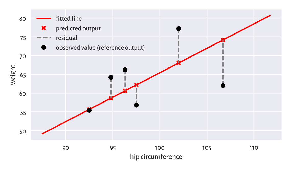
Figure 9.9 Example residuals in a simple linear regression task.
We wanted the squared residuals (on average – across all the points) to be as small as possible. The least squares method assures that this is the case relative to the chosen model, i.e., a linear one. Nonetheless, it still does not mean that what we obtained constitutes a good fit to the training data. Thus, we need to perform the analysis of residuals.
Interestingly, the average of residuals is always zero:
Therefore, if we want to summarise the residuals into a single number, we can use, for example, the root mean squared error instead:
np.sqrt(np.mean(r**2))
## 6.948470091176111
Hopefully we can see that RMSE is a function of SSR that we have already sought to minimise.
Alternatively, we can compute the mean absolute error:
np.mean(np.abs(r))
## 5.207073583769202
MAE is nicely interpretable: it measures by how many kilograms we err on average. Not bad.
Fit a regression line explaining weight as a function of the waist circumference and compute the corresponding RMSE and MAE. Are they better than when hip circumference is used as an explanatory variable?
Note
Generally, fitting simple (involving one independent variable) linear models can only make sense for highly linearly correlated variables. Interestingly, if \(\boldsymbol{y}\) and \(\boldsymbol{x}\) are both standardised, and \(r\) is their Pearson’s coefficient, then the least squares solution is given by \(y=rx\).
To verify whether a fitted model is not extremely wrong (e.g., when we fit a linear model to data that clearly follows a different functional relationship), a plot of residuals against the fitted values can be of help; see Figure 9.10. Ideally, the points are expected to be aligned totally at random therein, without any dependence structure (homoscedasticity).
plt.plot(y_pred, r, "o", alpha=0.1)
plt.axhline(0, ls="--", color="red")  # horizontal line at y=0
plt.xlabel("fitted values")
plt.ylabel("residuals")
plt.show()
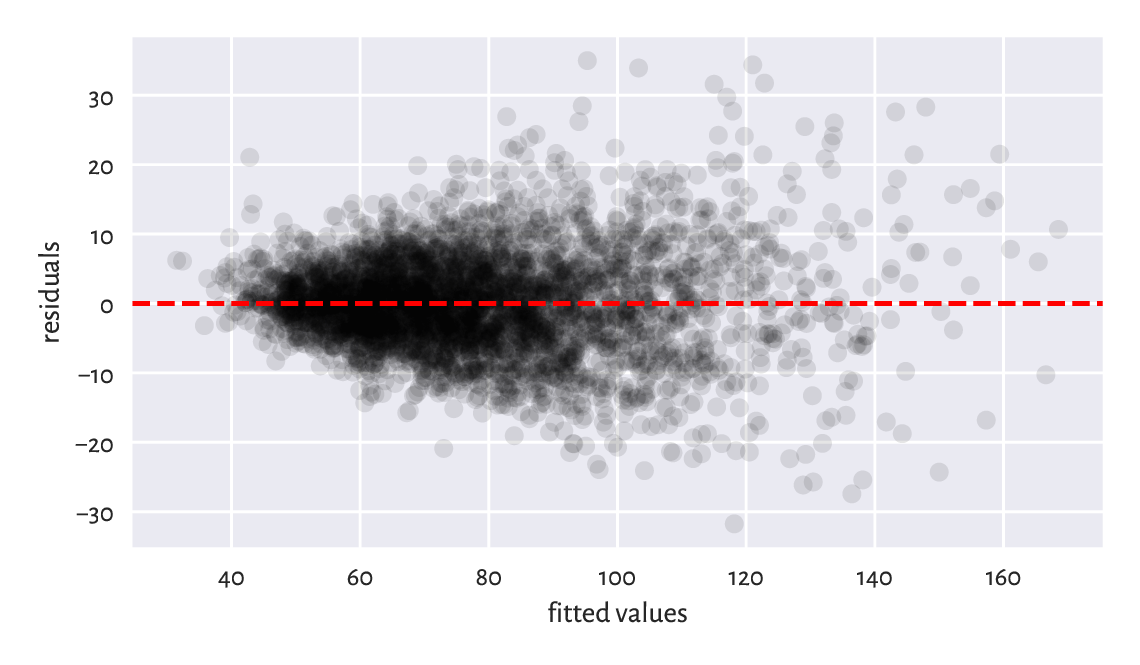
Figure 9.10 Residuals vs fitted values for the linear model explaining weight as a function of hip circumference. The variance of residuals slightly increases as \(\hat{y}_i\) increases. This is not ideal, but it could be much worse than this.
Compare[8] the RMSE and MAE for the \(k\)-nearest neighbour regression curves depicted in the left side of Figure 9.7. Also, draw the residuals vs fitted plot.
For linear models fitted using the least squares method, we have:
In other words, the variance of the dependent variable (left) can be decomposed into the sum of the variance of the predictions and the averaged squared residuals. Multiplying it by \(n\), we have that the total sum of squares is equal to the explained sum of squares plus the residual sum of squares:
We yearn for ESS to be as close to TSS as possible. Equivalently, it would be jolly nice to have RSS equal to 0.
The coefficient of determination (unadjusted R-Squared, sometimes referred to as simply the score) is a popular normalised, unitless measure that is easier to interpret than raw ESS or RSS when we have no domain-specific knowledge of the modelled problem. It is given by:
1 - np.var(y_train-y_pred)/np.var(y_train)
## 0.8959634726270759
The coefficient of determination in the current context[9] is thus the proportion of variance of the dependent variable explained by the independent variables in the model. The closer it is to 1, the better. A dummy model that always returns the mean of \(\boldsymbol{y}\) gives R-squared of 0.
In our case, \(R^2\simeq 0.9\) is high, which indicates a rather good fit.
Note
(*) There are certain statistical results that can be relied upon provided that the residuals are independent random variables with expectation zero and the same variance (e.g., the Gauss–Markov theorem). Further, if they are normally distributed, then we have several hypothesis tests available (e.g., for the significance of coefficients). This is why in various textbooks such assumptions are additionally verified. But we do not go that far in this introductory course.
9.2.5. Multiple regression (*)
As another example, let’s fit a model involving two independent variables: arm and hip circumference:
X_train = np.insert(body[:, [4, 5]], 2, 1, axis=1)  # append a column of 1s
res = scipy.linalg.lstsq(X_train, y_train)
c = res[0]
np.round(c, 2)
## array([  1.3 ,   0.9 , -63.38])
We fitted the plane:
We skip the visualisation part for we do not expect it to result in a readable plot: these are multidimensional data. The coefficient of determination is:
y_pred = c @ X_train.T
r = y_train - y_pred
1-np.var(r)/np.var(y_train)
## 0.9243996585518783
Root mean squared error:
np.sqrt(np.mean(r**2))
## 5.923223870044695
Mean absolute error:
np.mean(np.abs(r))
## 4.431548244333892
It is a slightly better model than the previous one. We can predict the participants’ weights more accurately, at the cost of an increased model’s complexity.
9.2.6. Variable transformation and linearisable models (**)
We are not restricted merely to linear functions of the input variables. By applying arbitrary transformations upon the columns of the design matrix, we can cover many diverse scenarios.
For instance, a polynomial model involving two variables:
can be obtained by substituting \(x_1=1\), \(x_2=v_1\), \(x_3=v_1^2\), \(x_4=v_1 v_2\), \(x_5=v_2\), \(x_6=v_2^2\), and then fitting a linear model involving six variables:
The design matrix is made of rubber, it can handle almost anything. If we have a linear model, but with respect to transformed data, the algorithm does not care. This is the beauty of the underlying mathematics; see also [12].
A creative modeller can also turn models such as \(u=c e^{av}\) into \(y=ax+b\) by replacing \(y=\log u\), \(x=v\), and \(b=\log c\). There are numerous possibilities based on the properties of the \(\log\) and \(\exp\) functions listed in Section 5.2. We call them linearisable models.
As an example, let’s model the life expectancy at birth in different countries as a function of their GDP per capita (PPP).
We will consider four different models:
\(y=c_1+c_2 x\) (linear),
\(y=c_1+c_2 x+c_3x^2\) (quadratic),
\(y=c_1+c_2 x+c_3x^2+c_4x^3\) (cubic),
\(y=c_1+c_2\log x\) (logarithmic).
Here are the helper functions that create the model matrices:
def make_model_matrix1(x):
    return x.reshape(-1, 1)**[0, 1]

def make_model_matrix2(x):
    return x.reshape(-1, 1)**[0, 1, 2]

def make_model_matrix3(x):
    return x.reshape(-1, 1)**[0, 1, 2, 3]

def make_model_matrix4(x):
    return (np.log(x)).reshape(-1, 1)**[0, 1]

make_model_matrix1.__name__ = "linear model"
make_model_matrix2.__name__ = "quadratic model"
make_model_matrix3.__name__ = "cubic model"
make_model_matrix4.__name__ = "logarithmic model"

model_matrix_makers = [
    make_model_matrix1,
    make_model_matrix2,
    make_model_matrix3,
    make_model_matrix4
]
x_original = world[:, 0]
Xs_train = [ make_model_matrix(x_original)
    for make_model_matrix in model_matrix_makers ]
Fitting the models:
y_train = world[:, 1]
cs = [ scipy.linalg.lstsq(X_train, y_train)[0]
    for X_train in Xs_train ]
Their coefficients of determination are equal to:
for i in range(len(Xs_train)):
    R2 = 1 - np.var(y_train - cs[i] @ Xs_train[i].T)/np.var(y_train)
    print(f"{model_matrix_makers[i].__name__:20} R2={R2:.3f}")
## linear model         R2=0.431
## quadratic model      R2=0.567
## cubic model          R2=0.607
## logarithmic model    R2=0.651
The logarithmic model is thus the best (out of the models we considered). The four models are depicted in Figure 9.11.
plt.plot(x_original, y_train, "o", alpha=0.1)
_x = np.linspace(x_original.min(), x_original.max(), 101).reshape(-1, 1)
for i in range(len(model_matrix_makers)):
    _y = cs[i] @ model_matrix_makers[i](_x).T
    plt.plot(_x, _y, label=model_matrix_makers[i].__name__)
plt.legend()
plt.xlabel("per capita GDP PPP")
plt.ylabel("life expectancy (years)")
plt.show()
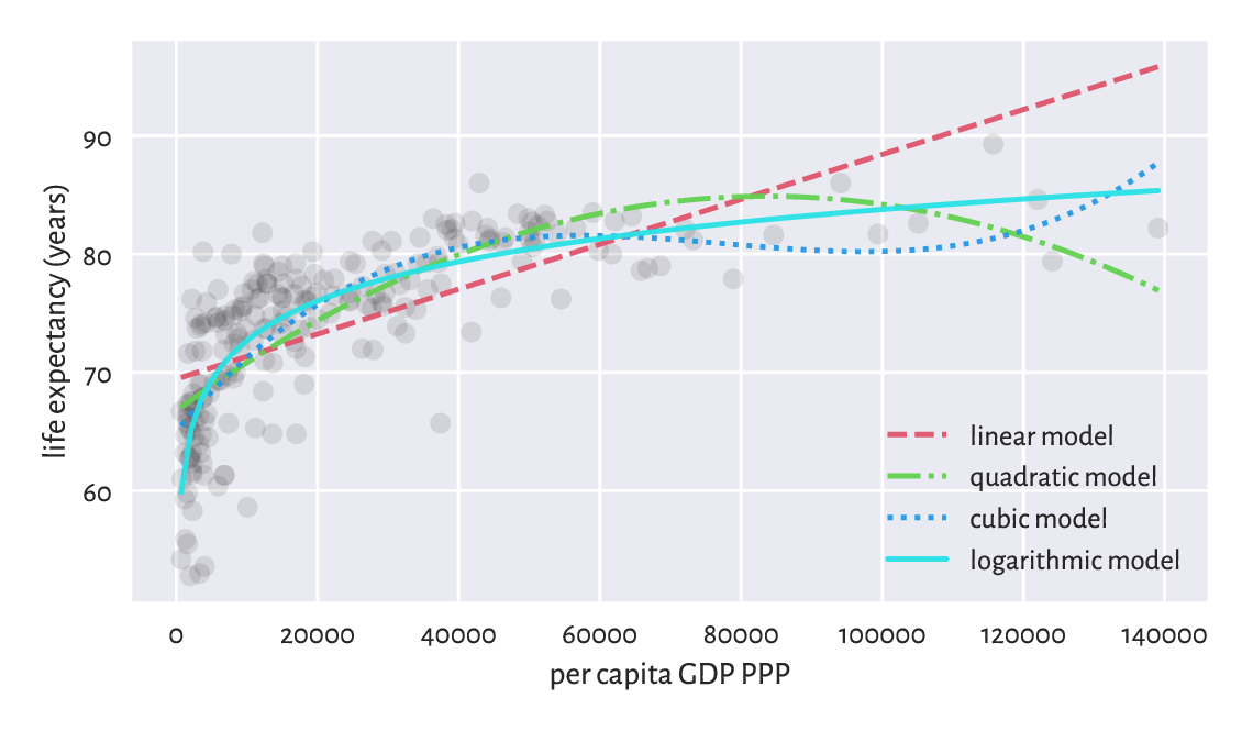
Figure 9.11 Different models for life expectancy vs GDP.
Draw box plots and histograms of residuals for each model as well as the scatter plots of residuals vs fitted values.
9.2.7. Descriptive vs predictive power (**)
We approximated the life vs GDP relationship using a few different functions. Nevertheless, we see that the foregoing quadratic and cubic models possibly do not make much sense, semantically speaking. Sure, as far as individual points in the training set are concerned, they do fit the data more closely than the linear model. After all, they have smaller mean squared errors (again: at these given points). Looking at the way they behave, one does not need a university degree in economics/social policy to conclude that they are not the best description of how the reality behaves (on average).
Important
Naturally, a model’s goodness of fit to observed data tends to improve as the model’s complexity increases. The Razor principle (by William of Ockham et al.) advises that if some phenomenon can be explained in many different ways, the simplest explanation should be chosen (do not multiply entities [here: introduce independent variables] without necessity).
In particular, the more independent variables we have in the model, the greater the \(R^2\) coefficient will be. We can try correcting for this phenomenon by considering the adjusted \(R^2\):
which, to some extent, penalises more complex models.
Note
(**) Model quality measures adjusted for the number of model parameters, \(m\), can also be useful in automated variable selection. For example, the Akaike Information Criterion is a popular measure given by:
Furthermore, the Bayes Information Criterion is defined via:
Unfortunately, they are both dependent on the scale of \(\boldsymbol{y}\).
We should also be concerned with quantifying a model’s predictive power, i.e., how well does it generalise to data points that we do not have now (or pretend we do not have) but might face in the future. As we observe the modelled reality only at a few different points, the question is how the model performs when filling the gaps between the dots it connects.
In particular, we must be careful when extrapolating the data, i.e., making predictions outside of its usual domain. For example, the linear model predicts the following life expectancy for an imaginary country with $500 000 per capita GDP:
cs[0] @ model_matrix_makers[0](np.array([500000])).T
## array([164.3593753])
and the quadratic one gives:
cs[1] @ model_matrix_makers[1](np.array([500000])).T
## array([-364.10630779])
Nonsense.
Consider a theoretical illustration, where a true model of some reality is \(y=5+3x^3\).
def true_model(x):
    return 5 + 3*(x**3)
Still, for some reason we are only able to gather a small (\(n=25\)) sample from this model. What is even worse, it is subject to some measurement error:
np.random.seed(42)
x = np.random.rand(25)                           # random xs on [0, 1]
y = true_model(x) + 0.2*np.random.randn(len(x))  # true_model(x) + noise
The least-squares fitting of \(y=c_1+c_2 x^3\) to the above gives:
X03 = x.reshape(-1, 1)**[0, 3]
c03 = scipy.linalg.lstsq(X03, y)[0]
ssr03 = np.sum((y-c03 @ X03.T)**2)
np.round(c03, 2)
## array([5.01, 3.13])
which is not too far, but still somewhat[10] distant from the true coefficients, 5 and 3.
We can also fit a more flexible cubic polynomial, \(y=c_1+c_2 x+c_3 x^2+c_4 x_3\):
X0123 = x.reshape(-1, 1)**[0, 1, 2, 3]
c0123 = scipy.linalg.lstsq(X0123, y)[0]
ssr0123 = np.sum((y-c0123 @ X0123.T)**2)
np.round(c0123, 2)
## array([4.89, 0.32, 0.57, 2.23])
In terms of the SSR, this more complex model of course explains the training data more accurately:
ssr03, ssr0123
## (1.0612111154029558, 0.9619488226837537)
Yet, it is farther away from the truth (which, whilst performing the fitting task based only on given \(\boldsymbol{x}\) and \(\boldsymbol{y}\), is unknown). We may thus say that the first model generalises better on yet-to-be-observed data; see Figure 9.12 for an illustration.
_x = np.linspace(0, 1, 101)
plt.plot(x, y, "o")
plt.plot(_x, true_model(_x), "--", label="true model")
plt.plot(_x, c0123 @ (_x.reshape(-1, 1)**[0, 1, 2, 3]).T,
    label="fitted model y=x**[0, 1, 2, 3]")
plt.plot(_x, c03 @ (_x.reshape(-1, 1)**[0, 3]).T,
    label="fitted model y=x**[0, 3]")
plt.legend()
plt.show()
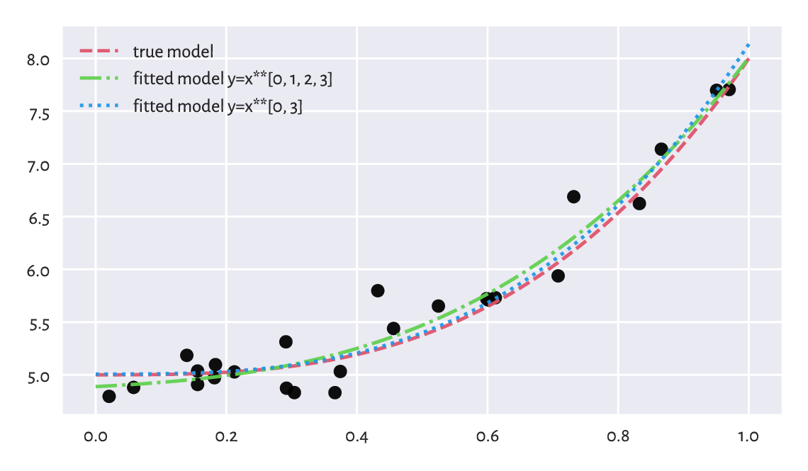
Figure 9.12 The true (theoretical) model vs some guesstimates (fitted based on noisy data). More degrees of freedom is not always better.
(**) We defined the sum of squared residuals (and its function, the root mean squared error) by means of the averaged deviation from the reference values. They are subject to error themselves, though. Even though they are our best-shot approximation of the truth, they should be taken with a degree of scepticism.
In the previous example, given the true (reference) model \(f\) defined over the domain \(D\) (in our case, \(f(x)=5+3x^3\) and \(D=[0,1]\)) and an empirically fitted model \(\hat{f}\), we can compute the square root of the integrated squared error over the whole \(D\):
For polynomials and other simple functions, RMSE can be computed analytically. More generally, we can approximate it numerically by sampling the above at sufficiently many points and applying the trapezoidal rule (e.g., [77]). As this can be an educative programming exercise, let’s consider a range of polynomial models of different degrees.
cs, rmse_train, rmse_test = [], [], []  # result containers
ps = np.arange(1, 10)  # polynomial degrees
for p in ps:           # for each polynomial degree:
    c = scipy.linalg.lstsq(x.reshape(-1, 1)**np.arange(p+1), y)[0]  # fit
    cs.append(c)

    y_pred = c @ (x.reshape(-1, 1)**np.arange(p+1)).T   # predictions
    rmse_train.append(np.sqrt(np.mean((y-y_pred)**2)))  # RMSE

    _x = np.linspace(0, 1, 101)                         # many _xs
    _y = c @ (_x.reshape(-1, 1)**np.arange(p+1)).T      # f(_x)
    _r = (true_model(_x) - _y)**2                       # residuals
    rmse_test.append(np.sqrt(0.5*np.sum(
        np.diff(_x)*(_r[1:]+_r[:-1])  # trapezoidal rule for integration
    )))

plt.plot(ps, rmse_train, label="RMSE (training set)")
plt.plot(ps, rmse_test, label="RMSE (theoretical)")
plt.legend()
plt.yscale("log")
plt.xlabel("model complexity (polynomial degree)")
plt.show()
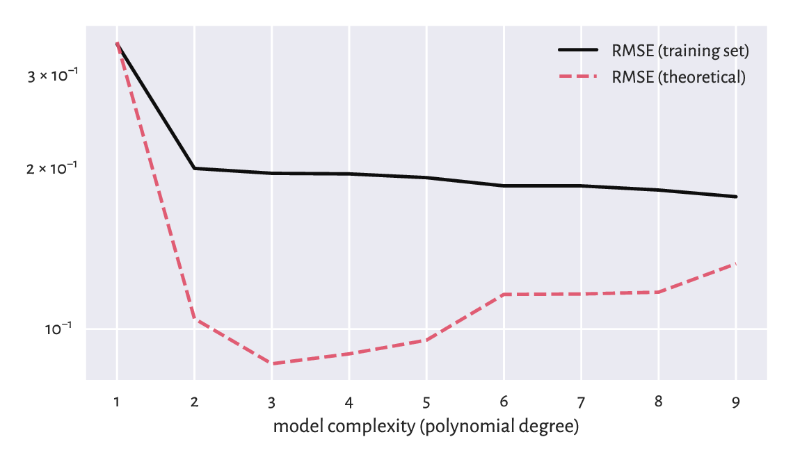
Figure 9.13 Small RMSE on training data does not necessarily imply good generalisation abilities.
Figure 9.13 shows that a model’s ability to make correct generalisations onto unseen data improves as the complexity increases, at least initially. However, then it becomes worse. It is a typical behaviour. In fact, the model with the smallest RMSE on the training set, overfits to the input sample, see Figure 9.14.
plt.plot(x, y, "o")
plt.plot(_x, true_model(_x), "--", label="true model")
for i in [0, 1, 8]:
    plt.plot(_x, cs[i] @ (_x.reshape(-1, 1)**np.arange(ps[i]+1)).T,
        label=f"fitted degree-{ps[i]} polynomial")
plt.legend()
plt.show()
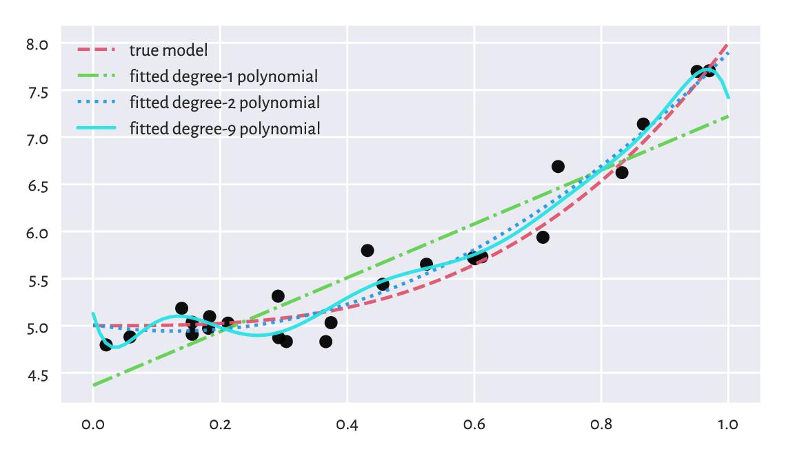
Figure 9.14 Under- and overfitting to training data.
Important
When evaluating a model’s quality in terms of predictive power on unseen data, we should go beyond inspecting its behaviour merely on the points from the training sample. As the truth is usually not known (if it were, we would not need any guessing), a common approach in case where we have a dataset of a considerable size is to divide it (randomly; see Section 10.5.4) into two parts:
training sample (say, 60%) – used to fit a model,
test sample (the remaining 40%) – used to assess its quality (e.g., by means of RMSE).
This might emulate an environment where some new data arrives later, see Section 12.3.3 for more details.
Furthermore, if model selection is required, we may apply a training/validation/test split (say, 60/20/20%; see Section 12.3.4). Here, many models are constructed on the training set, the validation set is used to compute the metrics and choose the best model, and then the test set gives the final model’s valuation to assure its usefulness/uselessness (because we do not want it to overfit to the test set).
Overall, models must never be blindly trusted. Common sense must always be applied. The fact that we fitted something using a sophisticated procedure on a dataset that was hard to obtain does not justify its use. Mediocre models must be discarded, and we should move on, regardless of how much time/resources we have invested whilst developing them. Too many bad models go into production and make our daily lives harder. We need to end this madness.
9.2.8. Fitting regression models with scikit-learn (*)
scikit-learn (sklearn; [75]) is a huge Python package built on top of numpy, scipy, and matplotlib. It has a consistent API and implements or provides wrappers for many regression, classification, clustering, and dimensionality reduction algorithms (amongst others).
Important
scikit-learn is very convenient. Nevertheless, it allows us to fit models even if we do not understand the mathematics behind them. This is dangerous: it is like driving a sports car without the necessary skills while wearing a blindfold. Advanced students and practitioners will appreciate it, but when used by beginners, it needs to be handled with care. We should not mistake something’s being easily accessible with its being safe to use. Remember that if we are given a procedure for which we are unable to provide its definition/mathematical properties/explain its idealised version in pseudocode, we are expected to refrain from using it (see Rule#7).
Due of this, we shall only present a quick demo of scikit-learn’s API. We will do that by fitting a multiple linear regression model again for the weight as a function of the arm and the hip circumference:
X_train = body[:, [4, 5]]
y_train = body[:, 0]
In scikit-learn, once we construct an object representing the model to be fitted, the fit method determines the optimal parameters.
import sklearn.linear_model
lm = sklearn.linear_model.LinearRegression(fit_intercept=True)
lm.fit(X_train, y_train)
lm.intercept_, lm.coef_
## (-63.383425410947524, array([1.30457807, 0.8986582 ]))
We, of course, obtained the same solution as with scipy.linalg.lstsq.
Computing the predicted values can be done via the predict method. For example, we can calculate the coefficient of determination:
y_pred = lm.predict(X_train)
import sklearn.metrics
sklearn.metrics.r2_score(y_train, y_pred)
## 0.9243996585518783
This function is convenient, but can we really recall the formula for the score and what it really measures?
9.2.9. Ill-conditioned model matrices (**)
Our approach to regression analysis relies on solving an optimisation problem (the method least squares). Nevertheless, sometimes the “optimal” solution that the algorithm returns might have nothing to do with the true minimum. And this is despite the fact that we have the theoretical results stating that the solution is unique[11] (the objective is convex). The problem stems from our using the computer’s finite-precision floating point arithmetic; compare Section 5.5.6.
Let’s fit a degree-4 polynomial to the life expectancy vs per capita GDP dataset.
x_original = world[:, 0]
X_train = (x_original.reshape(-1, 1))**[0, 1, 2, 3, 4]
y_train = world[:, 1]
cs = dict()
We store the estimated model coefficients in a dictionary because many methods will follow next. First, scipy:
res = scipy.linalg.lstsq(X_train, y_train)
cs["scipy_X"] = res[0]
cs["scipy_X"]
## array([ 2.33103950e-16,  6.42872371e-12,  1.34162021e-07,
##        -2.33980973e-12,  1.03490968e-17])
If we drew the fitted polynomial now (see Figure 9.15), we would see that the fit is unbelievably bad. The result returned by scipy.linalg.lstsq is now not at all optimal. All coefficients are approximately equal to 0.
It turns out that the fitting problem is extremely ill-conditioned (and it is not the algorithm’s fault): GDPs range from very small to very large ones. Furthermore, taking them to the fourth power breeds numbers of ever greater range. Finding the least squares solution involves some form of matrix inverse (not necessarily directly) and our model matrix may be close to singular (one that is not invertible).
As a measure of the model matrix’s ill-conditioning, we often use the condition number, denoted \(\kappa(\mathbf{X}^T)\). It is the ratio of the largest to the smallest singular values[12] of \(\mathbf{X}^T\), which are returned by the scipy.linalg.lstsq method itself:
s = res[3]    # singular values of X_train.T
s
## array([5.63097211e+20, 7.90771769e+14, 4.48366565e+09, 6.77575417e+04,
##        5.76116463e+00])
Note that they are already sorted nonincreasingly. The condition number \(\kappa(\mathbf{X}^T)\) is equal to:
s[0] / s[-1]  # condition number (largest/smallest singular value)
## 9.774017018467431e+19
As a rule of thumb, if the condition number is \(10^k\), we are losing \(k\) digits of numerical precision when performing the underlying computations. As the foregoing number is exceptionally large, we are thus currently faced with a very ill-conditioned problem. If the values in \(\mathbf{X}\) or \(\mathbf{y}\) are perturbed even slightly, we might expect significant changes in the computed regression coefficients.
Note
(**) The least squares regression problem can be solved by means of the singular value decomposition of the model matrix, see Section 9.3.4. Let \(\mathbf{U}\mathbf{S}\mathbf{Q}\) be the SVD of \(\mathbf{X}^T\). Then \(\mathbf{c} = \mathbf{U} \mathbf{S}^{-1} \mathbf{Q} \mathbf{y}\), with \(\mathbf{S}^{-1}=\mathrm{diag}(1/s_{1,1},\dots,1/s_{m,m})\). As \(s_{1,1}\ge\dots\ge s_{m,m}\) gives the singular values of \(\mathbf{X}^T\), the aforementioned condition number can simply be computed as \(s_{1,1}/s_{m,m}\).
Let’s verify the method used by scikit-learn. As it fits the intercept separately, we expect it to be slightly better-behaving; still, it is merely a wrapper around scipy.linalg.lstsq, but with a different API.
import sklearn.linear_model
lm = sklearn.linear_model.LinearRegression(fit_intercept=True)
lm.fit(X_train[:, 1:], y_train)
cs["sklearn"] = np.r_[lm.intercept_, lm.coef_]
cs["sklearn"]
## array([ 6.92257708e+01,  5.05752755e-13,  1.38835643e-08,
##        -2.18869346e-13,  9.09347772e-19])
Here is the condition number of the underlying model matrix:
lm.singular_[0] / lm.singular_[-1]
## 1.402603229842849e+16
The condition number is also enormous. Still, scikit-learn did not warn us about this being the case (insert frowning face emoji here). Had we trusted the solution returned by it, we would end up with conclusions from our data analysis built on sand. As we said in Section 9.2.8, the package designers assumed that the users know what they are doing. This is okay, we are all adults here, although some of us are still learning.
Overall, if the model matrix is close to singular, the computation of its inverse is prone to enormous numerical errors. One way of dealing with this is to remove highly correlated variables (the multicollinearity problem). Interestingly, standardisation can sometimes make the fitting more numerically stable.
Let \(\mathbf{Z}\) be a standardised version of the model matrix \(\mathbf{X}\) with the intercept part (the column of \(1\)s) not included, i.e., with \(\mathbf{z}_{\cdot,j} = (\mathbf{x}_{\cdot,j}-\bar{x}_j)/s_j\) where \(\bar{x}_j\) and \(s_j\) denotes the arithmetic mean and the standard deviation of the \(j\)-th column in \(\mathbf{X}\). If \((d_1,\dots,d_{m-1})\) is the least squares solution for \(\mathbf{Z}\), then the least squares solution to the underlying original regression problem is:
with the first term corresponding to the intercept.
Let’s test this approach with scipy.linalg.lstsq:
means = np.mean(X_train[:, 1:], axis=0)
stds = np.std(X_train[:, 1:], axis=0)
Z_train = (X_train[:, 1:]-means)/stds
resZ = scipy.linalg.lstsq(Z_train, y_train)
c_scipyZ = resZ[0]/stds
cs["scipy_Z"] = np.r_[np.mean(y_train) - (c_scipyZ @ means.T), c_scipyZ]
cs["scipy_Z"]
## array([ 6.35946784e+01,  1.04541932e-03, -2.41992445e-08,
##         2.39133533e-13, -8.13307828e-19])
The condition number is:
s = resZ[3]
s[0] / s[-1]
## 139.4279225737234
It is still far from perfect (we would prefer a value close to 1) but nevertheless it is a significant improvement over what we had before.
Figure 9.15 depicts the three fitted models, each claiming to be the solution to the original regression problem. Note that, luckily, we know that in our case the logarithmic model is better than the polynomial one.
plt.plot(x_original, y_train, "o", alpha=0.1)
_x = np.linspace(x_original.min(), x_original.max(), 101).reshape(-1, 1)
_X = _x**[0, 1, 2, 3, 4]
for lab, c in cs.items():
    ssr = np.sum((y_train - c @ X_train.T)**2)
    plt.plot(_x, c @ _X.T, label=f"{lab:10} SSR={ssr:.2f}")
plt.legend()
plt.ylim(20, 120)
plt.xlabel("per capita GDP PPP")
plt.ylabel("life expectancy (years)")
plt.show()
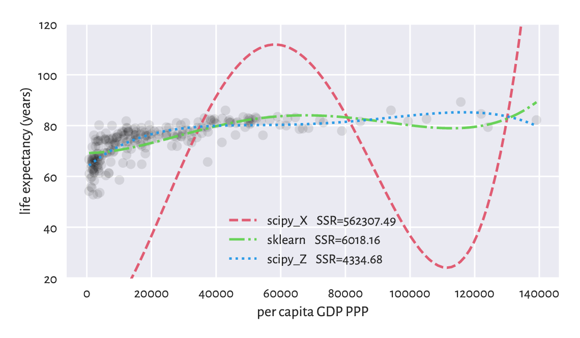
Figure 9.15 Ill-conditioned model matrix can give a very wrong model.
Important
Always check the model matrix’s condition number.
Check the condition numbers of all the models fitted so far in this chapter via the least squares method.
To be strict, if we read a paper in, say, social or medical sciences (amongst others) where the researchers fit a regression model but do not provide the model matrix’s condition number, it is worthwhile to doubt the conclusions they make.
On a final note, we might wonder why the standardisation is not done automatically by the least squares solver. As usual with most numerical methods, there is no one-fits-all solution: e.g., when there are columns of extremely small variance or there are outliers in data. This is why we need to study all the topics deeply: to be able to respond flexibly to many different scenarios ourselves.
9.3. Finding interesting combinations of variables (*)
9.3.1. Dot products, angles, collinearity, and orthogonality (*)
Let’s note that the dot product (Section 8.3) has a nice geometrical interpretation:
where \(\alpha\) is the angle between two given vectors \(\boldsymbol{x},\boldsymbol{y}\in\mathbb{R}^n\). In plain English, it is the product of the magnitudes of the two vectors and the cosine of the angle between them.
We can retrieve the cosine part by computing the dot product of the normalised vectors, i.e., such that their magnitudes are equal to 1:
For example, consider two vectors in \(\mathbb{R}^2\), \(\boldsymbol{u}=(1/2, 0)\) and \(\boldsymbol{v}=(\sqrt{2}/2, \sqrt{2}/2)\), which are depicted in Figure 9.16.
u = np.array([0.5, 0])
v = np.array([np.sqrt(2)/2, np.sqrt(2)/2])
Their dot product is equal to:
np.sum(u*v)
## 0.3535533905932738
The dot product of their normalised versions, i.e., the cosine of the angle between them is:
u_norm = u/np.sqrt(np.sum(u*u))
v_norm = v/np.sqrt(np.sum(v*v))  # BTW: this vector is already normalised
np.sum(u_norm*v_norm)
## 0.7071067811865476
The angle itself can be determined by referring to the inverse of the cosine function, i.e., arccosine.
np.arccos(np.sum(u_norm*v_norm)) * 180/np.pi
## 45.0
Notice that we converted the angle from radians to degrees.
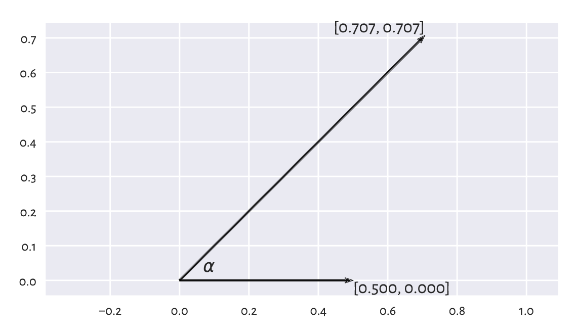
Figure 9.16 Example vectors and the angle between them.
Important
If two vectors are collinear (codirectional, one is a scaled version of another, angle \(0\)), then \(\cos 0 = 1\). If they point in opposite directions (\(\pm\pi=\pm 180^\circ\) angle), then \(\cos \pm\pi=-1\). For vectors that are orthogonal (perpendicular, \(\pm\frac{\pi}{2}=\pm 90^\circ\) angle), we get \(\cos\pm\frac{\pi}{2}=0\).
Note
(**) The standard deviation \(s\) of a vector \(\boldsymbol{x}\in\mathbb{R}^n\) that has already been centred (whose components’ mean is 0) is a scaled version of its magnitude, i.e., \(s = \|\boldsymbol{x}\|/\sqrt{n}\). Looking at the definition of the Pearson linear correlation coefficient (Section 9.1.1), we see that it is the dot product of the standardised versions of two vectors \(\boldsymbol{x}\) and \(\boldsymbol{y}\) divided by the number of elements therein. If the vectors are centred, we can rewrite the formula equivalently as \(r(\boldsymbol{x}, \boldsymbol{y})= \frac{\boldsymbol{x}}{\|\boldsymbol{x}\|}\cdot\frac{\boldsymbol{y}}{\|\boldsymbol{y}\|}\) and thus \(r(\boldsymbol{x}, \boldsymbol{y})= \cos\alpha\). It is not easy to imagine vectors in high-dimensional spaces, but from this observation we can at least imply the fact that \(r\) is bounded between -1 and 1. In this context, being not linearly correlated corresponds to the vectors’ orthogonality.
9.3.2. Geometric transformations of points (*)
For certain square matrices of size \(m\times m\), matrix multiplication can be thought of as an application of the corresponding geometrical transformation of points in \(\mathbb{R}^m\)
Let \(\mathbf{X}\) be a matrix of shape \(n\times m\), which we treat as representing the coordinates of \(n\) points in an \(m\)-dimensional space. For instance, if we are given a diagonal matrix:
then \(\mathbf{X} \mathbf{S}\) represents scaling (stretching) with respect to the individual axes of the coordinate system because:
The above can be expressed in numpy without
referring to the matrix multiplication.
A notation like X * np.array([s1, s2, ..., sm]).reshape(1, -1)
will suffice (elementwise multiplication and proper shape broadcasting).
Furthermore, let \(\mathbf{Q}\) is an orthonormal[13] matrix, i.e., a square matrix whose columns and rows are unit vectors (normalised), all orthogonal to each other:
\(\| \mathbf{q}_{i,\cdot} \| = 1\) for all \(i\),
\(\mathbf{q}_{i,\cdot}\cdot\mathbf{q}_{k,\cdot} = 0\) for all \(i,k\),
\(\| \mathbf{q}_{\cdot,j} \| = 1\) for all \(j\),
\(\mathbf{q}_{\cdot,j}\cdot\mathbf{q}_{\cdot,k} = 0\) for all \(j,k\).
In such a case, \(\mathbf{X}\mathbf{Q}\) represents a combination of rotations and reflections.
Important
By definition, a matrix \(\mathbf{Q}\) is orthonormal if and only if \(\mathbf{Q}^T \mathbf{Q} = \mathbf{Q} \mathbf{Q}^T = \mathbf{I}\). It is due to the \(\cos\pm\frac{\pi}{2}=0\) interpretation of the dot products of normalised orthogonal vectors.
In particular, the matrix representing the rotation in \(\mathbb{R}^2\) about the origin \((0, 0)\) by the counterclockwise angle \(\alpha\):
is orthonormal (which can be easily verified using the basic trigonometric equalities). Furthermore:
represent the two reflections, one against the x- and the other against the y-axis, respectively. Both are orthonormal matrices too.
Consider a dataset \(\mathbf{X}'\) in \(\mathbb{R}^2\):
np.random.seed(12345)
Xp = np.random.randn(10000, 2) * 0.25
and its scaled, rotated, and translated (shifted) version:
t = np.array([3, 2])
S = np.diag([2, 0.5])
S
## array([[2. , 0. ],
##        [0. , 0.5]])
alpha = np.pi/6
Q = np.array([
    [ np.cos(alpha), np.sin(alpha)],
    [-np.sin(alpha), np.cos(alpha)]
])
Q
## array([[ 0.8660254,  0.5      ],
##        [-0.5      ,  0.8660254]])
X = Xp @ S @ Q + t
Figure 9.17 A dataset and its scaled, rotated, and shifted version.
We can consider \(\mathbf{X}=\mathbf{X}' \mathbf{S} \mathbf{Q} + \mathbf{t}\) a version of \(\mathbf{X}'\) in a new coordinate system (basis), see Figure 9.17. Each column in the transformed matrix is a shifted linear combination of the columns in the original matrix:
The computing of such linear combinations of columns is not rare during a dataset’s preprocessing step, especially if they are on the same scale or are unitless. As a matter of fact, the standardisation itself is a form of scaling and translation.
Assume that we have a dataset with two columns representing the number of apples and the number of oranges in clients’ baskets. What orthonormal and scaling transforms should be applied to obtain a matrix that gives the total number of fruits and surplus apples (e.g., to convert a row \((4, 7)\) to \((11, -3)\))?
9.3.3. Matrix inverse (*)
The inverse of a square matrix \(\mathbf{A}\) (if it exists) is denoted by \(\mathbf{A}^{-1}\). It is the matrix fulfilling the identity:
Noting that the identity matrix \(\mathbf{I}\) is the neutral element of the matrix multiplication, the above is thus the analogue of the inverse of a scalar: something like \(3 \cdot 3^{-1} = 3\cdot \frac{1}{3} = \frac{1}{3} \cdot 3 = 1\).
Important
For any invertible matrices of admissible shapes, it might be shown that the following noteworthy properties hold:
\((\mathbf{A}^{-1})^T = (\mathbf{A}^T)^{-1}\),
\((\mathbf{A}\mathbf{B})^{-1} = \mathbf{B}^{-1} \mathbf{A}^{-1}\),
a matrix equality \(\mathbf{A}=\mathbf{B}\mathbf{C}\) holds if and only if \(\mathbf{A} \mathbf{C}^{-1}=\mathbf{B}\mathbf{C}\mathbf{C}^{-1}=\mathbf{B}\); this is also equivalent to \(\mathbf{B}^{-1} \mathbf{A}=\mathbf{B}^{-1} \mathbf{B}\mathbf{C}=\mathbf{C}\).
Matrix inverse to identify the inverses of geometrical transformations. Knowing that \(\mathbf{X} = \mathbf{X}'\mathbf{S}\mathbf{Q}+\mathbf{t}\), we can recreate the original matrix by applying:
It is worth knowing that if \(\mathbf{S}=\mathrm{diag}(s_1,s_2,\dots,s_m)\) is a diagonal matrix, then its inverse is \(\mathbf{S}^{-1} = \mathrm{diag}(1/s_1,1/s_2,\dots,1/s_m)\), which we can denote by \((1/\mathbf{S})\). In addition, the inverse of an orthonormal matrix \(\mathbf{Q}\) is always equal to its transpose, \(\mathbf{Q}^{-1}=\mathbf{Q}^T\). Luckily, we will not be inverting other matrices in this introductory course.
As a consequence:
Let’s verify this numerically (testing equality up to some inherent round-off error):
np.allclose(Xp, (X-t) @ Q.T @ np.diag(1/np.diag(S)))
## True
9.3.4. Singular value decomposition (*)
It turns out that given any real \(n\times m\) matrix \(\mathbf{X}\) with \(n\ge m\), we can find an interesting scaling and orthonormal transform that, when applied on a dataset whose columns are already normalised, yields exactly \(\mathbf{X}\).
Namely, the singular value decomposition (SVD in the so-called compact form) is a factorisation:
where:
\(\mathbf{U}\) is an \(n\times m\) semi-orthonormal matrix (its columns are orthonormal vectors; we have \(\mathbf{U}^T \mathbf{U} = \mathbf{I}\)),
\(\mathbf{S}\) is an \(m\times m\) diagonal matrix such that \(s_{1,1}\ge s_{2,2}\ge\dots\ge s_{m,m}\ge 0\),
\(\mathbf{Q}\) is an \(m\times m\) orthonormal matrix.
Important
In data analysis, we usually apply the SVD on matrices that have already been centred (so that their column means are all 0).
For example:
import scipy.linalg
n = X.shape[0]
X_centred = X - np.mean(X, axis=0)
U, s, Q = scipy.linalg.svd(X_centred, full_matrices=False)
And now:
U[:6, :]  # preview the first few rows
## array([[-0.00195072,  0.00474569],
##        [-0.00510625, -0.00563582],
##        [ 0.01986719,  0.01419324],
##        [ 0.00104386,  0.00281853],
##        [ 0.00783406,  0.01255288],
##        [ 0.01025205, -0.0128136 ]])
The norms of all the columns in \(\mathbf{U}\) are all equal to 1 (and hence standard deviations are \(1/\sqrt{n}\)). Consequently, they are on the same scale:
np.std(U, axis=0), 1/np.sqrt(n)  # compare
## (array([0.01, 0.01]), 0.01)
What is more, they are orthogonal: their dot products are all equal to 0. Regarding what we said about Pearson’s linear correlation coefficient and its relation to dot products of normalised vectors, we imply that the columns in \(\mathbf{U}\) are not linearly correlated. In some sense, they form independent dimensions.
Now, we have \(\mathbf{S} = \mathrm{diag}(s_1,\dots,s_m)\), with the elements on the diagonal being:
s
## array([49.72180455, 12.5126241 ])
The elements on the main diagonal of \(\mathbf{S}\) are used to scale the corresponding columns in \(\mathbf{U}\). The fact that they are ordered decreasingly means that the first column in \(\mathbf{U}\mathbf{S}\) has the greatest standard deviation, the second column has the second greatest variability, and so forth.
S = np.diag(s)
US = U @ S
np.std(US, axis=0)  # equal to s/np.sqrt(n)
## array([0.49721805, 0.12512624])
Multiplying \(\mathbf{U}\mathbf{S}\) by \(\mathbf{Q}\) simply rotates and/or reflects the dataset. This brings \(\mathbf{U}\mathbf{S}\) to a new coordinate system where, by construction, the dataset projected onto the direction determined by the first row in \(\mathbf{Q}\), i.e., \(\mathbf{q}_{1,\cdot}\) has the largest variance, projection onto \(\mathbf{q}_{2,\cdot}\) has the second largest variance, and so on.
Q
## array([[ 0.86781968,  0.49687926],
##        [-0.49687926,  0.86781968]])
This is why we refer to the rows in \(\mathbf{Q}\) as principal directions (or components). Their scaled versions (proportional to the standard deviations along them) are depicted in Figure 9.18. Note that we have more or less recreated the steps needed to construct \(\mathbf{X}\) from \(\mathbf{X}'\) (by the way we generated \(\mathbf{X}'\), we expect it to have linearly uncorrelated columns; yet, \(\mathbf{X}'\) and \(\mathbf{U}\) have different column variances).
plt.plot(X_centred[:, 0], X_centred[:, 1], "o", alpha=0.1)
plt.arrow(
    0, 0, Q[0, 0]*s[0]/np.sqrt(n), Q[0, 1]*s[0]/np.sqrt(n), width=0.02,
    facecolor="red", edgecolor="white", length_includes_head=True, zorder=2)
plt.arrow(
    0, 0, Q[1, 0]*s[1]/np.sqrt(n), Q[1, 1]*s[1]/np.sqrt(n), width=0.02,
    facecolor="red", edgecolor="white", length_includes_head=True, zorder=2)
plt.show()
Figure 9.18 Principal directions of an example dataset (scaled so that they are proportional to the standard deviations along them).
9.3.5. Dimensionality reduction with SVD (*)
Consider an example three-dimensional dataset:
chainlink = np.genfromtxt("https://raw.githubusercontent.com/gagolews/" +
    "teaching-data/master/clustering/fcps_chainlink.csv")
Section 7.4 said that the plotting is always done on a two-dimensional surface (be it the computer screen or book page). We can look at the dataset only from one angle at a time.
In particular, a scatter plot matrix only depicts the dataset from the perspective of the axes of the Cartesian coordinate system (standard basis); see Figure 9.19 (we used a function we defined in Section 7.4.3).
pairplot(chainlink, ["axis1", "axis2", "axis3"])  # our function
plt.show()
Figure 9.19 Views from the perspective of the main axes.
These viewpoints by no means must reveal the true geometric structure of the dataset. However, we know that we can rotate the virtual camera and find some more interesting angle. It turns out that our dataset represents two nonintersecting rings, hopefully visible Figure 9.20.
fig = plt.figure()
ax = fig.add_subplot(1, 3, 1, projection="3d", facecolor="#ffffff00")
ax.scatter(chainlink[:, 0], chainlink[:, 1], chainlink[:, 2])
ax.view_init(elev=45, azim=45, vertical_axis="z")
ax = fig.add_subplot(1, 3, 2, projection="3d", facecolor="#ffffff00")
ax.scatter(chainlink[:, 0], chainlink[:, 1], chainlink[:, 2])
ax.view_init(elev=37, azim=0, vertical_axis="z")
ax = fig.add_subplot(1, 3, 3, projection="3d", facecolor="#ffffff00")
ax.scatter(chainlink[:, 0], chainlink[:, 1], chainlink[:, 2])
ax.view_init(elev=10, azim=150, vertical_axis="z")
plt.show()
Figure 9.20 Different views of the same dataset.
It turns out that we may find a noteworthy viewpoint using the SVD. Namely, we can perform the decomposition of a centred dataset which we denote by \(\mathbf{X}\):
import scipy.linalg
X_centered = chainlink-np.mean(chainlink, axis=0)
U, s, Q = scipy.linalg.svd(X_centered, full_matrices=False)
Then, considering its rotated/reflected version:
we know that its first column has the highest variance, the second column has the second highest variability, and so on. It might indeed be worth looking at that dataset from that most informative perspective.
Figure 9.21 gives the scatter plot for \(\mathbf{p}_{\cdot,1}\) and \(\mathbf{p}_{\cdot,2}\). Maybe it does not reveal the true geometric structure of the dataset (no single two-dimensional projection can do that), but at least it is better than the initial ones (from the pairs plot).
P2 = U[:, :2] @ np.diag(s[:2])  # the same as (U@np.diag(s))[:, :2]
plt.plot(P2[:, 0], P2[:, 1], "o")
plt.axis("equal")
plt.show()
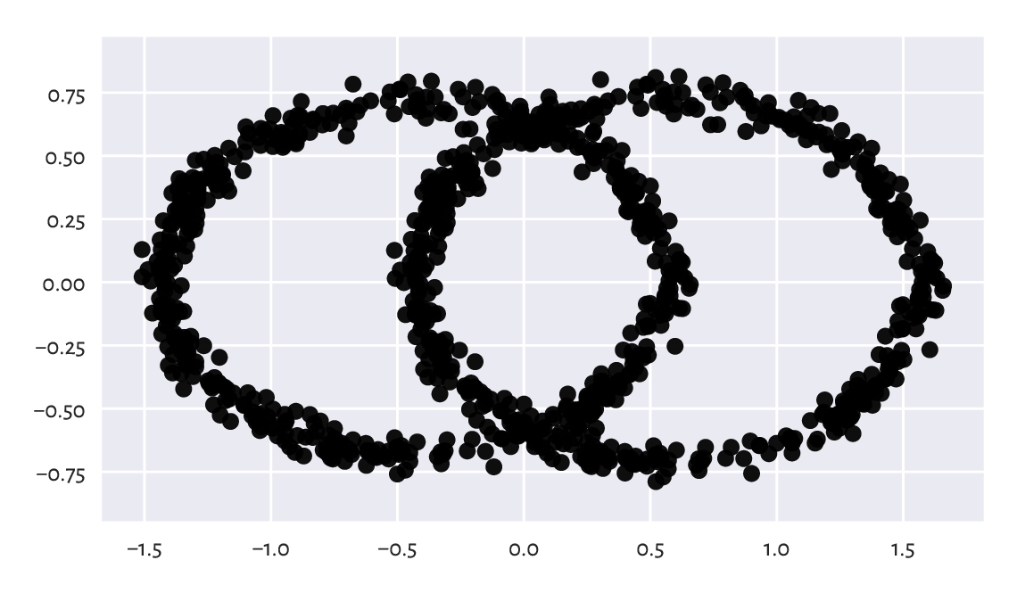
Figure 9.21 The view from the two principal axes.
What we just did is a kind of dimensionality reduction. We found a viewpoint (in the form of an orthonormal matrix, being a mixture of rotations and reflections) on \(\mathbf{X}\) such that its orthonormal projection onto the first two axes of the Cartesian coordinate system is the most informative[14] (in terms of having the highest variance along these axes).
9.3.6. Principal component analysis (*)
Principal component analysis (PCA) is a fancy name for the entire process involving our brainstorming upon what happens along the projections onto the most variable dimensions. It can be used not only for data visualisation and deduplication, but also for feature engineering (as it creates new columns that are linear combinations of existing ones).
Consider a few chosen countrywise 2016 Sustainable Society Indices:
ssi = pd.read_csv("https://raw.githubusercontent.com/gagolews/" +
    "teaching-data/master/marek/ssi_2016_indicators.csv",
    comment="#")  # more on data frames in the next chapter
X = np.array(ssi.iloc[:, [3, 5, 13, 15, 19] ])  # select columns, make matrix
n = X.shape[0]
X[:6, :]  # preview
## array([[ 9.32      ,  8.13333333,  8.386     ,  8.5757    ,  5.46249573],
##        [ 8.74      ,  7.71666667,  7.346     ,  6.8426    ,  6.2929302 ],
##        [ 5.11      ,  4.31666667,  8.788     ,  9.2035    ,  3.91062849],
##        [ 9.61      ,  7.93333333,  5.97      ,  5.5232    ,  7.75361284],
##        [ 8.95      ,  7.81666667,  8.032     ,  8.2639    ,  4.42350654],
##        [10.        ,  8.65      ,  1.        ,  1.        ,  9.66401848]])
Each index is on the scale from 0 to 10. These are, in this order:
Safe Sanitation,
Healthy Life,
Energy Use,
Greenhouse Gases,
Gross Domestic Product.
Above we displayed the data corresponding to six countries:
countries = list(ssi.iloc[:, 0])  # select the 1st column from the data frame
countries[:6]  # preview
## ['Albania', 'Algeria', 'Angola', 'Argentina', 'Armenia', 'Australia']
This is a five-dimensional dataset. We cannot easily visualise it. Observing that the pairs plot does not reveal too much is left as an exercise. Let’s thus perform the SVD decomposition of a standardised version of this dataset, \(\mathbf{Z}\) (recall that the centring is necessary, at the very least).
Z = (X - np.mean(X, axis=0))/np.std(X, axis=0)
U, s, Q = scipy.linalg.svd(Z, full_matrices=False)
The standard deviations of the data projected onto the consecutive principal components (columns in \(\mathbf{U}\mathbf{S}\)) are:
s/np.sqrt(n)
## array([2.02953531, 0.7529221 , 0.3943008 , 0.31897889, 0.23848286])
It is customary to check the ratios of the cumulative variances explained by the consecutive principal components, which is a normalised measure of their importances. We can compute them by calling:
np.cumsum(s**2)/np.sum(s**2)
## array([0.82380272, 0.93718105, 0.96827568, 0.98862519, 1.        ])
As, in some sense, the variability within the first two components covers c. 94% of the variability of the whole dataset, we can restrict ourselves only to a two-dimensional projection of this dataset. The rows in \(\mathbf{Q}\) define the loadings, which give the coefficients defining the linear combinations of the rows in \(\mathbf{Z}\) that correspond to the principal components.
Let’s try to find their interpretation.
np.round(Q[0, :], 2)  # loadings – the first principal axis
## array([-0.43, -0.43,  0.44,  0.45, -0.47])
The first row in \(\mathbf{Q}\) consists of similar values, but with different signs. We can consider them a scaled version of the average Energy Use (column 3), Greenhouse Gases (4), and MINUS Safe Sanitation (1), MINUS Healthy Life (2), MINUS Gross Domestic Product (5). We could call this a measure of a country’s overall eco-unfriendliness(?) because countries with low Healthy Life and high Greenhouse Gasses will score highly on this scale.
np.round(Q[1, :], 2)  # loadings – the second principal axis
## array([ 0.52,  0.5 ,  0.52,  0.45, -0.02])
The second row in \(\mathbf{Q}\) defines a scaled version of the average of Safe Sanitation (1), Healthy Life (2), Energy Use (3), and Greenhouse Gases (4), almost completely ignoring the GDP (5). Can we call it a measure of industrialisation? Something like this. But this naming is just for fun[15].
Figure 9.22 is a scatter plot of the countries projected onto the said two principal directions. For readability, we only display a few chosen labels. This is merely a projection/approximation, but it might be an interesting one for some decision makers.
P2 = U[:, :2] @ np.diag(s[:2])  # == Y @ Q[:2, :].T
plt.plot(P2[:, 0], P2[:, 1], "o", alpha=0.1)
which = [   # hand-crafted/artisan
    141, 117, 69, 123, 35, 80, 93, 45, 15, 2, 60, 56, 14,
    104, 122, 8, 134, 128, 0, 94, 114, 50, 34, 41, 33, 77,
    64, 67, 152, 135, 148, 99, 149, 126, 111, 57, 20, 63
]
for i in which:
    plt.text(P2[i, 0], P2[i, 1], countries[i], ha="center")
plt.axis("equal")
plt.xlabel("1st principal component (eco-unfriendliness?)")
plt.ylabel("2nd principal component (industrialisation?)")
plt.show()
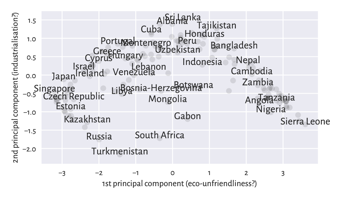
Figure 9.22 An example principal component analysis of countries.
Perform a principal component analysis of the body dataset.
Project the points onto a two-dimensional plane.
9.4. Further reading
Other approaches to regression via linear models include ridge and lasso, the latter having the nice property of automatically getting rid of noninformative variables from the model. Furthermore, instead of minimising squared residuals, we can also consider, e.g., least absolute deviation.
There are many other approaches to dimensionality reduction, also nonlinear ones, including kernel PCA, feature agglomeration via hierarchical clustering, autoencoders, t-SNE, UMAP, etc.
A popular introductory text in statistical learning is [50]. We recommend [2, 10, 11, 24, 26] for more advanced students. Computing-orientated students could benefit from checking out [68].
9.5. Exercises
Why correlation is not causation?
What does the linear correlation of 0.9 mean? What? about the rank correlation of 0.9? And the linear correlation of 0.0?
How is Spearman’s coefficient related to Pearson’s one?
State the optimisation problem behind the least squares fitting of linear models.
What are the different ways of the numerical summarising of residuals?
Why is it important for the residuals to be homoscedastic?
Is a more complex model always better?
Why must extrapolation be handled with care?
Why did we say that novice users should refrain from using scikit-learn?
What is the condition number of a model matrix and why is it worthwhile to always check it?
What is the geometrical interpretation of the dot product of two normalised vectors?
How can we verify if two vectors are orthonormal? What is an orthonormal projection? What is the inverse of an orthonormal matrix?
What is the inverse of a diagonal matrix?
Characterise the general properties of the three matrices obtained by performing the singular value decomposition of a given matrix of shape \(n\times m\).
How can we obtain the first principal component of a given centred matrix?
How can we compute the ratios of the variances explained by the consecutive principal components?