11. Handling categorical data
This open-access textbook is, and will remain, freely available for everyone’s enjoyment (also in PDF; a paper copy can also be ordered). It is a non-profit project. Although available online, it is a whole course, and should be read from the beginning to the end. Refer to the Preface for general introductory remarks. Any bug/typo reports/fixes are appreciated. Make sure to check out Deep R Programming [36] too.
So far, we have been mostly dealing with quantitative (numeric) data, on which we were able to apply various mathematical operations, such as computing the arithmetic mean or taking the square thereof. Naturally, not every transformation must always make sense in every context (e.g., multiplying temperatures – what does it mean when we say that it is twice as hot today as compared to yesterday?), but still, the possibilities were plenty.
Qualitative data (also known as categorical data, factors, or enumerated types) such as eye colour, blood type, or a flag whether a patient is ill, on the other hand, take a small number of unique values. They support an extremely limited set of admissible operations. Namely, we can only determine whether two entities are equal or not.
In datasets involving many features (Chapter 12), categorical variables are often used for observation grouping (e.g., so that we can compute the best and average time for marathoners in each age category or draw box plots for finish times of men and women separately). Also, they may serve as target variables in statistical classification tasks (e.g., so that we can determine if an email is “spam” or “not spam”).
11.1. Representing and generating categorical data
Common ways to represent a categorical variable with \(l\) distinct levels \(\{L_1,L_2,\dots,L_l\}\) is by storing it as:
a vector of strings,
a vector of integers between 0 (inclusive) and \(l\) (exclusive[1]).
These two are easily interchangeable.
For \(l=2\) (binary data), another convenient representation is by means of logical vectors. This can be extended to a so-called one-hot encoded representation using a logical vector of length \(l\).
Consider the data on the original whereabouts of the top 16 marathoners (the 37th Warsaw Marathon dataset):
marathon = pd.read_csv("https://raw.githubusercontent.com/gagolews/" +
    "teaching-data/master/marek/37_pzu_warsaw_marathon_simplified.csv",
    comment="#")
cntrs = np.array(marathon.country, dtype="str")
cntrs16 = cntrs[:16]
cntrs16
## array(['KE', 'KE', 'KE', 'ET', 'KE', 'KE', 'ET', 'MA', 'PL', 'PL', 'IL',
##        'PL', 'KE', 'KE', 'PL', 'PL'], dtype='<U2')
These are two-letter ISO 3166 country codes
encoded as strings (notice the dtype="str" argument).
Calling pandas.unique determines the set of distinct categories:
cat_cntrs16 = pd.unique(cntrs16)
cat_cntrs16
## array(['KE', 'ET', 'MA', 'PL', 'IL'], dtype='<U2')
Hence, cntrs16 is a categorical vector of length \(n=16\)
(len(cntrs16))
with data assuming one of \(l=5\) different levels
(len(cat_cntrs16)).
Note
We could have also used numpy.unique (Section 5.5.3) but it would sort the distinct values lexicographically. In other words, they would not be listed in the order of appearance.
11.1.1. Encoding and decoding factors
To encode a label vector using a set of consecutive nonnegative integers, we can call pandas.factorize:
codes_cntrs16, cat_cntrs16 = pd.factorize(cntrs16)  # sort=False
cat_cntrs16
## array(['KE', 'ET', 'MA', 'PL', 'IL'], dtype='<U2')
codes_cntrs16
## array([0, 0, 0, 1, 0, 0, 1, 2, 3, 3, 4, 3, 0, 0, 3, 3])
The code sequence 0, 0, 0, 1, … corresponds to
the first, the first, the first, the second, … level in cat_cntrs16,
i.e., Kenya, Kenya, Kenya, Ethiopia, ….
Important
When we represent categorical data using numeric codes, it is possible to introduce non-occurring levels. Such information can be useful, e.g., we could explicitly indicate that there were no runners from Australia in the top 16.
Even though we can represent categorical variables using a set of integers, it does not mean that they become instances of a quantitative type. Arithmetic operations thereon do not really make sense.
The values between \(0\) (inclusive) and \(5\) (exclusive) can be used to index a given array of length \(l=5\). As a consequence, to decode our factor, we can call:
cat_cntrs16[codes_cntrs16]
## array(['KE', 'KE', 'KE', 'ET', 'KE', 'KE', 'ET', 'MA', 'PL', 'PL', 'IL',
##        'PL', 'KE', 'KE', 'PL', 'PL'], dtype='<U2')
We can use any other set of labels now:
np.array(["Kenya", "Ethiopia", "Morocco", "Poland", "Israel"])[codes_cntrs16]
## array(['Kenya', 'Kenya', 'Kenya', 'Ethiopia', 'Kenya', 'Kenya',
##        'Ethiopia', 'Morocco', 'Poland', 'Poland', 'Israel', 'Poland',
##        'Kenya', 'Kenya', 'Poland', 'Poland'], dtype='<U8')
It is an instance of the relabelling of a categorical variable.
(**) Here is a way of recoding a variable, i.e., changing the order of labels and permuting the numeric codes:
new_codes = np.array([3, 0, 2, 4, 1])  # an example permutation of labels
new_cat_cntrs16 = cat_cntrs16[new_codes]
new_cat_cntrs16
## array(['PL', 'KE', 'MA', 'IL', 'ET'], dtype='<U2')
Then we make use of the fact that numpy.argsort applied on a vector representing a permutation, determines its very inverse:
new_codes_cntrs16 = np.argsort(new_codes)[codes_cntrs16]
new_codes_cntrs16
## array([1, 1, 1, 4, 1, 1, 4, 2, 0, 0, 3, 0, 1, 1, 0, 0])
Verification:
np.all(cntrs16 == new_cat_cntrs16[new_codes_cntrs16])
## True
(**)
Determine the set of unique values in cntrs16 in the order
of appearance (and not sorted lexicographically), but
without using pandas.unique
nor pandas.factorize.
Then, encode cntrs16 using this level set.
Hint: check out the return_index argument to numpy.unique
and numpy.searchsorted.
Furthermore,
pandas includes
a special dtype for storing categorical data.
Namely, we can write:
cntrs16_series = pd.Series(cntrs16, dtype="category")
or, equivalently:
cntrs16_series = pd.Series(cntrs16).astype("category")
These two yield a Series object displayed as if it was represented
using string labels:
cntrs16_series.head()  # preview
## 0    KE
## 1    KE
## 2    KE
## 3    ET
## 4    KE
## dtype: category
## Categories (5, object): ['ET', 'IL', 'KE', 'MA', 'PL']
Instead, it is encoded using the aforementioned numeric representation:
np.array(cntrs16_series.cat.codes)
## array([2, 2, 2, 0, 2, 2, 0, 3, 4, 4, 1, 4, 2, 2, 4, 4], dtype=int8)
cntrs16_series.cat.categories
## Index(['ET', 'IL', 'KE', 'MA', 'PL'], dtype='object')
This time the labels are sorted lexicographically.
Most often we will be storing categorical data in data frames as ordinary strings, unless a relabelling on the fly is required:
(marathon.iloc[:16, :].country.astype("category")
    .cat.reorder_categories(
        ["KE",    "IL",     "MA",      "ET",       "PL"]
    )
    .cat.rename_categories(
        ["Kenya", "Israel", "Morocco", "Ethiopia", "Poland"]
    ).astype("str")
).head()
## 0       Kenya
## 1       Kenya
## 2       Kenya
## 3    Ethiopia
## 4       Kenya
## Name: country, dtype: object
11.1.2. Binary data as logical and probability vectors
Binary data is a special case of the qualitative setting, where we only have \(l=2\) categories. For example:
0, e.g., healthy/fail/off/non-spam/absent/…),
1, e.g., ill/success/on/spam/present/…).
Usually, the interesting or noteworthy category is denoted by 1.
Important
When converting logical to numeric, False becomes 0 and True becomes 1.
Conversely, 0 is converted to False and anything else (including -0.326)
to True.
Hence, instead of working with vectors of 0s and 1s, we might equivalently be playing with logical arrays. For example:
np.array([True, False, True, True, False]).astype(int)
## array([1, 0, 1, 1, 0])
The other way around:
np.array([-2, -0.326, -0.000001, 0.0, 0.1, 1, 7643]).astype(bool)
## array([ True,  True,  True, False,  True,  True,  True])
or, equivalently:
np.array([-2, -0.326, -0.000001, 0.0, 0.1, 1, 7643]) != 0
## array([ True,  True,  True, False,  True,  True,  True])
Important
It is not rare to work with vectors of probabilities,
where the \(i\)-th element therein, say p[i], denotes the likelihood of
an observation’s belonging to the class 1.
Consequently, the probability of being a member of the class 0 is 1-p[i].
In the case where we would rather work with crisp
classes, we can simply apply the conversion (p>=0.5)
to get a logical vector.
Given a numeric vector x, create a vector of the same length
as x whose \(i\)-th element is equal to "yes"
if x[i] is in the unit interval and to "no" otherwise.
Use numpy.where, which can act as a vectorised version
of the if statement.
11.1.3. One-hot encoding (*)
Let \(\boldsymbol{x}\) be a vector of \(n\) integer labels in \(\{0,...,l-1\}\). Its one-hot-encoded version is a 0/1 (or, equivalently, logical) matrix \(\mathbf{R}\) of shape \(n\times l\) such that \(r_{i,j}=1\) if and only if \(x_i = j\).
For example, if \(\boldsymbol{x}=(0, 1, 2, 1)\) and \(l=4\), then:
One can easily verify that each row consists of one and only one 1 (the number of 1s per one row is 1). Such a representation is adequate when solving a multiclass classification problem by means of \(l\) binary classifiers. For example, if spam, bacon, and hot dogs are on the menu, then spam is encoded as \((1, 0, 0)\), i.e., yeah-spam, nah-bacon, and nah-hot dog. We can build three binary classifiers, each narrowly specialising in sniffing one particular type of food.
Write a function to one-hot encode a given categorical vector represented using character strings.
Compose a function to decode a one-hot-encoded matrix.
(*) We can also work with matrices like \(\mathbf{P}\in[0,1]^{n\times l}\), where \(p_{i,j}\) denotes the probability of the \(i\)-th object’s belonging to the \(j\)-th class. Given an example matrix of this kind, verify that in each row the probabilities sum to 1 (up to a small numeric error). Then, decode such a matrix by choosing the greatest element in each row.
11.1.4. Binning numeric data (revisited)
Numerical data can be converted to categorical via binning (quantisation). Even though this causes information loss, it may open some new possibilities. In fact, we needed binning to draw all the histograms in Chapter 4. Also, reporting observation counts in each bin instead of raw data enables us to include them in printed reports (in the form of tables).
Note
We are strong proponents of openness and transparency. Thus, we always encourage all entities (governments, universities, non-profits, corporations, etc.) to share raw, unabridged versions of their datasets under the terms of some open data license. This is to enable public scrutiny and to get the most out of the possibilities they can bring for benefit of the community.
Of course, sometimes the sharing of unprocessed information can violate the privacy of the subjects. In such a case, it might be worthwhile to communicate them in a binned form.
Note
Rounding is a kind of binning. In particular, numpy.round rounds to the nearest tenths, hundredths, …, as well as tens, hundreds, …. It is useful if data are naturally imprecise, and we do not want to give the impression that it is otherwise. Nonetheless, rounding can easily introduce tied observations, which are problematic on their own; see Section 5.5.3.
Consider the 16 best marathon finish times (in minutes):
mins = np.array(marathon.mins)
mins16 = mins[:16]
mins16
## array([129.32, 130.75, 130.97, 134.17, 134.68, 135.97, 139.88, 143.2 ,
##        145.22, 145.92, 146.83, 147.8 , 149.65, 149.88, 152.65, 152.88])
numpy.searchsorted can determine
the interval where each value in mins falls.
bins = [130, 140, 150]
codes_mins16 = np.searchsorted(bins, mins16)
codes_mins16
## array([0, 1, 1, 1, 1, 1, 1, 2, 2, 2, 2, 2, 2, 2, 3, 3])
By default, the intervals are of the form \((a, b]\) (not including \(a\), including \(b\)). The code 0 corresponds to values less than the first bin edge, whereas the code 3 represent items greater than or equal to the last boundary.
pandas.cut gives us another interface to the same binning method.
It returns a vector-like object with dtype="category",
with very readable labels generated automatically
(and ordered; see Section 11.4.7):
cut_mins16 = pd.Series(pd.cut(mins16, [-np.inf, 130, 140, 150, np.inf]))
cut_mins16.iloc[ [0, 1, 6, 7, 13, 14, 15] ].astype("str")  # preview
## 0      (-inf, 130.0]
## 1     (130.0, 140.0]
## 6     (130.0, 140.0]
## 7     (140.0, 150.0]
## 13    (140.0, 150.0]
## 14      (150.0, inf]
## 15      (150.0, inf]
## dtype: object
cut_mins16.cat.categories.astype("str")
## Index(['(-inf, 130.0]', '(130.0, 140.0]', '(140.0, 150.0]',
##        '(150.0, inf]'],
##       dtype='object')
(*) We can create a set of the corresponding categories manually, for example, as follows:
bins2 = np.r_[-np.inf, bins, np.inf]
np.array(
    [f"({bins2[i]}, {bins2[i+1]}]" for i in range(len(bins2)-1)]
)
## array(['(-inf, 130.0]', '(130.0, 140.0]', '(140.0, 150.0]',
##        '(150.0, inf]'], dtype='<U14')
(*) Check out the numpy.histogram_bin_edges function which tries to determine some informative interval boundaries based on a few simple heuristics. Recall that numpy.linspace and numpy.geomspace can be used for generating equidistant bin edges on linear and logarithmic scales, respectively.
11.1.5. Generating pseudorandom labels
numpy.random.choice creates a pseudorandom sample with categories picked with given probabilities:
np.random.seed(123)
np.random.choice(
    a=["spam", "bacon", "eggs", "tempeh"],
    p=[   0.7,     0.1,   0.15,     0.05],
    replace=True,
    size=16
)
## array(['spam', 'spam', 'spam', 'spam', 'bacon', 'spam', 'tempeh', 'spam',
##        'spam', 'spam', 'spam', 'bacon', 'spam', 'spam', 'spam', 'bacon'],
##       dtype='<U6')
If we generate a sufficiently long vector,
we will expect "spam" to occur approximately 70% of the time,
and "tempeh" to be drawn in 5% of the cases, etc.
11.2. Frequency distributions
11.2.1. Counting
pandas.Series.value_counts creates
a frequency table in the form of a Series object
equipped with a readable index (element labels):
pd.Series(cntrs16).value_counts()  # sort=True, ascending=False
## KE    7
## PL    5
## ET    2
## MA    1
## IL    1
## Name: count, dtype: int64
By default, data are ordered with respect to the counts, decreasingly.
If we already have an array of integer codes between \(0\) and \(l-1\), numpy.bincount will return the number of times each code appears therein.
counts_cntrs16 = np.bincount(codes_cntrs16)
counts_cntrs16
## array([7, 2, 1, 5, 1])
A vector of counts can easily be turned into a vector of proportions (fractions) or percentages (if we multiply them by 100):
counts_cntrs16 / np.sum(counts_cntrs16) * 100
## array([43.75, 12.5 ,  6.25, 31.25,  6.25])
Almost 31.25% of the top runners were from Poland (this marathon is held in Warsaw after all…).
Using numpy.argsort, sort
counts_cntrs16 increasingly
together with the corresponding items in cat_cntrs16.
11.2.2. Two-way contingency tables: Factor combinations
Some datasets may bear many categorical columns,
each having possibly different levels.
Let’s now consider all the runners in the marathon dataset:
marathon.loc[:, "age"] = marathon.category.str.slice(1)  # first two chars
marathon.loc[marathon.age >= "60", "age"] = "60+"  # not enough 70+ y.olds
marathon = marathon.loc[:, ["sex", "age", "country"]]
marathon.head()
##   sex age country
## 0   M  20      KE
## 1   M  20      KE
## 2   M  20      KE
## 3   M  20      ET
## 4   M  30      KE
The three columns are: sex, age (in 10-year brackets), and country. We can, of course, analyse the data distribution in each column individually, but this we leave as an exercise. Instead, we note that some interesting patterns might also arise when we study the combinations of levels of different variables.
Here are the levels of the sex and age variables:
pd.unique(marathon.sex)
## array(['M', 'F'], dtype=object)
pd.unique(marathon.age)
## array(['20', '30', '50', '40', '60+'], dtype=object)
We have \(2\cdot 5=10\) combinations thereof. We can use pandas.DataFrame.value_counts to determine the number of observations at each two-dimensional level:
counts2 = marathon.loc[:, ["sex", "age"]].value_counts()
counts2
## sex  age
## M    30     2200
##      40     1708
##      20      879
##      50      541
## F    30      449
##      40      262
##      20      240
## M    60+     170
## F    50       43
##      60+      19
## Name: count, dtype: int64
These can be converted to a two-way contingency table, which is a matrix that gives the number of occurrences of each pair of values from the two factors:
V = counts2.unstack(fill_value=0)
V
## age   20    30    40   50  60+
## sex
## F    240   449   262   43   19
## M    879  2200  1708  541  170
For example, there were 19 women aged at least 60 amongst the marathoners. Jolly good.
The marginal (one-dimensional) frequency distributions
can be recreated by computing the rowwise and columnwise sums
of V:
np.sum(V, axis=1)
## sex
## F    1013
## M    5498
## dtype: int64
np.sum(V, axis=0)
## age
## 20     1119
## 30     2649
## 40     1970
## 50      584
## 60+     189
## dtype: int64
11.2.3. Combinations of even more factors
pandas.DataFrame.value_counts can also be used with a combination of more than two categorical variables:
counts3 = (marathon
    .loc[
        marathon.country.isin(["PL", "UA", "SK"]),
        ["country", "sex", "age"]
    ]
    .value_counts()
    .rename("count")
    .reset_index()
)
counts3
##    country sex  age  count
## 0       PL   M   30   2081
## 1       PL   M   40   1593
## 2       PL   M   20    824
## 3       PL   M   50    475
## 4       PL   F   30    422
## 5       PL   F   40    248
## 6       PL   F   20    222
## 7       PL   M  60+    134
## 8       PL   F   50     26
## 9       PL   F  60+      8
## 10      UA   M   30      8
## 11      UA   M   20      8
## 12      UA   M   50      3
## 13      UA   F   30      2
## 14      UA   M   40      2
## 15      SK   M  60+      1
## 16      SK   F   50      1
## 17      SK   M   40      1
The display is in the long format (compare Section 10.6.2) because we cannot nicely print a three-dimensional array. Yet, we can always partially unstack the dataset, for aesthetic reasons:
counts3.set_index(["country", "sex", "age"]).unstack()
##              count
## age             20      30      40     50    60+
## country sex
## PL      F    222.0   422.0   248.0   26.0    8.0
##         M    824.0  2081.0  1593.0  475.0  134.0
## SK      F      NaN     NaN     NaN    1.0    NaN
##         M      NaN     NaN     1.0    NaN    1.0
## UA      F      NaN     2.0     NaN    NaN    NaN
##         M      8.0     8.0     2.0    3.0    NaN
Let’s again appreciate how versatile the concept of data frames is. Not only can we represent data to be investigated (one row per observation, variables possibly of mixed types) but also we can store the results of such analyses (neatly formatted tables).
11.3. Visualising factors
Methods for visualising categorical data are by no means fascinating (unless we use them as grouping variables in more complex datasets, but this is a topic that we cover in Chapter 12).
11.3.1. Bar plots
Example data:
x = (marathon.age.astype("category")
    .cat.reorder_categories(["20", "30", "40", "50", "60+"])
    .value_counts(sort=False)
)
x
## age
## 20     1119
## 30     2649
## 40     1970
## 50      584
## 60+     189
## Name: count, dtype: int64
Bar plots are self-explanatory and hence will do the trick most of the time; see Figure 11.1.
ind = np.arange(len(x))  # 0, 1, 2, 3, 4
plt.bar(ind, height=x, color="lightgray", edgecolor="black", alpha=0.8)
plt.xticks(ind, x.index)
plt.show()
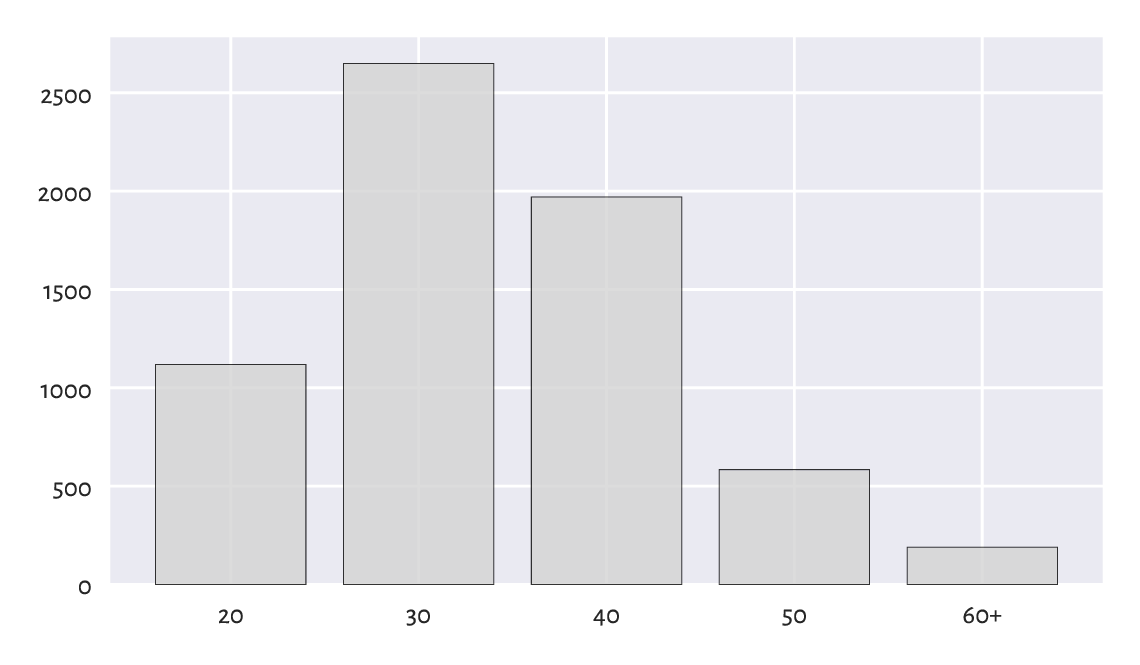
Figure 11.1 Runners’ age categories.
The ind vector gives the x-coordinates of the bars;
here: consecutive integers.
By calling matplotlib.pyplot.xticks
we assign them readable labels.
Draw a bar plot for the five most prevalent foreign (i.e., excluding Polish) marathoners’ original whereabouts. Add a bar that represents “all other” countries. Depict percentages instead of counts, so that the total bar height is 100%. Assign a different colour to each bar.
A bar plot is a versatile tool for visualising the counts also in the two-variable case; see Figure 11.2. Let’s now use a pleasant wrapper around matplotlib.pyplot.bar offered by the statistical data visualisation package called seaborn [99] (written by Michael Waskom).
import seaborn as sns
v = (marathon.loc[:, ["sex", "age"]].value_counts(sort=False)
    .rename("count").reset_index()
)
sns.barplot(x="age", hue="sex", y="count", data=v)
plt.show()
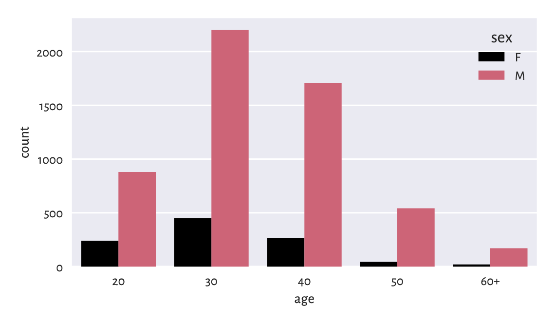
Figure 11.2 Number of runners by age category and sex.
Note
It is customary to call a single function from seaborn and then perform a series of additional calls to matplotlib to tweak the display details. We should remember that the former uses the latter to achieve its goals, not vice versa. seaborn is particularly convenient for plotting grouped data.
(*) Draw a similar chart using matplotlib.pyplot.bar.
(**) Create a stacked bar plot similar to the one in Figure 11.3, where we have horizontal bars for data that have been normalised so that, for each sex, their sum is 100%.
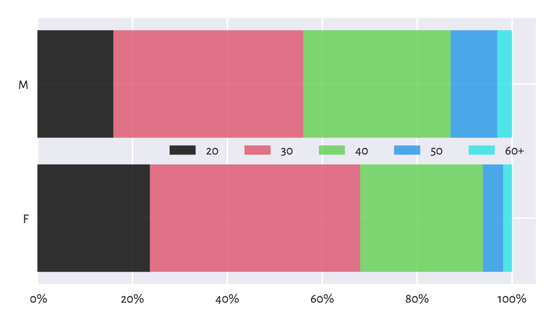
Figure 11.3 An example stacked bar plot: age distribution for different sexes amongst all the runners.
11.3.2. Political marketing and statistics
Even such a simple chart as bar plot can be manipulated. In the second round of the 2025 Polish presidential elections, Karol Nawrocki won against Rafał Trzaskowski. The results might have been presented by some right-wing outlets in a way depicted in Figure 11.4.
plt.subplot(xlim=(0, 3), ylim=(49, 51), ylabel="%")
plt.bar([1, 2], height=[50.89, 49.11], width=0.25,
    color="lightgray", edgecolor="black", alpha=0.8)
plt.xticks([1, 2], ["Nawrocki", "Trzaskowski"])
plt.show()
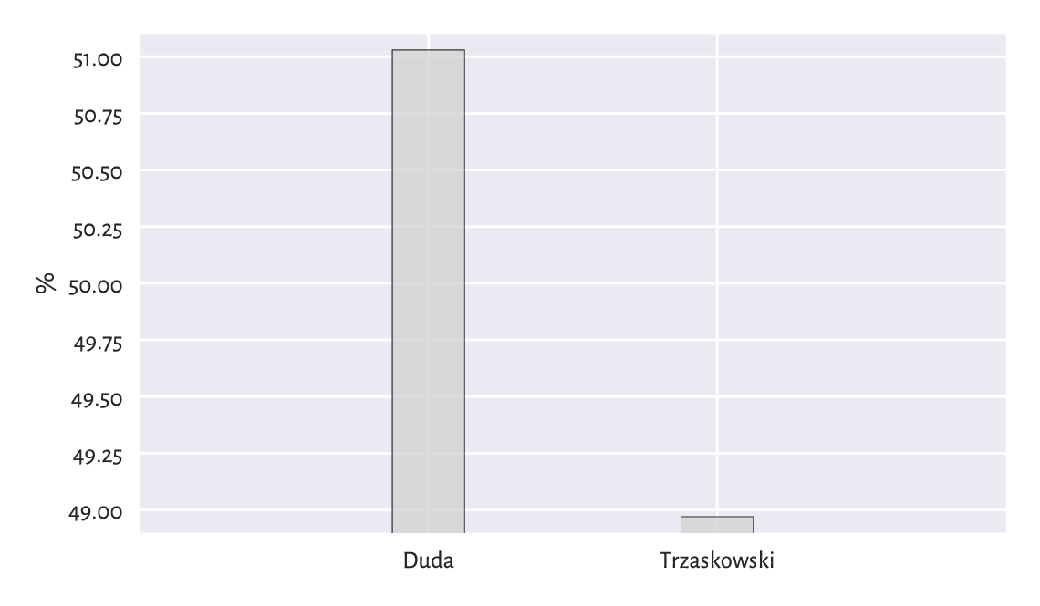
Figure 11.4 Flawless victory
On the other hand, a media conglomerate from the opposite side of the political spectrum could have reported them like in Figure 11.5.
plt.bar([1, 2], height=[50.89, 49.11], width=0.25,
    color="lightgray", edgecolor="black", alpha=0.8)
plt.xticks([1, 2], ["Nawrocki", "Trzaskowski"])
plt.ylabel("%")
plt.xlim(0, 3)
plt.ylim(0, 250)
plt.yticks([0, 100])
plt.show()
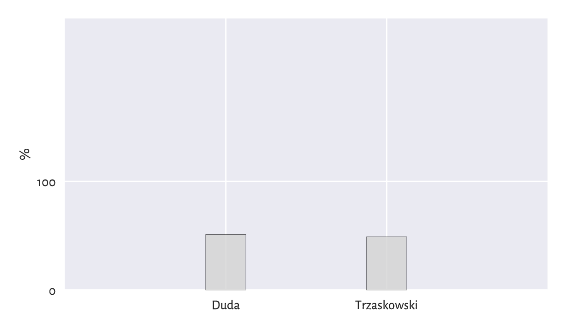
Figure 11.5 So close
Important
We must always read the axis tick marks. Also, when drawing bar plots, we must never trick the reader for this is unethical; compare Rule#9. More issues in statistical deception are explored, e.g., in [98].
11.3.3. .
We are definitely not going to discuss the infamous pie charts because their use in data analysis has been widely criticised for a long time (it is difficult to judge the ratios of areas of their slices). Do not draw them. Ever. Good morning.
11.3.4. Pareto charts (*)
It is often the case that most instances of something’s happening (usually 70–90%) are due to only a few causes (10–30%). This is known as the Pareto principle (with 80% vs 20% being an often cited rule of thumb).
Chapter 6 modelled the US cities’ population dataset using the Pareto distribution (the very same Pareto, but a different, yet related mathematical object). We discovered that only c. 14% of the settlements (those with 10 000 or more inhabitants) are home to as much as 84% of the population. Hence, we may say that this data domain follows the Pareto rule.
Here is a dataset fabricated by the Clinical Excellence Commission in New South Wales, Australia, listing the most frequent causes of medication errors:
cat_med = np.array([
    "Unauthorised drug", "Wrong IV rate", "Wrong patient", "Dose missed",
    "Underdose", "Wrong calculation","Wrong route", "Wrong drug",
    "Wrong time", "Technique error", "Duplicated drugs", "Overdose"
])
counts_med = np.array([1, 4, 53, 92, 7, 16, 27, 76, 83, 3, 9, 59])
np.sum(counts_med)  # total number of medication errors
## 430
Let’s display the dataset ordered with respect to the counts, decreasingly:
med = pd.Series(counts_med, index=cat_med).sort_values(ascending=False)
med
## Dose missed          92
## Wrong time           83
## Wrong drug           76
## Overdose             59
## Wrong patient        53
## Wrong route          27
## Wrong calculation    16
## Duplicated drugs      9
## Underdose             7
## Wrong IV rate         4
## Technique error       3
## Unauthorised drug     1
## dtype: int64
Pareto charts may aid in visualising the datasets where the Pareto principle is likely to hold, at least approximately. They include bar plots with some extras:
bars are listed in decreasing order,
the cumulative percentage curve is added.
The plotting of the Pareto chart is a little tricky because it involves using two different Y axes (as usual, fine-tuning the figure and studying the manual of the matplotlib package is left as an exercise.)
x = np.arange(len(med))  # 0, 1, 2, ...
p = 100.0*med/np.sum(med)  # percentages

fig, ax1 = plt.subplots()
ax1.set_xticks(x-0.5, med.index, rotation=60)
ax1.set_ylabel("%")
ax1.bar(x, height=p, color="lightgray", edgecolor="black")

ax2 = ax1.twinx()  # creates a new coordinate system with a shared x-axis
ax2.plot(x, np.cumsum(p), "ro-")
ax2.grid(visible=False)
ax2.set_ylabel("cumulative %")

fig.tight_layout()
plt.show()
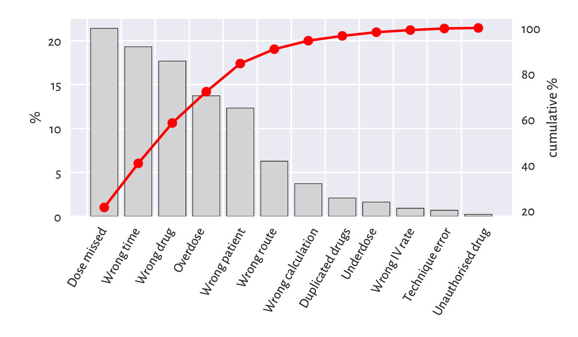
Figure 11.6 An example Pareto chart: the most frequent causes for medication errors.
Figure 11.6 shows that the first five causes (less than 40%) correspond to c. 85% of the medication errors. More precisely, the cumulative probabilities are:
med.cumsum()/np.sum(med)
## Dose missed          0.213953
## Wrong time           0.406977
## Wrong drug           0.583721
## Overdose             0.720930
## Wrong patient        0.844186
## Wrong route          0.906977
## Wrong calculation    0.944186
## Duplicated drugs     0.965116
## Underdose            0.981395
## Wrong IV rate        0.990698
## Technique error      0.997674
## Unauthorised drug    1.000000
## dtype: float64
Note that there is an explicit assumption here that a single error is only due to a single cause. Also, we presume that each medication error has a similar degree of severity.
Policymakers and quality controllers often rely on similar simplifications. They most probably are going to be addressing only the top causes. If we ever wondered why some processes (mal)function the way they do, foregoing is a hint. Inventing something more effective yet so simple at the same time requires much more effort.
It would be also nice to report the number of cases where no mistakes are made and the cases where errors are insignificant. Healthcare workers are doing a wonderful job for our communities, especially in the public system. Why add to their stress?
11.3.5. Heat maps
Two-way contingency tables can be depicted by means of a heat map, where each count influences the corresponding cell’s colour intensity; see Figure 11.7.
V = marathon.loc[:, ["sex", "age"]].value_counts().unstack(fill_value=0)
sns.heatmap(V, annot=True, fmt="d", cmap=plt.colormaps.get_cmap("copper"))
plt.show()
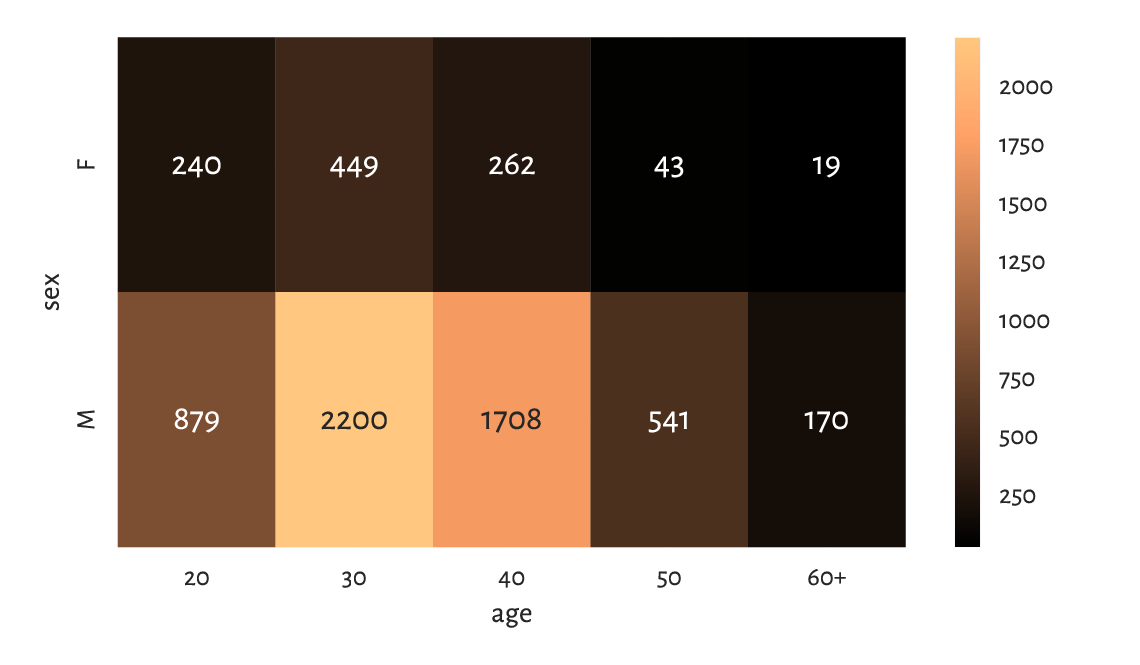
Figure 11.7 A heat map for the marathoners’ sex and age category.
As an exercise, draw a similar heat map using matplotlib.pyplot.imshow.
11.4. Aggregating and comparing factors
11.4.1. Mode
The only operation on categorical data on which we can rely is counting.
counts = marathon.country.value_counts()
counts.head()
## country
## PL    6033
## GB      71
## DE      38
## FR      33
## SE      30
## Name: count, dtype: int64
Therefore, as far as qualitative data aggregation is concerned, what we are left with is the mode, i.e., the most frequently occurring value.
counts.index[0]  # counts are sorted
## 'PL'
Important
A mode might be ambiguous.
It turns out that amongst the fastest 22 runners (a nicely round number), there is a tie between Kenya and Poland – both meet our definition of a mode:
counts = marathon.country.iloc[:22].value_counts()
counts
## country
## KE    7
## PL    7
## ET    3
## IL    3
## MA    1
## MD    1
## Name: count, dtype: int64
To avoid any bias, it is always best to report all the potential mode candidates:
counts.loc[counts == counts.max()].index
## Index(['KE', 'PL'], dtype='object', name='country')
If one value is required, though, we can pick one at random (calling numpy.random.choice).
11.4.2. Binary data as logical vectors
Recall that we are used to representing binary data as logical vectors or, equivalently, vectors of 0s and 1s.
Perhaps the most useful arithmetic operation on logical vectors is the sum. For example:
np.sum(marathon.country == "PL")
## 6033
This gave the number of elements that are equal to "PL"
because the sum of 0s and 1s is equal to the number of 1s in the sequence.
Note that (country == "PL") is a logical vector that
represents a binary categorical variable
with levels: not-Poland (False) and Poland (True).
If we divide the preceding result by the length of the vector, we will get the proportion:
np.mean(marathon.country == "PL")
## 0.9265857779142989
Roughly 93% of the runners were from Poland.
As this is greater than 0.5, "PL” is definitely the mode.
What is the meaning of numpy.all, numpy.any, numpy.min, numpy.max, numpy.cumsum, and numpy.cumprod applied on logical vectors?
Note
(**)
Having the 0/1 (or zero/non-zero) vs False/True correspondence
permits us to perform some logical operations using integer arithmetic.
In mathematics, 0 is the annihilator of multiplication
and the neutral element of addition,
whereas 1 is the neutral element of multiplication.
In particular, assuming that p and q are logical values
and a and b are numeric ones, we have, what follows:
p+q != 0means that at least one value isTrueandp+q == 0if and only if both areFalse;more generally,
p+q == 2if both elements areTrue,p+q == 1if only one isTrue(we call it exclusive-or, XOR), andp+q == 0if both areFalse;p*q != 0means that both values areTrueandp*q == 0holds whenever at least one isFalse;1-pcorresponds to the negation ofp(changes 1 to 0 and 0 to 1);p*a + (1-p)*bis equal toaifpisTrueand equal tobotherwise.
11.4.3. Pearson chi-squared test (*)
The Kolmogorov–Smirnov test described in Section 6.2.3 verifies whether a given sample differs significantly from a hypothesised continuous[2] distribution, i.e., it works for numeric data.
For binned/categorical data, we can use a classical and easy-to-understand test developed by Karl Pearson in 1900. It is supposed to judge whether the differences between the observed proportions \(\hat{p}_1,\dots,\hat{p}_l\) and the theoretical ones \(p_1,\dots,p_l\) are significantly large or not:
Having such a test is beneficial, e.g., when the data we have at hand are based on small surveys that are supposed to serve as estimates of what might be happening in a larger population.
Going back to our political example from Section 11.3.2, it turns out that one of the pre-election polls indicated that \(c=516\) out of \(n=1017\) people would vote for the first candidate. We have \(\hat{p}_1=50.74\%\) (Nawrocki) and \(\hat{p}_2=49.26\%\) (Trzaskowski). If we would like to test whether the observed proportions are significantly different from each other, we could test them against the theoretical distribution \(p_1=50\%\) and \(p_2=50\%\), which states that there is a tie between the competitors (up to a sampling error).
A natural test statistic is based on the relative squared differences:
c, n = 516, 1017
p_observed = np.array([c, n-c]) / n
p_expected = np.array([0.5, 0.5])
T = n * np.sum( (p_observed-p_expected)**2 / p_expected )
T
## 0.2212389380530986
Similarly to the continuous case in Section 6.2.3, we reject the null hypothesis, if:
The critical value \(K\) is computed based on the fact that, if the null hypothesis is true, \(\hat{T}\) follows the \(\chi^2\) (chi-squared, hence the name of the test) distribution with \(l-1\) degrees of freedom, see scipy.stats.chi2.
We thus need to query the theoretical quantile function to determine the test statistic that is not exceeded in 99.9% of the trials (under the null hypothesis):
alpha = 0.001  # significance level
scipy.stats.chi2.ppf(1-alpha, len(p_observed)-1)
## 10.827566170662733
As \(\hat{T} < K\) (because \(0.22 < 10.83\)), we cannot deem the two proportions significantly different. In other words, this poll did not indicate (at the significance level \(0.1\%\)) any of the candidates as a clear winner.
Assuming \(n=1017\), determine the smallest \(c\), i.e., the number of respondents claiming they would vote for Nawrocki, that leads to the rejection of the null hypothesis.
11.4.4. Two-sample Pearson chi-squared test (*)
Let’s consider the data depicted in Figure 11.3 and test whether the runners’ age distributions differ significantly between men and women.
V = marathon.loc[:, ["sex", "age"]].value_counts().unstack(fill_value=0)
c1, c2 = np.array(V)  # the first row, the second row
c1  # women
## array([240, 449, 262,  43,  19])
c2  # men
## array([ 879, 2200, 1708,  541,  170])
There are \(l=5\) age categories. First, denote the total number of observations in both groups by \(n'\) and \(n''\).
n1 = c1.sum()
n2 = c2.sum()
n1, n2
## (1013, 5498)
The observed proportions in the first group (females), denoted by \(\hat{p}_1',\dots,\hat{p}_l'\), are, respectively:
p1 = c1/n1
p1
## array([0.23692004, 0.44323791, 0.25863771, 0.04244817, 0.01875617])
Here are the proportions in the second group (males), \(\hat{p}_1'',\dots,\hat{p}_l''\):
p2 = c2/n2
p2
## array([0.15987632, 0.40014551, 0.31065842, 0.09839942, 0.03092033])
We would like to verify whether the corresponding proportions are equal (up to some sampling error):
In other words, we want to determine whether the categorical data in the two groups come from the same discrete probability distribution.
Taking the estimated expected proportions:
for all \(i=1,\dots,l\), the test statistic this time is equal to:
which is a variation on the one-sample theme presented in the previous subsection.
pp = (n1*p1+n2*p2)/(n1+n2)
T = n1 * np.sum( (p1-pp)**2 / pp ) + n2 * np.sum( (p2-pp)**2 / pp )
T
## 75.31373854741857
If the null hypothesis is true, the test statistic approximately follows the \(\chi^2\) distribution with \(l-1\) degrees of freedom[3]. The critical value \(K\) is equal to:
alpha = 0.001  # significance level
scipy.stats.chi2.ppf(1-alpha, len(p1)-1)
## 18.46682695290317
As \(\hat{T} \ge K\) (because \(75.31 \ge 18.47\)), we reject the null hypothesis. And so, the runners’ age distribution differs across sexes (at significance level 0.1%).
11.4.5. Measuring association (*)
Let’s consider the Australian Bureau of Statistics National Health Survey 2018 data on the prevalence of certain medical conditions as a function of age. Here is the extracted contingency table:
l = [
    ["Arthritis", "Asthma", "Back problems", "Cancer (malignant neoplasms)",
     "Chronic obstructive pulmonary disease", "Diabetes mellitus",
     "Heart, stroke and vascular disease", "Kidney disease",
     "Mental and behavioural conditions", "Osteoporosis"],
    ["15-44", "45-64", "65+"]
]
C = 1000*np.array([
    [ 360.2,     1489.0,      1772.2],
    [1069.7,      741.9,       433.7],
    [1469.6,     1513.3,       955.3],
    [  28.1,      162.7,       237.5],
    [ 103.8,      207.0,       251.9],
    [ 135.4,      427.3,       607.7],
    [  94.0,      344.4,       716.0],
    [  29.6,       67.7,       123.3],
    [2218.9,     1390.6,       725.0],
    [  36.1,      312.3,       564.7],
]).astype(int)
pd.DataFrame(C, index=l[0], columns=l[1])
##                                          15-44    45-64      65+
## Arthritis                               360000  1489000  1772000
## Asthma                                 1069000   741000   433000
## Back problems                          1469000  1513000   955000
## Cancer (malignant neoplasms)             28000   162000   237000
## Chronic obstructive pulmonary disease   103000   207000   251000
## Diabetes mellitus                       135000   427000   607000
## Heart, stroke and vascular disease       94000   344000   716000
## Kidney disease                           29000    67000   123000
## Mental and behavioural conditions      2218000  1390000   725000
## Osteoporosis                             36000   312000   564000
Cramér’s \(V\) is one of a few ways to measure the degree of association between two categorical variables. It is equal to 0 (the lowest possible value) if the two variables are independent (there is no association between them) and 1 (the highest possible value) if they are tied.
Given a two-way contingency table \(C\) with \(n\) rows and \(m\) columns and assuming that:
where:
the Cramér coefficient is given by:
Here, \(c_{i,j}\) gives the actually observed counts and \(e_{i, j}\) denotes the number that we would expect to see if the two variables were really independent.
scipy.stats.contingency.association(C)
## 0.316237999724298
Hence, there might be a small association between age and the prevalence of certain conditions. In other words, some conditions might be more prevalent in some age groups than others.
Compute the Cramér \(V\) using only numpy functions.
(**) We can easily verify the hypothesis whether \(V\) does not differ significantly from \(0\), i.e., whether the variables are independent. Looking at \(T\), we see that this is essentially the test statistic in Pearson’s chi-squared goodness-of-fit test.
E = C.sum(axis=1).reshape(-1, 1) * C.sum(axis=0).reshape(1, -1) / C.sum()
T = np.sum((C-E)**2 / E)
T
## 3715440.465191512
If the data are really independent, \(T\) follows the chi-squared distribution \(n + m - 1\). As a consequence, the critical value \(K\) is equal to:
alpha = 0.001  # significance level
scipy.stats.chi2.ppf(1-alpha, C.shape[0] + C.shape[1] - 1)
## 32.90949040736021
As \(T\) is much greater than \(K\), we conclude (at significance level \(0.1\%\)) that the health conditions are not independent of age.
(*) Take a look at Table 19: Comorbidity of selected chronic conditions in the National Health Survey 2018, where we clearly see that many disorders co-occur. Visualise them on some heat maps and bar plots (including data grouped by sex and age).
11.4.6. Binned numeric data
Generally, modes are meaningless for continuous data, where repeated values are – at least theoretically – highly unlikely. It might make sense to compute them on binned data, though.
Looking at a histogram, e.g., in Figure 4.2, the mode is the interval corresponding to the highest bar (hopefully assuming there is only one). If we would like to obtain a single number, we can choose for example the middle of this interval as the mode.
For numeric data, the mode will heavily depend on the coarseness and type of binning; compare Figure 4.4 and Figure 6.8. Thus, the question “what is the most popular income” is overall a difficult one to answer.
Compute some informative modes for
the uk_income_simulated_2020 dataset.
Play around with different numbers
of bins on linear and logarithmic scales and see how they affect the mode.
11.4.7. Ordinal data (*)
The case where the categories can be linearly ordered, is called ordinal data. For instance, Australian university grades are: F (fail) < P (pass) < C (credit) < D (distinction) < HD (high distinction), some questionnaires use Likert-type scales such as “strongly disagree” < “disagree” < “neutral” < “agree” < “strongly agree”, etc.
With a linear ordering we can go beyond the mode. Due to the existence of order statistics and observation ranks, we can also easily define sample quantiles. Nevertheless, the standard methods for resolving ties will not work: we need to be careful.
For example, the median of a sample of student grades (P, P, C, D, HD) is C, but (P, P, C, D, HD, HD) is either C or D - we can choose one at random or just report that the solution is ambiguous (C+? D-? C/D?).
Another option, of course, is to treat ordinal data as numbers (e.g., F = 0, P = 1, …, HD = 4). In the latter example, the median would be equal to 2.5.
There are some cases, though, where the conversion of labels to consecutive integers is far from optimal. For instance, where it gives the impression that the “distance” between different levels is always equal (linear).
(**)
The grades_results
dataset represents the grades (F, P, C, D, HD)
of 100 students attending an imaginary course in an Australian
university. You can load it in the form of an ordered categorical Series
by calling:
grades = np.genfromtxt("https://raw.githubusercontent.com/gagolews/" +
    "teaching-data/master/marek/grades_results.txt", dtype="str")
grades = pd.Series(pd.Categorical(grades,
    categories=["F", "P", "C", "D", "HD"], ordered=True))
grades.value_counts()  # note the order of labels
## F     30
## P     29
## C     23
## HD    22
## D     19
## Name: count, dtype: int64
How would you determine the average grade represented as
a number between 0 and 100, taking into account that
for a P you need at least 50%, C is given for ≥ 60%,
D for ≥ 70%, and HD for only (!) 80% of the points.
Come up with a pessimistic, optimistic, and best-shot estimate,
and then compare your result
to the true corresponding scores listed in the
grades_scores dataset.
11.5. Exercises
Does it make sense to compute the arithmetic mean of a categorical variable?
Name the basic use cases for categorical data.
(*) What is a Pareto chart?
How can we deal with the case of the mode being nonunique?
What is the meaning of the sum and mean for binary data (logical vectors)?
What is the meaning of numpy.mean((x > 0) & (x < 1)),
where x is a numeric vector?
List some ways to visualise multidimensional categorical data (combinations of two or more factors).
(*) State the null hypotheses verified by the one- and two-sample chi-squared goodness-of-fit tests.
(*) How is Cramér’s \(V\) defined and what values does it take?