6. Continuous probability distributions
This open-access textbook is, and will remain, freely available for everyone’s enjoyment (also in PDF; a paper copy can also be ordered). It is a non-profit project. Although available online, it is a whole course, and should be read from the beginning to the end. Refer to the Preface for general introductory remarks. Any bug/typo reports/fixes are appreciated. Make sure to check out Deep R Programming [36] too.
Successful data analysts deal with hundreds or thousands of datasets in their lifetimes. In the long run, at some level, most of them will be deemed boring (datasets, not analysts). This is because only a few common patterns will be occurring over and over again. In particular, the previously mentioned bell-shapedness and right-skewness are prevalent in the so-called real world. Surprisingly, however, this is exactly when things become scientific and interesting, allowing us to study various phenomena at an appropriate level of generality.
Mathematically, such idealised patterns in the histogram shapes can be formalised using the notion of a probability density function (PDF) of a continuous, real-valued random variable. Intuitively[1], a PDF is a smooth curve that would arise if we drew a histogram for the entire population (e.g., all women living currently on Earth and beyond or otherwise an extremely large data sample obtained by independently querying the same underlying data generating process) in such a way that the total area of all the bars is equal to 1 and the bin sizes are very small. On the other hand, a real-valued random variable is a theoretical process that generates quantitative data. From this perspective, a sample at hand is assumed to be drawn from a given distribution; it is a realisation of the underlying process.
We do not intend ours to be a course in probability theory and mathematical statistics. Rather, a one that precedes and motivates them (e.g., [23, 40, 41, 82, 83]). Therefore, our definitions must be simplified so that they are digestible. We will thus consider the following characterisation.
Important
(*) We call an integrable function \(f:\mathbb{R}\to\mathbb{R}\) a probability density function, if \(f(x)\ge 0\) for all \(x\) and \(\int_{-\infty}^\infty f(x)\,dx=1\). In other words, \(f\) is nonnegative and normalised in such a way that the total area under the whole curve is 1.
For any \(a < b\), we treat \(\int_a^b f(x)\,dx\), being the area under the fragment of the \(f(x)\) curve for \(x\) between \(a\) and \(b\), as the probability of the underlying real-valued random variable’s falling into the \([a, b]\) interval.
Some distributions arise more frequently than others and appear to fit empirical data or their parts particularly well [29]. In this chapter, we review a few noteworthy probability distributions: the normal, log-normal, Pareto, and uniform families (we will also mention the chi-squared, Kolmogorov, and exponential ones in this course).
6.1. Normal distribution
A normal (Gaussian) distribution has a prototypical, nicely symmetric, bell-shaped density. It is described by two parameters:
\(\mu\in\mathbb{R}\) being its expected value, at which the PDF is centred,
\(\sigma>0\) is the standard deviation, saying how much the distribution is dispersed around \(\mu\).
The probability density function of \(\mathrm{N}(\mu, \sigma)\), compare Figure 6.1, is given by:
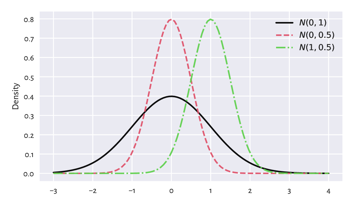
Figure 6.1 The probability density functions of some normal distributions \(\mathrm{N}(\mu, \sigma)\). Note that \(\mu\) is responsible for shifting and \(\sigma\) affects scaling/stretching of the probability mass.
6.1.1. Estimating parameters
A course in mathematical statistics, may tell us that the sample arithmetic mean \(\bar{x}\) and standard deviation \(s\) are natural, statistically well-behaving estimators of the said parameters. If all observations are really drawn independently from \(\mathrm{N}(\mu, \sigma)\) each, then we will expect \(\bar{x}\) and \(s\) to be equal to, more or less, \(\mu\) and \(\sigma\). Furthermore, the larger the sample size, the smaller the error.
Recall the heights (females from the NHANES study)
dataset and its bell-shaped histogram
in Figure 4.2.
heights = np.genfromtxt("https://raw.githubusercontent.com/gagolews/" +
    "teaching-data/master/marek/nhanes_adult_female_height_2020.txt")
n = len(heights)
n
## 4221
Let’s estimate the said parameters of the normal distribution:
mu = np.mean(heights)
sigma = np.std(heights, ddof=1)
mu, sigma
## (160.13679222932953, 7.062858532891359)
Mathematically, we will denote these two by
\(\hat{\mu}\) and \(\hat{\sigma}\) (mu and sigma with a hat) to emphasise that
they are merely guesstimates of the unknown theoretical parameters
\(\mu\) and \(\sigma\) describing the whole population.
On a side note, in this context,
the requested ddof=1 estimator has slightly better statistical properties.
Figure 6.2 shows the fitted density function, i.e., the PDF of \(\mathrm{N}(160.1, 7.06)\), which we computed using scipy.stats.norm.pdf, on top of a histogram.
plt.hist(heights, density=True, color="lightgray", edgecolor="black")
x = np.linspace(np.min(heights), np.max(heights), 1000)
plt.plot(x, scipy.stats.norm.pdf(x, mu, sigma), "r--",
    label=f"PDF of N({mu:.1f}, {sigma:.2f})")
plt.ylabel("Density")
plt.legend()
plt.show()
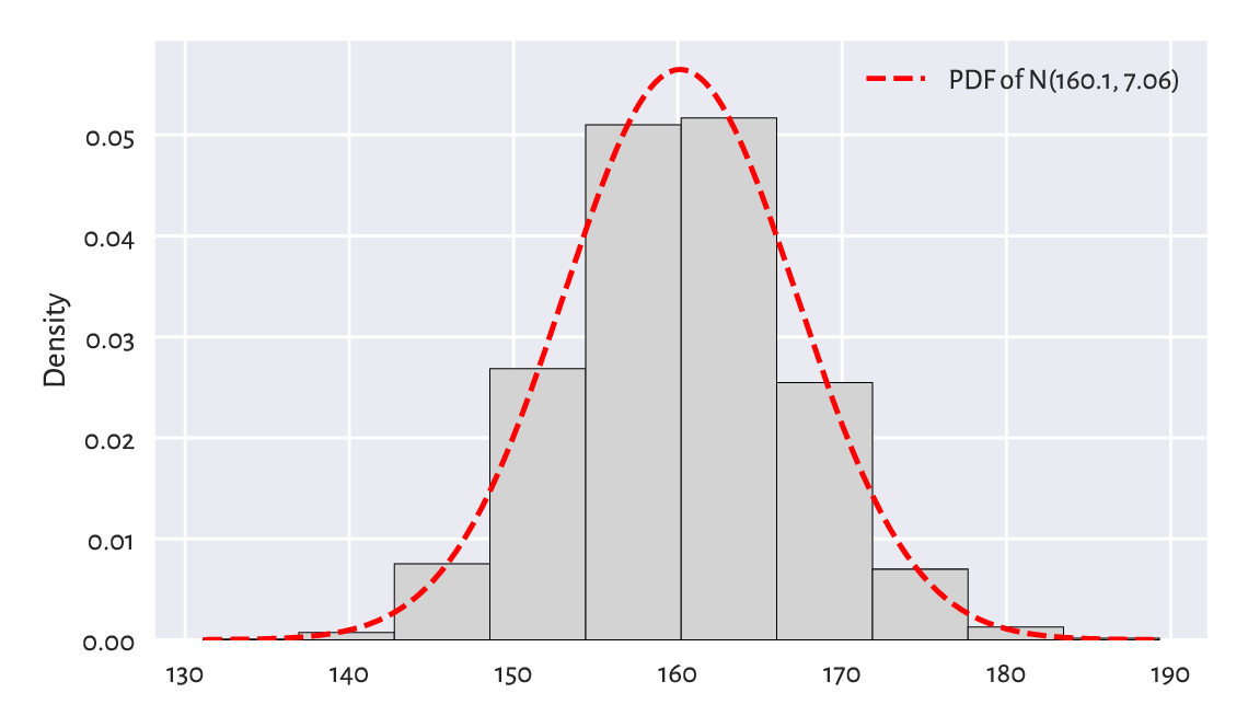
Figure 6.2 A histogram for the heights dataset and the probability density function of the fitted normal distribution.
We passed density=True to matplotlib.pyplot.hist
to normalise the bars’ heights so that their total area is 1.
At first glimpse, the density matches the histogram nicely. Before proceeding with an overview of the ways to assess the goodness-of-fit more rigorously, we should heap praise on the potential benefits of getting access to idealised models of our datasets.
6.1.2. Data models are useful
If (provided that, assuming that, on condition that) our sample is really a realisation of the independent random variables following a given distribution, or a data analyst judges that such an approximation might be justified or beneficial, then we can reduce them to merely a few parameters.
We can risk assuming that the heights data follow the normal distribution (assumption 1) with parameters \(\mu=160.1\) and \(\sigma=7.06\) (assumption 2). Note that the choice of the distribution family is one thing, and the way[2] we estimate the underlying parameters (in our case, we use the aforementioned \(\hat{\mu}\) and \(\hat{\sigma}\)) is another.
Creating a data model only saves storage space and computational time, but also – based on what we can learn from a course in probability and statistics (by appropriately integrating the normal PDF) – we can imply the facts such as:
c. 68% of (i.e., a majority) women are \(\mu\pm \sigma\) tall (the \(1\sigma\) rule),
c. 95% of (i.e., the most typical) women are \(\mu\pm 2\sigma\) tall (the \(2\sigma\) rule),
c. 99.7% of (i.e., almost all) women are \(\mu\pm 3\sigma\) tall (the \(3\sigma\) rule).
Also, if we knew that the distribution of heights of men is also normal with some other parameters (spoiler alert: \(\mathrm{N}(173.8, 7.66)\)), we could make some comparisons between the two samples. For example, we could compute the probability that a passerby who is 155 cm tall is actually a man.
How different manufacturing industries (e.g., clothing) can make use of such models? Are simplifications necessary when dealing with complexity of the real world? What are the alternatives?
Furthermore, assuming a particular model gives us access to a range of parametric statistical methods (ones that are derived for the corresponding family of probability distributions), e.g., the t-test to compare the expected values.
Important
We should always verify the assumptions of the tool at hand before we apply it in practice. In particular, we will soon discover that the UK annual incomes are not normally distributed. Therefore, we must not refer to the aforementioned \(2\sigma\) rule in their case. A hammer neither barks nor can it serve as a screwdriver. Period.
6.2. Assessing goodness-of-fit
6.2.1. Comparing cumulative distribution functions
Bell-shaped histograms are encountered fairly frequently in real-world data: e.g., measurement errors in physical experiments and standardised tests’ results (like IQ and other ability scores) tend to be distributed this way, at least approximately. If we yearn for more precision, there is a better way of assessing the extent to which a sample deviates from a hypothesised distribution. Namely, we can measure the discrepancy between some theoretical cumulative distribution function (CDF) and the empirical one (ECDF which we defined in Section 4.3.8).
Important
If \(f\) is a PDF, then the corresponding theoretical CDF is defined as \(F(x) = \int_{-\infty}^x f(t)\,dt\), i.e., the probability of the corresponding random variable’s being less than or equal to \(x\). By definition[3], each CDF takes values in the unit interval (\([0, 1]\)) and is nondecreasing.
For the normal distribution family, the values of the theoretical CDF can be computed by calling scipy.stats.norm.cdf; compare Figure 6.4 below.
Figure 6.3 depicts the CDF of \(\mathrm{N}(160.1, 7.06)\)
and the empirical CDF of the heights dataset.
This looks like a superb match.
x = np.linspace(np.min(heights), np.max(heights), 1001)
probs = scipy.stats.norm.cdf(x, mu, sigma)  # sample the CDF at many points
plt.plot(x, probs, "r--", label=f"CDF of N({mu:.1f}, {sigma:.2f})")
heights_sorted = np.sort(heights)
plt.plot(heights_sorted, np.arange(1, n+1)/n,
    drawstyle="steps-post", label="Empirical CDF")
plt.xlabel("$x$")
plt.ylabel("Prob(height $\\leq$ x)")
plt.legend()
plt.show()
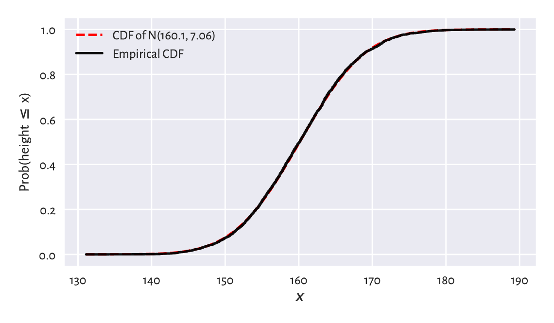
Figure 6.3 The empirical CDF and the fitted normal CDF for the heights dataset: the fit is superb.
\(F(b)-F(a)=\int_{a}^b f(t)\,dt\) is the probability of generating a value in the interval \([a, b]\). Let’s compute the probability related to the \(3\sigma\) rule:
F = lambda x: scipy.stats.norm.cdf(x, mu, sigma)
F(mu+3*sigma) - F(mu-3*sigma)
## 0.9973002039367398
A common way to summarise the discrepancy between the empirical CDF \(\hat{F}_n\) and a given theoretical CDF \(F\) is by computing the greatest absolute deviation:
where the supremum is a continuous version of the maximum. We have:
i.e., \(F\) needs to be probed only at the \(n\) points from the sorted input sample.
def compute_Dn(x, F):  # equivalent to scipy.stats.kstest(x, F)[0]
    Fx = F(np.sort(x))
    n = len(x)
    k = np.arange(1, n+1)  # 1, 2, ..., n
    Dn1 = np.max(np.abs((k-1)/n - Fx))
    Dn2 = np.max(np.abs(k/n - Fx))
    return max(Dn1, Dn2)
If the difference is sufficiently[4] small, then we can assume that the normal model describes data quite well.
Dn = compute_Dn(heights, F)
Dn
## 0.010470976524201148
This is indeed the case here: we may estimate the probability of someone’s being as tall as the given height with an error less than about 1.05%.
6.2.2. Comparing quantiles
A Q-Q plot (quantile-quantile or probability plot) is another graphical method for comparing two distributions. This time, instead of working with a cumulative distribution function \(F\), we will be dealing with the related quantile function \(Q\).
Important
Given a continuous[5] CDF \(F\), the corresponding quantile function \(Q\) is exactly its inverse, i.e., we have \(Q(p)=F^{-1}(p)\) for all \(p\in(0, 1)\).
The theoretical quantiles can be generated by the scipy.stats.norm.ppf function; compare Figure 6.4. Here, ppf stands for the percent point function which is another (yet quite esoteric) name for the above \(Q\).
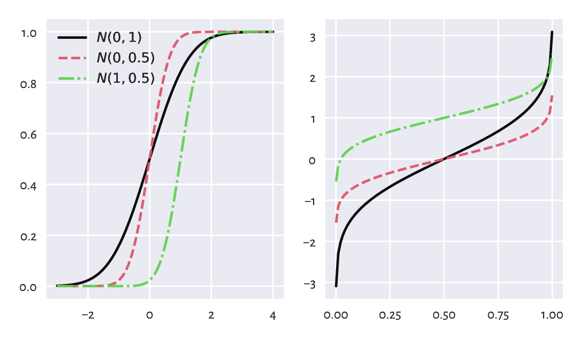
Figure 6.4 The cumulative distribution functions (left) and the quantile functions (being the inverse of the CDF; right) of some normal distributions.
In our \(\mathrm{N}(160.1, 7.06)\)-distributed heights dataset,
\(Q(0.9)\) is the height not exceeded by 90% of the female population.
In other words, only 10% of American women are taller than:
scipy.stats.norm.ppf(0.9, mu, sigma)
## 169.18820963937648
A Q-Q plot draws the sample quantiles against the corresponding theoretical quantiles. In Section 5.1.1.3, we mentioned that there are a few possible definitions thereof in the literature. Thus, we have some degree of flexibility. For simplicity, instead of using numpy.quantile, we will assume that the \(i/(n+1)\)-quantile[6] is equal to \(x_{(i)}\), i.e., the \(i\)-th smallest value in a given sample \((x_1,x_2,\dots,x_n)\) and consider only \(i=1, 2, \dots, n\). This way, we mitigate the problem which arises when the 0- or 1-quantiles of the theoretical distribution, i.e., \(Q(0)\) or \(Q(1)\), are not finite (and this is the case for the normal distribution family).
def qq_plot(x, Q):
    """
    Draws a Q-Q plot, given:
    * x - a data sample (vector)
    * Q - a theoretical quantile function
    """
    n = len(x)
    q = np.arange(1, n+1)/(n+1)    # 1/(n+1), 2/(n+2), ..., n/(n+1)
    x_sorted = np.sort(x)          # sample quantiles
    quantiles = Q(q)               # theoretical quantiles
    plt.plot(quantiles, x_sorted, "o")
    plt.axline((x_sorted[n//2], x_sorted[n//2]), slope=1,
        linestyle=":", color="gray")  # identity line
Figure 6.5 depicts the Q-Q plot for our example dataset.
qq_plot(heights, lambda q: scipy.stats.norm.ppf(q, mu, sigma))
plt.xlabel(f"Quantiles of N({mu:.1f}, {sigma:.2f})")
plt.ylabel("Sample quantiles")
plt.show()
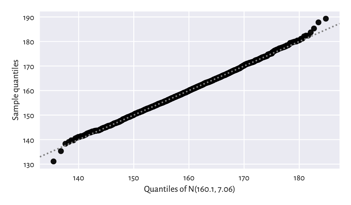
Figure 6.5 The Q-Q plot for the heights dataset. It is a nice fit.
Ideally, we wish that the points would be arranged on the \(y=x\) line. In our case, there are small discrepancies[7] in the tails (e.g., the smallest observation was slightly smaller than expected, and the largest one was larger than expected), although it is common a behaviour for small samples and certain distribution families. However, overall, we can say that we observe a fine fit.
6.2.3. Kolmogorov–Smirnov test (*)
To be more scientific, we can introduce a more formal method for assessing the quality of fit. It will enable us to test the null hypothesis stating that a given empirical distribution \(\hat{F}_n\) does not differ significantly from the theoretical continuous CDF \(F\):
The popular goodness-of-fit test by Kolmogorov and Smirnov can give us a conservative interval of the acceptable values of the largest deviation between the empirical and theoretical CDF, \(\hat{D}_n\), as a function of \(n\).
Namely, if the test statistic \(\hat{D}_n\) is smaller than some critical value \(K_n\), then we shall deem the difference insignificant. This is to take into account the fact that reality might deviate from the ideal. Section 6.4.4 mentions that even for samples that truly come from a hypothesised distribution, there is some inherent variability. We need to be somewhat tolerant.
An authoritative textbook in mathematical statistics will tell us (and prove) that, under the assumption that \(\hat{F}_n\) is the ECDF of a sample of \(n\) independent variables really generated from a continuous CDF \(F\), the random variable \(\hat{D}_n = \sup_{t\in\mathbb{R}} | \hat{F}_n(t) - F(t) |\) follows the Kolmogorov distribution with parameter \(n\).
In other words, if we generate many samples of length \(n\) from \(F\), and compute \(\hat{D}_n\)s for each of them, we expect it to be distributed like in Figure 6.6, which we obtained by referring to scipy.stats.kstwo.
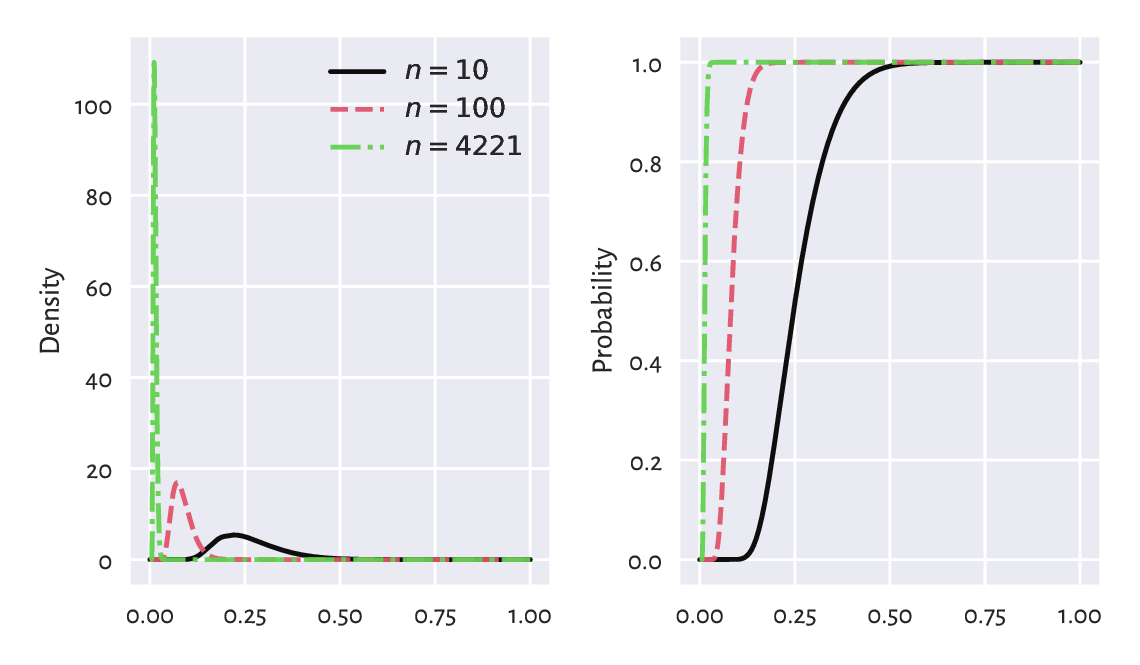
Figure 6.6 Densities (left) and cumulative distribution functions (right) of some Kolmogorov distributions. The greater the sample size, the smaller the acceptable deviations between the theoretical and empirical CDFs.
The choice of the critical value \(K_n\) involves a trade-off between our desire to:
accept the null hypothesis when it is true (data really come from \(F\)), and
reject it when it is false (data follow some other distribution, i.e., the difference is significant enough).
These two needs are, unfortunately, mutually exclusive.
In the framework of frequentist hypothesis testing, we assume some fixed upper bound (significance level) for making the former kind of mistake, which we call the type-I error. A nicely conservative (in a good way) value that we suggest employing is \(\alpha=0.001=0.1\%\), i.e., only 1 out of 1000 samples that really come from \(F\) will be rejected as not coming from \(F\).
Such a \(K_n\) may be determined by considering the inverse of the CDF of the Kolmogorov distribution, \(\Xi_n\). Namely, \(K_n=\Xi_n^{-1}(1-\alpha)\):
alpha = 0.001  # significance level
scipy.stats.kstwo.ppf(1-alpha, n)
## 0.029964456376393188
In our case \(\hat{D}_n < K_n\) because \(0.01047 < 0.02996\).
We conclude that our empirical (heights) distribution
does not differ significantly (at significance level \(0.1\%\))
from the assumed one, i.e., \(\mathrm{N}(160.1, 7.06)\).
In other words, we do not have enough evidence against the statement
that data are normally distributed. It is the presumption of innocence:
they are normal enough.
We will return to this discussion in Section 6.4.4 and Section 12.2.6.
6.3. Other noteworthy distributions
6.3.1. Log-normal distribution
We say that a sample is log-normally distributed, if its logarithm is normally distributed. Such a behaviour is frequently observed in biology and medicine (size of living tissue), social sciences (number of sexual partners), or technology (file sizes). Figure 6.7 suggests that it might also be true in the case of the UK taxpayers’ incomes[8].
income = np.genfromtxt("https://raw.githubusercontent.com/gagolews/" +
    "teaching-data/master/marek/uk_income_simulated_2020.txt")
plt.hist(np.log(income), bins=30, color="lightgray", edgecolor="black")
plt.ylabel("Count")
plt.show()
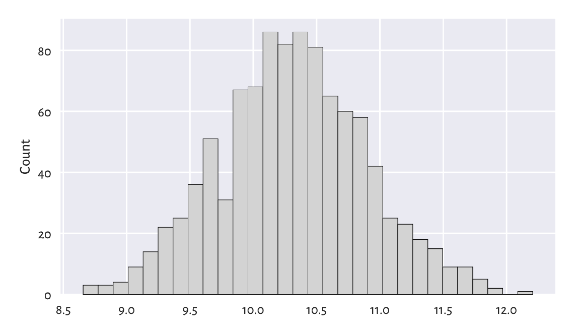
Figure 6.7 A histogram of the logarithm of incomes.
Let’s thus proceed with the fitting of a log-normal model, \(\mathrm{LN}(\mu, \sigma)\). The procedure is similar to the normal case, but this time we determine the mean and standard deviation based on the logarithms of the observations:
lmu = np.mean(np.log(income))
lsigma = np.std(np.log(income), ddof=1)
lmu, lsigma
## (10.314409794364623, 0.5816585197803816)
Unintuitively, scipy.stats.lognorm identifies a distribution via the parameter \(s\) equal to \(\sigma\) and scale equal to \(e^\mu\). Computing the PDF at different points must thus be done as follows:
x  = np.linspace(np.min(income), np.max(income), 101)
fx = scipy.stats.lognorm.pdf(x, s=lsigma, scale=np.exp(lmu))
Figure 6.8 depicts the histograms on the log- and original scale together with the fitted probability density function. On the whole, the fit is not too bad; after all, we are only dealing with a sample of 1000 households. The original UK Office of National Statistics data could tell us more about the quality of this model in general, but it is beyond the scope of our simple exercise.
plt.subplot(1, 2, 1)
logbins = np.geomspace(np.min(income), np.max(income), 31)
plt.hist(income, bins=logbins, density=True,
    color="lightgray", edgecolor="black")
plt.plot(x, fx, "r--")
plt.xscale("log")  # log-scale on the x-axis
plt.ylabel("Density")

plt.subplot(1, 2, 2)
plt.hist(income, bins=30, density=True, color="lightgray", edgecolor="black")
plt.plot(x, fx, "r--", label=f"PDF of LN({lmu:.1f}, {lsigma:.2f})")
plt.ylabel("Density")
plt.legend()

plt.show()
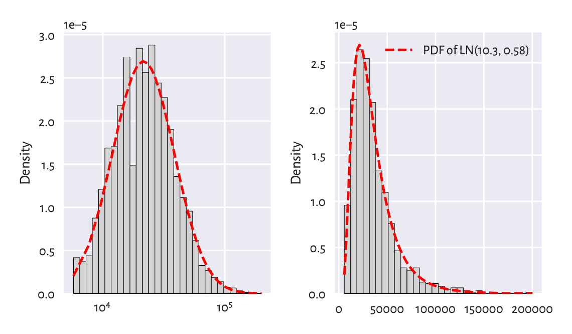
Figure 6.8 A histogram and the probability density function of the fitted log-normal distribution for the income dataset, on log- (left) and original (right) scale.
Next, the left side of Figure 6.9 gives the quantile-quantile plot for the above log-normal model (note the double logarithmic scale). Additionally, on the right, we check the sensibility of the normality assumption (using a “normal” normal distribution, not its “log” version).
plt.subplot(1, 2, 1)
qq_plot(  # see above for the definition
    income,
    lambda q: scipy.stats.lognorm.ppf(q, s=lsigma, scale=np.exp(lmu))
)
plt.xlabel(f"Quantiles of LN({lmu:.1f}, {lsigma:.2f})")
plt.ylabel("Sample quantiles")
plt.xscale("log")
plt.yscale("log")

plt.subplot(1, 2, 2)
mu = np.mean(income)
sigma = np.std(income, ddof=1)
qq_plot(income, lambda q: scipy.stats.norm.ppf(q, mu, sigma))
plt.xlabel(f"Quantiles of N({mu:.1f}, {sigma:.2f})")

plt.show()
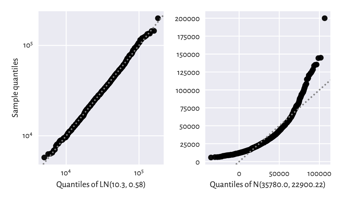
Figure 6.9 The Q-Q plots for the income dataset vs the fitted log-normal (good fit; left) and normal (bad fit; right) distribution.
Graphically compare the ECDF for income
and the CDF of \(\mathrm{LN}(10.3, 0.58)\).
(*) Perform the Kolmogorov–Smirnov goodness-of-fit test as in Section 6.2.3, to verify that the hypothesis of log-normality is not rejected at the \(\alpha=0.001\) significance level. At the same time, the income distribution significantly differs from a normal one.
The hypothesis that our data follow a normal distribution is most likely false. On the other hand, the log-normal model might be adequate. We can again reduce the whole dataset to merely two numbers, \(\mu\) and \(\sigma\), based on which (and probability theory), we may deduce that:
the expected average (mean) income is \(e^{\mu + \sigma^2/2}\),
median is \(e^\mu\),
the most probable value (mode) in \(e^{\mu-\sigma^2}\),
and so forth.
Note
Recall again that for skewed a distribution such as the log-normal one, reporting the mean might be misleading. This is why most people are sceptical when they read the news about our prospering economy (“yeah, we’d like to see that kind of money in our pockets”). It is not only \(\mu\) that matters, but also \(\sigma\) that quantifies the discrepancy between the rich and the poor.
For a normal distribution, the situation is vastly different. The mean, the median, and the most probable outcomes are the same: the distribution is symmetric around \(\mu\).
What is the fraction of people with earnings below the mean in our \(\mathrm{LN}(10.3, 0.58)\) model? Hint: use scipy.stats.lognorm.cdf to get the answer.
6.3.2. Pareto distribution
Consider again the populations of the US cities:
cities = np.genfromtxt("https://raw.githubusercontent.com/gagolews/" +
    "teaching-data/master/other/us_cities_2000.txt")
len(cities), sum(cities)  # number of cities, total population
## (19447, 175062893.0)
Figure 6.10 gives the histogram of the city sizes on the log-scale. It looks like a log-normal distribution again, which the readers can fit themselves when they are feeling playful and have nothing better to do. (But, honestly, is there anything more delightful than doing stats?)
logbins = np.geomspace(np.min(cities), np.max(cities), 21)
plt.hist(cities, bins=logbins, color="lightgray", edgecolor="black")
plt.xscale("log")
plt.ylabel("Count")
plt.show()
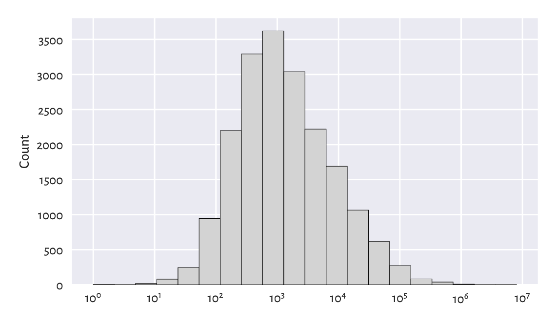
Figure 6.10 A histogram of the unabridged cities dataset. Note the log-scale on the x-axis.
This time, however, we will be concerned with not what is typical, but what is in some sense anomalous or extreme. Just like in Section 4.3.7, let’s look at the truncated version of the city size distribution by considering the cities with 10 000 or more inhabitants.
s = 10_000
large_cities = cities[cities >= s]  # a right tail of the original dataset
len(large_cities), sum(large_cities)  # number of cities, total population
## (2696, 146199374.0)
Plotting it on a double logarithmic scale
can be performed by calling additionally
plt.yscale("log"), which is left as an exercise.
Doing so will lead to a picture similar to Figure 6.11,
which reveals something remarkable. The bar tops on the
double log-scale are arranged more or less in a straight line.
There are many datasets that exhibit this behaviour.
We say that they follow a power law (power in the arithmetic sense, not
the political one); see, e.g., [3].
The Pareto distribution (type I) family has a prototypical power law-like density. It is identified by two parameters:
the (what scipy calls it) scale parameter \(s>0\) is equal to the shift from \(0\),
the shape parameter, \(\alpha>0\), controls the slope of the said line on the double log-scale.
The probability density function of \(\mathrm{P}(\alpha, s)\) is given for \(x\ge s\) by:
and \(f(x)=0\) if \(x < s\).
\(s\) is usually taken as the sample minimum (i.e., 10 000 in our case). \(\alpha\) can be estimated through the reciprocal of the mean of the scaled logarithms of our observations:
alpha = 1/np.mean(np.log(large_cities/s))
alpha
## 0.9496171695997675
The left side of Figure 6.11 compares the theoretical density and an empirical histogram on the double log-scale. The right part gives the corresponding Q-Q plot on a double logarithmic scale. We see that the populations of the largest cities are overestimated. The model could be better, but the cities are still growing, aren’t they?
plt.subplot(1, 2, 1)
logbins = np.geomspace(s, np.max(large_cities), 21)  # bin boundaries
plt.hist(large_cities, bins=logbins, density=True,
    color="lightgray", edgecolor="black")
plt.plot(logbins, scipy.stats.pareto.pdf(logbins, alpha, scale=s),
    "r--", label=f"PDF of P({alpha:.3f}, {s})")
plt.ylabel("Density")
plt.xscale("log")
plt.yscale("log")
plt.legend()

plt.subplot(1, 2, 2)
qq_plot(large_cities, lambda q: scipy.stats.pareto.ppf(q, alpha, scale=s))
plt.xlabel(f"Quantiles of P({alpha:.3f}, {s})")
plt.ylabel("Sample quantiles")
plt.xscale("log")
plt.yscale("log")

plt.show()
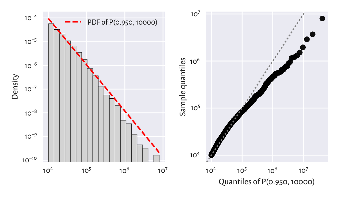
Figure 6.11 A histogram (left) and a Q-Q plot (right) of the large_cities dataset vs the fitted density of a Pareto distribution on a double log-scale.
(*) We might also be keen on verifying how accurately the probability of a randomly selected city’s being at least of a given size can be predicted. Let’s denote by \(S(x)=1-F(x)\) the complementary cumulative distribution function (CCDF; sometimes referred to as the survival function), and by \(\hat{S}_n(x)=1-\hat{F}_n(x)\) its empirical version. Figure 6.12 compares the empirical and the fitted CCDFs with probabilities on the linear- and log-scale.
x = np.geomspace(np.min(large_cities), np.max(large_cities), 1001)
probs = scipy.stats.pareto.cdf(x, alpha, scale=s)
n = len(large_cities)
for i in [1, 2]:
    plt.subplot(1, 2, i)
    plt.plot(x, 1-probs, "r--", label=f"CCDF of P({alpha:.3f}, {s})")
    plt.plot(np.sort(large_cities), 1-np.arange(1, n+1)/n,
        drawstyle="steps-post", label="Empirical CCDF")
    plt.xlabel("$x$")
    plt.xscale("log")
    plt.yscale(["linear", "log"][i-1])
    if i == 1:
        plt.ylabel("Prob(city size > x)")
        plt.legend()
plt.show()
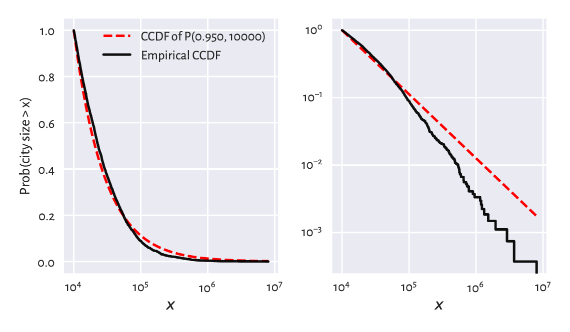
Figure 6.12 The empirical and theoretical complementary cumulative distribution functions for the large_cities dataset with probabilities on the linear- (left) and log-scale (right) and city sizes on the log-scale.
In terms of the maximal absolute distance between the two functions, \(\hat{D}_n\), from the left plot we see that the fit seems acceptable. Still, let’s stress that the log-scale overemphasises the relatively minor differences in the right tail and should not be used for judging the value of \(\hat{D}_n\).
However, that the Kolmogorov–Smirnov goodness-of-fit test rejects the hypothesis of Paretianity (at a significance level \(0.1\%\)) is left as an exercise for the reader.
6.3.3. Uniform distribution
In the Polish Lotto lottery, six numbered balls \(\{1,2,\dots,49\}\) are drawn without replacement from an urn. Here is a dataset that summarises the number of times each ball has been drawn in all the games in the period 1957–2016:
lotto = np.genfromtxt("https://raw.githubusercontent.com/gagolews/" +
    "teaching-data/master/marek/lotto_table.txt")
lotto
## array([720., 720., 714., 752., 719., 753., 701., 692., 716., 694., 716.,
##        668., 749., 713., 723., 693., 777., 747., 728., 734., 762., 729.,
##        695., 761., 735., 719., 754., 741., 750., 701., 744., 729., 716.,
##        768., 715., 735., 725., 741., 697., 713., 711., 744., 652., 683.,
##        744., 714., 674., 654., 681.])
All events seem to occur more or less with the same probability. Of course, the numbers on the balls are integer, but in our idealised scenario, we may try modelling this dataset using a continuous uniform distribution \(\mathrm{U}(a, b)\), which yields arbitrary real numbers on a given interval \((a, b)\), i.e., between some \(a\) and \(b\). Its probability density function is given for \(x\in(a, b)\) by:
and \(f(x)=0\) otherwise.
Notice that scipy.stats.uniform
uses parameters a and scale, the latter being equal to our \(b-a\).
In the Lotto case, it makes sense to set \(a=1\) and \(b=50\) and interpret an outcome like 49.1253 as representing the 49th ball (compare the notion of the floor function, \(\lfloor x\rfloor\)).
x = np.linspace(1, 50, 1001)
plt.bar(np.arange(1, 50), width=1, height=lotto/np.sum(lotto),
    color="lightgray", edgecolor="black", alpha=0.8, align="edge")
plt.plot(x, scipy.stats.uniform.pdf(x, 1, scale=49), "r--",
    label="PDF of U(1, 50)")
plt.ylim(0, 0.025)
plt.legend()
plt.show()
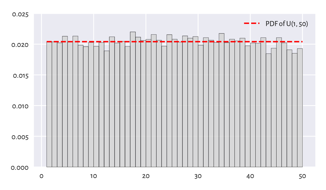
Figure 6.13 A histogram of the lotto dataset.
Visually, see Figure 6.13, this model makes much sense, but again, some more rigorous statistical testing would be required to determine if someone has not been tampering with the lottery results, i.e., if data do not deviate from the uniform distribution significantly. Unfortunately, we cannot use the Kolmogorov–Smirnov test in the foregoing version as data are not continuous. See, however, Section 11.4.3 for the Pearson chi-squared test which is applicable here.
Does playing lotteries and engaging in gambling make rational sense at all, from the perspective of an individual player? Well, we see that 16 is the most frequently occurring outcome in Lotto, maybe there’s some magic in it? Also, some people sometimes became millionaires, don’t they?
Note
In data modelling (e.g., Bayesian statistics), sometimes a uniform distribution is chosen as a placeholder for “we know nothing about a phenomenon, so let’s just assume that every event is equally likely”. Nonetheless, it is fascinating that in the end, the real world tends to be structured. Patterns that emerge are plentiful, and most often they are far from being uniformly distributed. Even more strikingly, they are subject to quantitative analysis.
6.3.4. Distribution mixtures (*)
Certain datasets may fail to fit through simple probabilistic models. It may sometimes be due to their non-random behaviour: statistics gives one of many means to create data idealisations, but in data science we can also employ partial differential equations, graphs and complex networks, agent-based modelling, cellular automata, amongst many others. They all might be worth giving a study (and then try).
It may also happen that what we observe is, in fact, a mixture of simpler processes. The dataset representing the December 2021 hourly averages pedestrian counts near the Southern Cross Station in Melbourne is a likely instance of such a scenario; compare Figure 4.5.
peds = np.genfromtxt("https://raw.githubusercontent.com/gagolews/" +
    "teaching-data/master/marek/southern_cross_station_peds_2019_dec.txt")
It might not be a bad idea to try to fit a probabilistic (convex) combination of three normal distributions \(f_1\), \(f_2\), \(f_3\), corresponding to the morning, lunchtime, and evening pedestrian count peaks. This yields the PDF:
for some coefficients \(w_1,w_2,w_3\ge 0\) such that \(w_1+w_2+w_3=1\).
Figure 6.14 depicts a mixture of \(\mathrm{N}(8.4, 0.9)\), \(\mathrm{N}(14.2, 4)\), and \(\mathrm{N}(17.3, 0.9)\) with the corresponding weights of \(0.27\), \(0.53\), and \(0.2\). This dataset is coarse-grained: we only have 24 bar heights at our disposal. Consequently, the estimated[9] coefficients should be taken with a pinch of Sichuan pepper.
plt.bar(np.arange(24)+0.5, width=1, height=peds/np.sum(peds),
    color="lightgray", edgecolor="black", alpha=0.8)
x = np.linspace(0, 24, 101)
p1 = scipy.stats.norm.pdf(x,  8.4, 0.9)
p2 = scipy.stats.norm.pdf(x, 14.2, 4.0)
p3 = scipy.stats.norm.pdf(x, 17.3, 0.9)
p = 0.27*p1 + 0.53*p2 + 0.20*p3  # a weighted combination of three densities
plt.plot(x, p, "r--", label="PDF of a normal mixture")
plt.xticks([0, 6, 12, 18, 24])
plt.legend()
plt.show()
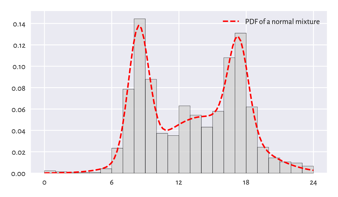
Figure 6.14 A histogram of the peds dataset and an estimated mixture of three normal distributions.
Important
More complex entities (models, methods) frequently arise as combinations of simpler (primitive) components. This is why we ought to spend a great deal of time studying the fundamentals.
Note
Some data clustering techniques (in particular, the \(k\)-means algorithm that we briefly discuss later in this course) can be used to split a data sample into disjoint chunks corresponding to different mixture components. Also, it might be the case that the subpopulations are identified by another categorical variable that divides the dataset into natural groups; compare Chapter 12.
6.4. Generating pseudorandom numbers
A probability distribution is useful not only for describing a dataset. It also enables us to perform many experiments on data that we do not currently have, but we might obtain in the future, to test various scenarios and hypotheses. Let’s thus discuss some methods for generating random samples of independent (not related to each other) observations.
6.4.1. Uniform distribution
When most people say random, they implicitly mean uniformly distributed. For example:
np.random.rand(5)
## array([0.69646919, 0.28613933, 0.22685145, 0.55131477, 0.71946897])
gives five observations sampled independently from the uniform distribution on the unit interval, i.e., \(\mathrm{U}(0, 1)\). Here is the same with scipy, but this time the support is \((-10, 15)\).
scipy.stats.uniform.rvs(-10, scale=25, size=5)  # from -10 to -10+25
## array([ 0.5776615 , 14.51910496,  7.12074346,  2.02329754, -0.19706205])
Alternatively, we could have shifted and scaled the output of the
random number generator on the unit interval using the formula
numpy.random.rand(5)*25-10.
6.4.2. Not exactly random
We generate numbers using a computer, which is a purely deterministic machine. Albeit they are indistinguishable from truly random when subject to rigorous tests for randomness, we refer to them as pseudorandom or random-like ones.
To prove that they are not random-random, let’s set a specific initial state of the generator (the seed) and inspect what values are produced:
np.random.seed(123)  # set the seed (the ID of the initial state)
np.random.rand(5)
## array([0.69646919, 0.28613933, 0.22685145, 0.55131477, 0.71946897])
Now, let’s set the same seed and see how “random” the next values are:
np.random.seed(123)  # set seed
np.random.rand(5)
## array([0.69646919, 0.28613933, 0.22685145, 0.55131477, 0.71946897])
Nobody expected that. Such a behaviour is very welcome, though. It enables us to perform completely reproducible numerical experiments, and truly scientific inquiries tend to nourish identical results under the same conditions.
Note
If we do not set the seed manually, it will be initialised based on the current wall time, which is different every… time. As a result, the numbers will seem random to us, but only because we are slightly ignorant.
Many Python packages that we refer to in the sequel,
including pandas and scikit-learn, rely
on numpy’s random number generator.
To harness them, we will have to become used to calling
numpy.random.seed. Additionally, some of them
(e.g., sklearn.model_selection.train_test_split
or pandas.DataFrame.sample) will be equipped with
the random_state argument, which behaves as if we temporarily changed
the seed (for just one call to that function). For instance:
scipy.stats.uniform.rvs(size=5, random_state=123)
## array([0.69646919, 0.28613933, 0.22685145, 0.55131477, 0.71946897])
We obtained the same sequence again.
6.4.3. Sampling from other distributions
Generating data from other distributions is possible too; there are many rvs methods implemented in scipy.stats. For example, here is a sample from \(\mathrm{N}(160.1, 7.06)\):
scipy.stats.norm.rvs(160.1, 7.06, size=3, random_state=50489)
## array([166.01775384, 136.7107872 , 185.30879579])
Pseudorandom deviates from the standard normal distribution, i.e., \(\mathrm{N}(0, 1)\), can also be generated using numpy.random.randn. As \(\mathrm{N}(160.1, 7.06)\) is a scaled and shifted version thereof, the preceding is equivalent to:
np.random.seed(50489)
np.random.randn(3)*7.06 + 160.1
## array([166.01775384, 136.7107872 , 185.30879579])
Important
Conclusions based on simulated data are trustworthy for they cannot be manipulated. Or can they?
The above pseudorandom number generator’s seed,
50489, is a bit suspicious. It may suggest that someone
wanted to prove some point (in this case, the violation
of the \(3\sigma\) rule).
This is why we recommend sticking to only one seed,
e.g., 123, or – when performing simulations – setting
the consecutive natural seeds in each iteration
of the for loop: 1, 2, ….
Generate 1000 pseudorandom numbers from the log-normal distribution and draw its histogram.
Note
(*) Having a reliable pseudorandom number generator from the uniform distribution on the unit interval is crucial as sampling from other distributions usually involves transforming the independent \(\mathrm{U}(0, 1)\) variates. For instance, realisations of random variables following any continuous cumulative distribution function \(F\) can be constructed through the inverse transform sampling:
Generate a sample \(x_1,\dots,x_n\) independently from \(\mathrm{U}(0, 1)\).
Transform each \(x_i\) by applying the quantile function, \(y_i=F^{-1}(x_i)\).
Now \(y_1,\dots,y_n\) follows the CDF \(F\).
(*) Generate 1000 pseudorandom numbers from the log-normal distribution using inverse transform sampling.
(**) Generate 1000 pseudorandom numbers from the distribution mixture discussed in Section 6.3.4.
6.4.4. Natural variability
Even a sample truly generated from a specific distribution will deviate from it, sometimes considerably. Such effects will be especially visible for small sample sizes, but they usually dissolve[10] when the availability of data increases.
For example, Figure 6.15 depicts the histograms of nine different samples of size 100, all drawn independently from the standard normal distribution.
plt.figure(figsize=(plt.rcParams["figure.figsize"][0], )*2)  # width=height
for i in range(9):
    plt.subplot(3, 3, i+1, xlim=(-4, 4), ylim=(0, 0.6), ylabel=None)
    sample = scipy.stats.norm.rvs(size=100, random_state=i+1)
    plt.hist(sample, density=True, bins=10,
        color="lightgray", edgecolor="black")
plt.legend()
plt.show()
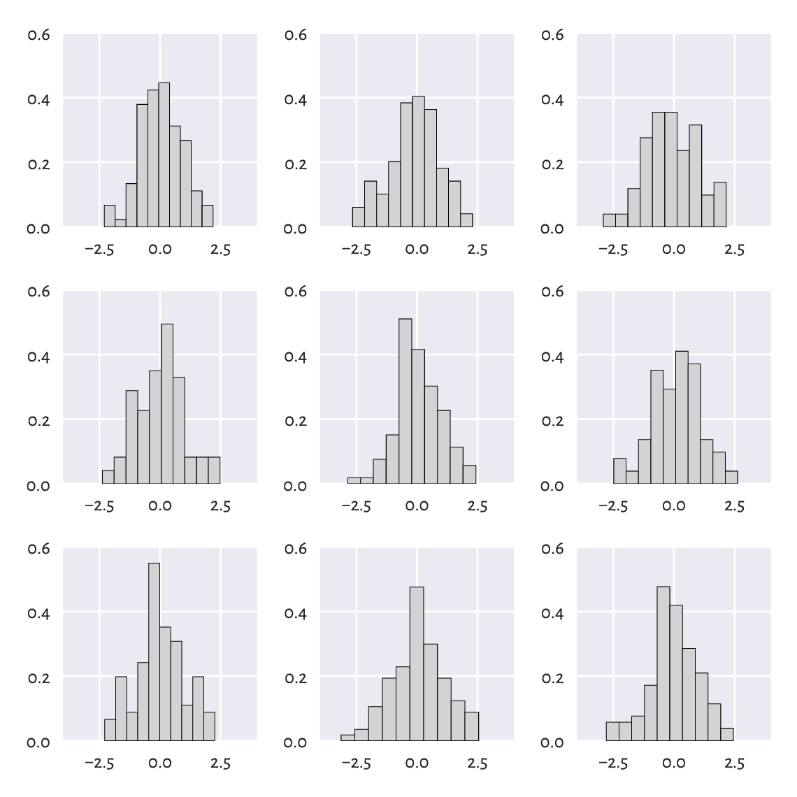
Figure 6.15 All nine samples are normally distributed.
There is a certain ruggedness in the bar sizes that a naïve observer would try to interpret as something meaningful. Competent data scientists train their eyes to ignore such impurities. In this case, they are only due to random effects. Nevertheless, we must always be ready to detect deviations from the assumed model that are worth attention.
Repeat the above experiment for samples of sizes 10, 1 000, and 10 000.
(*) Using a simple Monte Carlo simulation, we can verify (approximately) that the Kolmogorov–Smirnov goodness-of-fit test introduced in Section 6.2.3 has been calibrated properly, i.e., that for samples that really follow the assumed distribution, the null hypothesis is indeed rejected in roughly 0.1% of the cases.
Assume we are interested in the null hypothesis referencing the standard normal distribution, \(\mathrm{N}(160.1, 7.06)\), and sample size \(n=4221\). We need to generate many (we assume 10 000 below) such samples. For each of them, we compute and store the maximal absolute deviation from the theoretical CDF, i.e., \(\hat{D}_n\).
n = 4221
distrib = scipy.stats.norm(160.1, 7.06)  # the assumed distribution
Dns = []
for i in range(10000):  # increase this for better precision
    x = distrib.rvs(size=n, random_state=i+1)  # really follows the distrib.
    Dns.append(compute_Dn(x, distrib.cdf))
Dns = np.array(Dns)
Now let’s compute the proportion of cases which lead to \(\hat{D}_n\) greater than the critical value \(K_n\):
len(Dns[Dns >= scipy.stats.kstwo.ppf(1-0.001, n)]) / len(Dns)
## 0.0008
Its expected value is 0.001. But our approximation is necessarily imprecise because we rely on randomness. Increasing the number of trials from 10 000 to, say, 1 000 000 should make the above estimate closer to the theoretical expectation.
It is also worth checking that the density histogram of Dns resembles
the Kolmogorov distribution that we can compute via
scipy.stats.kstwo.pdf.
(*) It might also be interesting to verify the test’s power,
i.e., the probability that when the null hypothesis is false,
it will actually be rejected.
Modify the above code in such a way that x in the for loop
is not generated from \(\mathrm{N}(160.1, 7.06)\), but
\(\mathrm{N}(140, 7.06)\), \(\mathrm{N}(141, 7.06)\), etc.,
and check the proportion of cases where we deem the sample distribution significantly different from
\(\mathrm{N}(160.1, 7.06)\).
Small deviations from the true location parameter \(\mu\) are usually
ignored, but this improves with sample size \(n\).
6.4.5. Adding jitter (white noise)
We mentioned that measurements might be subject to observational
error. Rounding can also occur as early as in
the data collection phase. In particular, our heights
dataset is precise up to 1 fractional digit.
However, in statistics, when we say that data follow
a continuous distribution, the probability of having two identical
values in a sample is 0. Therefore, some data analysis methods
might assume no ties in the input vector, i.e.,
that all values are unique.
The easiest way to deal with such numerical inconveniences is to add some white noise with the expected value of 0, either uniformly or normally distributed.
For example, for heights, it makes sense to add some jitter from
\(\mathrm{U}[-0.05, 0.05]\):
heights_jitter = heights + (np.random.rand(len(heights))*0.1-0.05)
heights_jitter[:6]  # preview
## array([160.21704623, 152.68870195, 161.24482407, 157.3675293 ,
##        154.61663465, 144.68964596])
Adding noise also might be performed for aesthetic reasons, e.g., when drawing scatter plots.
6.4.6. Independence assumption
Let’s generate nine binary digits in a pseudorandom fashion:
np.random.choice([0, 1], 9)
## array([1, 1, 1, 1, 1, 1, 1, 1, 1])
We can consider ourselves very lucky; all numbers are the same. So, the next number must finally be a “zero”, right?
np.random.choice([0, 1], 1)
## array([1])
Wrong. The numbers we generate are independent of each other. There is no history. In the current model of randomness (Bernoulli trials; two possible outcomes with the same probability), there is a 50% chance of obtaining a “one” regardless of how many “ones” were observed previously.
We should not seek patterns where no regularities exist. Our brain forms expectations about the world, and overcoming them is hard work. This must be done as the reality could not care less about what we consider it to be.
6.5. Further reading
For an excellent general introductory course on probability and statistics, see [40, 41] and also [82, 83]. More advanced students are likely to enjoy other classics such as [5, 9, 19, 28, 46]. To go beyond the basics, check out [26]. Topics in random number generation are covered in [39, 59, 81].
For a more detailed introduction to exploratory data analysis, see the classical books by Tukey [92, 93], Tufte [91], and Wainer [98].
We took the logarithm of the log-normally distributed incomes and obtained a normally distributed sample. In statistical practice, it is not rare to apply different non-linear transforms of the input vectors at the data preprocessing stage (see, e.g., Section 9.2.6). In particular, the Box–Cox (power) transform [12] is of the form \(x\mapsto (x^\lambda-1)/\lambda\) for some \(\lambda\). Interestingly, in the limit as \(\lambda\to 0\), this formula yields \(x\mapsto \log x\) which is exactly what we were applying in this chapter.
Newman et al. [16, 71] give a nice overview of the power-law-like behaviour of some “rich” or otherwise extreme datasets. It is worth noting that the logarithm of a Paretian sample divided by the minimum follows an exponential distribution (which we discuss in Chapter 16). For a comprehensive catalogue of statistical distributions, their properties, and relationships between them, see [29].
6.6. Exercises
Why is the notion of the mean income confusing to the general public?
When manually setting the seed of a pseudorandom number generator makes sense?
Given a log-normally distributed sample x, how can we turn it
to a normally distributed one, i.e., y=f(x),
with f being… what?
What is the \(3\sigma\) rule for normally distributed data?
Can the \(3\sigma\) rule be applied for log-normally distributed data?
(*) How can we verify graphically if a sample follows a hypothesised theoretical distribution?
(*) Explain the meaning of the type I error, significance level, and a test’s power.