12. Processing data in groups
This open-access textbook is, and will remain, freely available for everyone’s enjoyment (also in PDF; a paper copy can also be ordered). It is a non-profit project. Although available online, it is a whole course, and should be read from the beginning to the end. Refer to the Preface for general introductory remarks. Any bug/typo reports/fixes are appreciated. Make sure to check out Deep R Programming [36] too.
Consider another subset of the US Centres for Disease Control and Prevention National Health and Nutrition Examination Survey, this time carrying some body measures (P_BMX) together with demographics (P_DEMO).
nhanes = pd.read_csv("https://raw.githubusercontent.com/gagolews/" +
    "teaching-data/master/marek/nhanes_p_demo_bmx_2020.csv",
    comment="#")
nhanes = (
    nhanes
    .loc[
        (nhanes.DMDBORN4 <= 2) & (nhanes.RIDAGEYR >= 18),
        ["RIDAGEYR", "BMXWT", "BMXHT", "BMXBMI", "RIAGENDR", "DMDBORN4"]
    ]  # age >= 18 and only US and non-US born
    .rename({
        "RIDAGEYR": "age",
        "BMXWT": "weight",
        "BMXHT": "height",
        "BMXBMI": "bmival",
        "RIAGENDR": "gender",
        "DMDBORN4": "usborn"
    }, axis=1)  # rename columns
    .dropna()   # remove missing values
    .reset_index(drop=True)
)
We consider only the adult (at least 18 years old) participants,
whose country of birth (the US or not) is well-defined.
Let’s recode the usborn and gender variables (for readability),
and introduce the BMI categories:
nhanes = nhanes.assign(
    usborn=(  # recode usborn
        nhanes.usborn.astype("category")
        .cat.rename_categories(["yes", "no"]).astype("str")
    ),
    gender=(  # recode gender
        nhanes.gender.astype("category")
        .cat.rename_categories(["male", "female"]).astype("str")
    ),
    bmicat=pd.cut(                             # new column
        nhanes.bmival,
        bins=  [0, 18.5, 25, 30, np.inf],
        labels=["underweight", "normal", "overweight", "obese"]
    )
)
Here is a preview of this data frame:
nhanes.head()
##    age  weight  height  bmival  gender usborn      bmicat
## 0   29    97.1   160.2    37.8  female     no       obese
## 1   49    98.8   182.3    29.7    male    yes  overweight
## 2   36    74.3   184.2    21.9    male    yes      normal
## 3   68   103.7   185.3    30.2    male    yes       obese
## 4   76    83.3   177.1    26.6    male    yes  overweight
We have a mix of categorical (gender, US born-ness, BMI category) and numerical (age, weight, height, BMI) variables. Unless we had encoded qualitative variables as integers, this would not be possible with plain matrices, at least not with a single one.
In this section, we will treat the categorical columns as grouping variables. This way, we will be able to e.g., summarise or visualise the data in each group separately. Suffice it to say that it is likely that data distributions vary across different factor levels. It is much like having many data frames stored in one object, e.g., the heights of women and men separately.
nhanes is thus an example of heterogeneous data at their best.
12.1. Basic methods
DataFrame and Series objects are equipped with the groupby
methods, which assist in performing a wide range
of operations in data groups defined by one
or more data frame columns (compare [100]).
They return objects of the classes DataFrameGroupBy
and SeriesGroupby:
type(nhanes.groupby("gender"))
## <class 'pandas.core.groupby.generic.DataFrameGroupBy'>
type(nhanes.groupby("gender").height)  # or (...)["height"]
## <class 'pandas.core.groupby.generic.SeriesGroupBy'>
Important
When browsing the list of available attributes
in the pandas manual, it is worth knowing that
DataFrameGroupBy and SeriesGroupBy are separate types.
Still, they have many methods and slots in common.
Skim through the documentation of the said classes.
For example, the pandas.DataFrameGroupBy.size method determines the number of observations in each group:
nhanes.groupby("gender").size()
## gender
## female    4514
## male      4271
## dtype: int64
It returns an object of the type Series.
We can also perform the grouping with respect
to a combination of levels in two qualitative columns:
nhanes.groupby(["gender", "bmicat"], observed=False).size()
## gender  bmicat
## female  underweight      93
##         normal         1161
##         overweight     1245
##         obese          2015
## male    underweight      65
##         normal         1074
##         overweight     1513
##         obese          1619
## dtype: int64
This yields a Series with a hierarchical index (Section 10.1.3).
Nevertheless, we can always call
reset_index to convert it to standalone columns:
nhanes.groupby(
    ["gender", "bmicat"], observed=True
).size().rename("counts").reset_index()
##    gender       bmicat  counts
## 0  female  underweight      93
## 1  female       normal    1161
## 2  female   overweight    1245
## 3  female        obese    2015
## 4    male  underweight      65
## 5    male       normal    1074
## 6    male   overweight    1513
## 7    male        obese    1619
Take note of the rename part. It gave us some readable column names.
Furthermore, it is possible to group rows in a data frame
using a list of any Series objects, i.e., not just column names in
a given data frame; see Section 16.2.3
for an example.
(*) Note the difference between pandas.GroupBy.count and pandas.GroupBy.size methods (by reading their documentation).
12.1.1. Aggregating data in groups
The DataFrameGroupBy and SeriesGroupBy classes are equipped
with several well-known aggregation functions. For example:
nhanes.groupby("gender").mean(numeric_only=True).reset_index()
##    gender        age     weight      height     bmival
## 0  female  48.956580  78.351839  160.089189  30.489189
## 1    male  49.653477  88.589932  173.759541  29.243620
The arithmetic mean was computed only on numeric columns[1]. Alternatively, we can apply the aggregate only on specific columns:
nhanes.groupby("gender")[["weight", "height"]].mean().reset_index()
##    gender     weight      height
## 0  female  78.351839  160.089189
## 1    male  88.589932  173.759541
Another example:
nhanes.groupby(["gender", "bmicat"], observed=False)["height"].\
    mean().reset_index()
##    gender       bmicat      height
## 0  female  underweight  161.976344
## 1  female       normal  160.149182
## 2  female   overweight  159.573012
## 3  female        obese  160.286452
## 4    male  underweight  174.073846
## 5    male       normal  173.443855
## 6    male   overweight  173.051685
## 7    male        obese  174.617851
Further, the most common aggregates that we described in Section 5.1 can be generated by calling the describe method:
nhanes.groupby("gender").height.describe().T
## gender       female         male
## count   4514.000000  4271.000000
## mean     160.089189   173.759541
## std        7.035483     7.702224
## min      131.100000   144.600000
## 25%      155.300000   168.500000
## 50%      160.000000   173.800000
## 75%      164.800000   178.900000
## max      189.300000   199.600000
We have applied the transpose (T) to get a more readable (“tall”) result.
If different aggregates are needed, we can call aggregate to apply a custom list of functions:
(nhanes.
    groupby("gender")[["height", "weight"]].
    aggregate(["mean", len, lambda x: (np.max(x)+np.min(x))/2]).
    reset_index()
)
##    gender      height                      weight
##                  mean   len <lambda_0>       mean   len <lambda_0>
## 0  female  160.089189  4514      160.2  78.351839  4514     143.45
## 1    male  173.759541  4271      172.1  88.589932  4271     139.70
Interestingly, the result’s columns slot uses a hierarchical index.
Note
The column names in the output object
are generated by reading the applied functions’ __name__ slots;
see, e.g., print(np.mean.__name__).
mr = lambda x: (np.max(x)+np.min(x))/2
mr.__name__ = "midrange"
(nhanes.
    loc[:, ["gender", "height", "weight"]].
    groupby("gender").
    aggregate(["mean", mr]).
    reset_index()
)
##    gender      height              weight
##                  mean midrange       mean midrange
## 0  female  160.089189    160.2  78.351839   143.45
## 1    male  173.759541    172.1  88.589932   139.70
12.1.2. Transforming data in groups
We can easily transform individual columns relative to different
data groups by means of the transform method for GroupBy
objects.
def std0(x, axis=None):
    return np.std(x, axis=axis, ddof=0)
std0.__name__ = "std0"

def standardise(x):
    return (x-np.mean(x, axis=0))/std0(x, axis=0)

nhanes.loc[:, "height_std"] = (
    nhanes.
    loc[:, ["height", "gender"]].
    groupby("gender").
    transform(standardise)
)

nhanes.head()
##    age  weight  height  bmival  gender usborn      bmicat  height_std
## 0   29    97.1   160.2    37.8  female     no       obese    0.015752
## 1   49    98.8   182.3    29.7    male    yes  overweight    1.108960
## 2   36    74.3   184.2    21.9    male    yes      normal    1.355671
## 3   68   103.7   185.3    30.2    male    yes       obese    1.498504
## 4   76    83.3   177.1    26.6    male    yes  overweight    0.433751
The new column gives the relative z-scores: a woman with a relative z-score of 0 has height of 160.1 cm, whereas a man with the same z-score has height of 173.8 cm.
We can check that the means and standard deviations in both groups are equal to 0 and 1:
(nhanes.
    loc[:, ["gender", "height", "height_std"]].
    groupby("gender").
    aggregate(["mean", std0])
)
##             height              height_std
##               mean      std0          mean std0
## gender
## female  160.089189  7.034703 -1.351747e-15  1.0
## male    173.759541  7.701323  3.145329e-16  1.0
Note that we needed to use a custom function for computing the standard
deviation with ddof=0. This is likely a bug in pandas that
nhanes.groupby("gender").aggregate([np.std]) somewhat passes ddof=1 to numpy.std,
Create a data frame comprised of the five tallest men and the five tallest women.
12.1.3. Manual splitting into subgroups (*)
It turns out that GroupBy objects and their derivatives
are iterable; compare Section 3.4. As a consequence,
the grouped data frames and series can be easily processed manually
in case where the built-in methods are insufficient (i.e.,
not so rarely).
Let’s consider a small sample of our data frame.
grouped = (nhanes.head()
    .loc[:, ["gender", "weight", "height"]].groupby("gender")
)
list(grouped)
## [('female',    gender  weight  height
## 0  female    97.1   160.2), ('male',   gender  weight  height
## 1   male    98.8   182.3
## 2   male    74.3   184.2
## 3   male   103.7   185.3
## 4   male    83.3   177.1)]
The way the output is formatted is imperfect,
so we need to contemplate it for a tick.
We see that when iterating through a GroupBy object,
we get access to pairs giving all the levels of the grouping
variable and the subsets of the input data frame
corresponding to these categories.
Here is a simple example where we make use of the earlier fact:
for level, df in grouped:
    # level is a string label
    # df is a data frame - we can do whatever we want
    print(f"There are {df.shape[0]} subject(s) with gender=`{level}`.")
## There are 1 subject(s) with gender=`female`.
## There are 4 subject(s) with gender=`male`.
We see that splitting followed by manual processing of the chunks
in a loop is tedious in the case where we would merely like to compute
some simple aggregates.
These scenarios are extremely common. No wonder why the pandas
developers introduced a convenient interface
in the form of the pandas.DataFrame.groupby
and pandas.Series.groupby methods and the DataFrameGroupBy
and SeriesGroupby classes.
Still, for more ambitious tasks, the low-level way to perform
the splitting will come in handy.
(**) Using the manual splitting and matplotlib.pyplot.boxplot, draw a box-and-whisker plot of heights grouped by BMI category (four boxes side by side).
(**) Using the manual splitting, compute the relative z-scores of the height column separately for each BMI category.
12.2. Plotting data in groups
The seaborn package is particularly convenient for plotting grouped data – it is highly interoperable with pandas.
12.2.1. Series of box plots
Figure 12.1 depicts a box plot with four boxes side by side:
sns.boxplot(x="bmival", y="gender", hue="usborn",
    data=nhanes, palette="Paired")
plt.show()
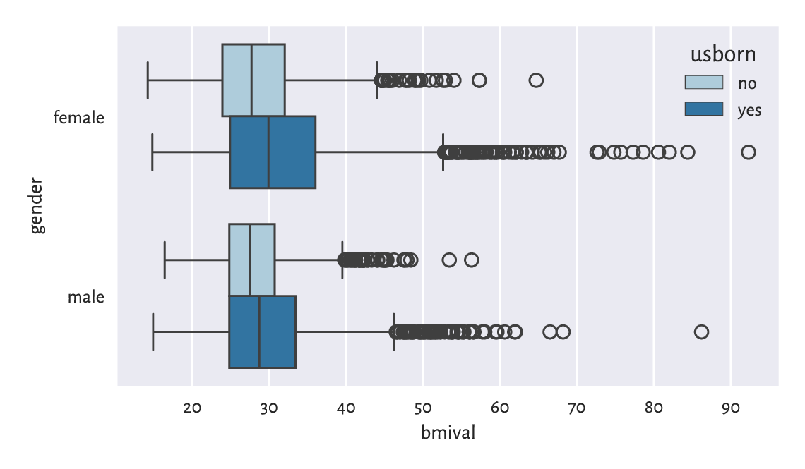
Figure 12.1 The distribution of BMIs for different genders and countries of birth.
Let’s contemplate for a while how easy it is now to compare
the BMI distributions in different groups.
Here, we have two grouping variables, as specified
by the y and hue arguments.
Create a similar series of violin plots.
(*) Add the average BMIs in each group to the
above box plot using matplotlib.pyplot.plot.
Check ylim to determine the range on the y-axis.
12.2.2. Series of bar plots
On the other hand, Figure 12.2 shows a bar plot representing a contingency table. It was obtained in a different way from that used in Chapter 11:
sns.barplot(
    y="counts", x="gender", hue="bmicat", palette="Paired",
    data=(
        nhanes.
        groupby(["gender", "bmicat"], observed=False).
        size().
        rename("counts").
        reset_index()
    )
)
plt.show()
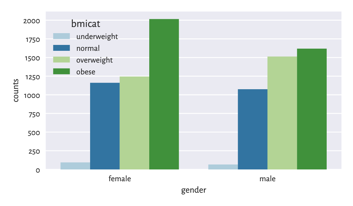
Figure 12.2 Number of persons for each gender and BMI category.
Draw a similar bar plot where the bar heights sum to 100% for each gender.
Using the two-sample chi-squared test, verify whether the BMI category distributions for men and women differ significantly from each other.
12.2.3. Semitransparent histograms
Figure 12.3 illustrates
that playing with semitransparent objects
can make comparisons more intuitive (the alpha argument).
sns.histplot(data=nhanes, x="weight", hue="usborn", alpha=0.33,
    element="step", stat="density", common_norm=False)
plt.show()
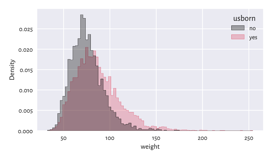
Figure 12.3 The weight distribution of the US-born participants has a higher mean and variance.
By passing common_norm=False, we scaled each histogram separately,
so that it represents a density function (are under each curve is 1).
It is the behaviour we desire when the samples are of different lengths.
12.2.4. Scatter plots with group information
Scatter plots for grouped data can display category information using points of different colours and/or styles, compare Figure 12.4.
sns.scatterplot(x="height", y="weight", hue="gender", style="gender",
    data=nhanes, alpha=0.2, markers=["o", "v"])
plt.show()
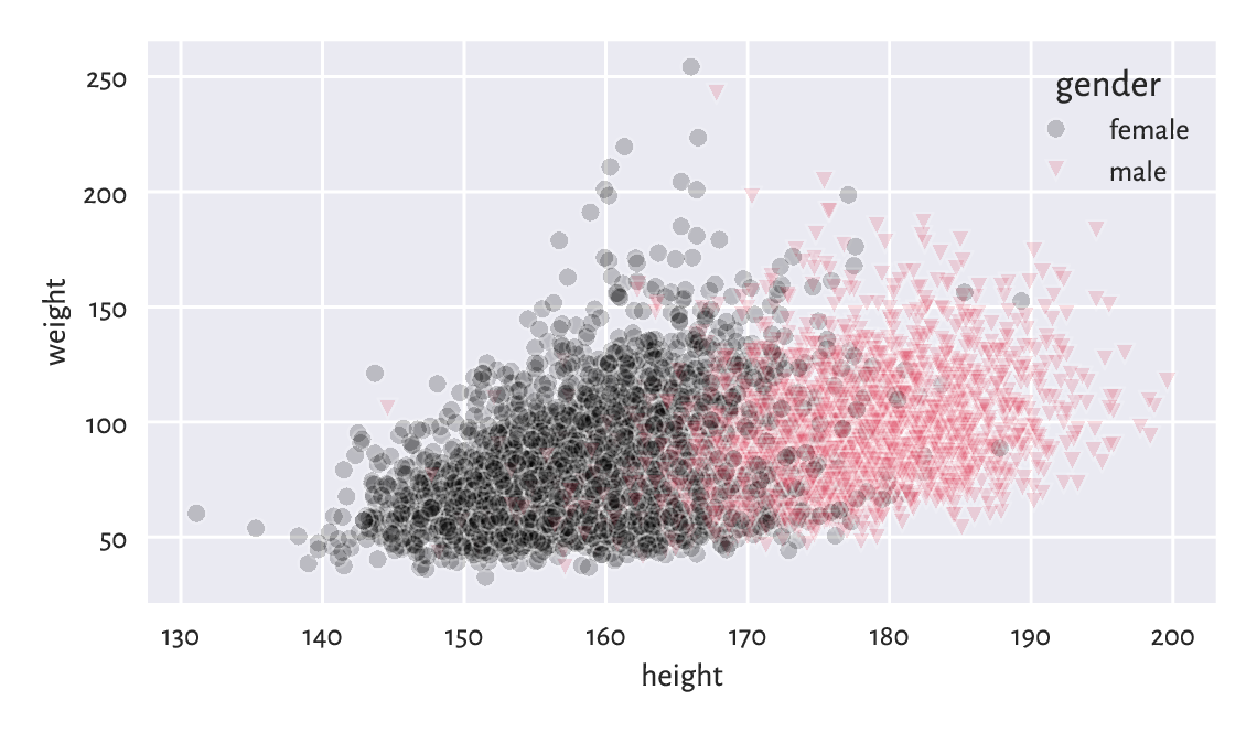
Figure 12.4 Weight vs height grouped by gender.
12.2.5. Grid (trellis) plots
Grid plot (also known as trellis, panel, conditioning, or lattice plots) are a way to visualise data separately for each factor level. All the plots share the same coordinate ranges which makes them easily comparable. For instance, Figure 12.5 depicts a series of histograms of weights grouped by a combination of two categorical variables.
grid = sns.FacetGrid(nhanes, col="gender", row="usborn")
grid = grid.map(sns.histplot, "weight", stat="density", color="lightgray")
plt.show()
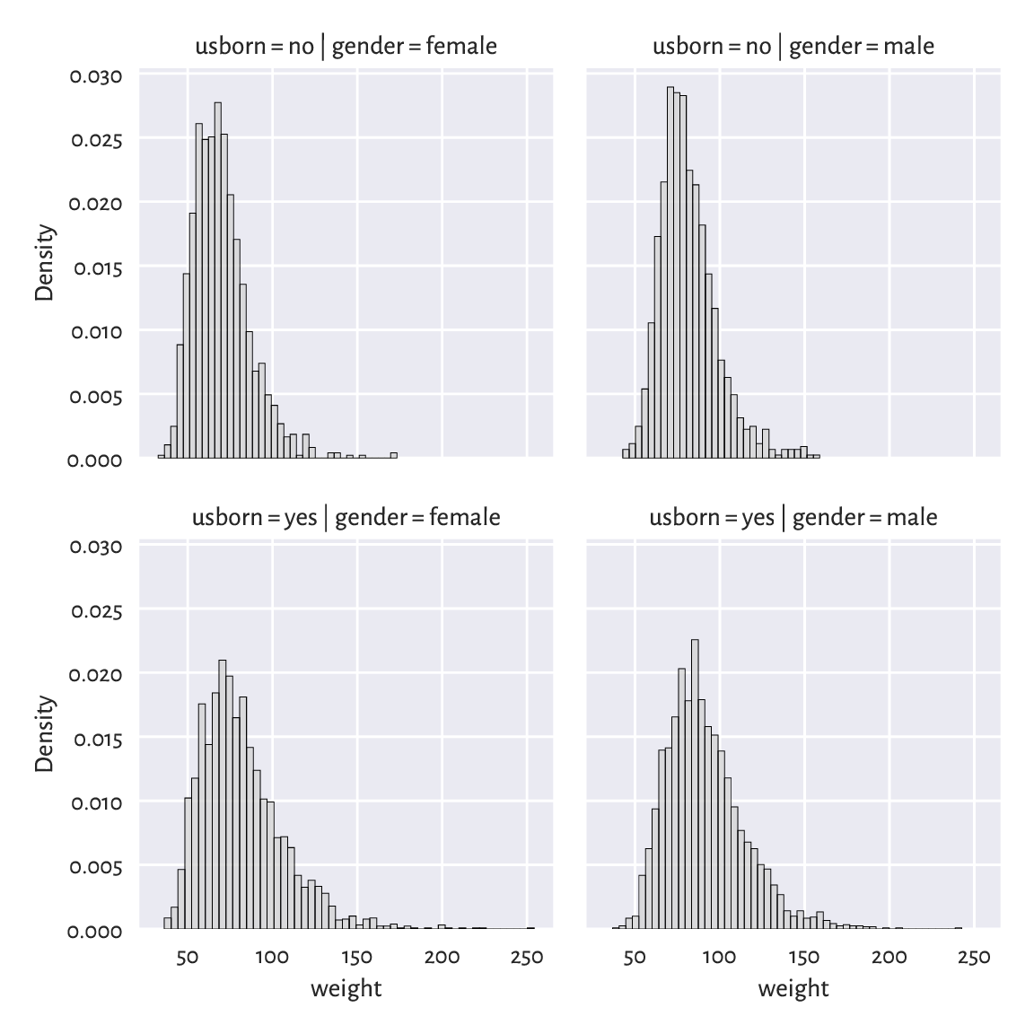
Figure 12.5 Distribution of weights for different genders and countries of birth.
Pass hue="bmicat" additionally to seaborn.FacetGrid.
Important
Grid plots can feature any kind of data visualisation we have discussed so far (e.g., histograms, bar plots, scatter plots).
Draw a trellis plot with scatter plots of weight vs height grouped by BMI category and gender.
12.2.6. Kolmogorov–Smirnov test for comparing ECDFs (*)
Figure 12.6 compares the empirical cumulative distribution functions of the weight distributions for US and non-US born participants.
for usborn, weight in nhanes.groupby("usborn").weight:
    sns.ecdfplot(data=weight, legend=False, label=usborn)
plt.legend(title="usborn")
plt.show()
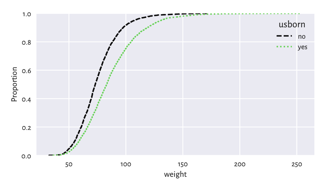
Figure 12.6 Empirical cumulative distribution functions of weight distributions for different birthplaces.
We have used manual splitting of the weight column
into subgroups and then plotted the two ECDFs separately
because a call to
seaborn.ecdfplot(data=nhanes, x="weight", hue="usborn")
does not honour our wish to use alternating lines styles
(most likely due to a bug).
A two-sample Kolmogorov–Smirnov test can be used to check whether two ECDFs \(\hat{F}_n'\) (e.g., the weight of the US-born participants) and \(\hat{F}_m''\) (e.g., the weight of non-US-born persons) are significantly different from each other:
The test statistic will be a variation of the one-sample setting discussed in Section 6.2.3. Namely, let:
Computing it is slightly trickier than in the previous case[2]. Luckily, an appropriate procedure is available in scipy.stats:
x12 = nhanes.set_index("usborn").weight
x1 = x12.loc["yes"]  # the first sample
x2 = x12.loc["no"]   # the second sample
Dnm = scipy.stats.ks_2samp(x1, x2)[0]
Dnm
## 0.22068075889911914
Assuming significance level \(\alpha=0.001\), the critical value is approximately (for larger \(n\) and \(m\)) equal to:
alpha = 0.001
np.sqrt(-np.log(alpha/2) * (len(x1)+len(x2)) / (2*len(x1)*len(x2)))
## 0.04607410479813944
As usual, we reject the null hypothesis when \(\hat{D}_{n,m}\ge K_{n,m}\), which is exactly the case here (at significance level \(0.1\%\)). In other words, weights of US- and non-US-born participants differ significantly.
Important
Frequentist hypothesis testing only takes into account the deviation between distributions that is explainable due to sampling effects (the assumed randomness of the data generation process). For large sample sizes, even very small deviations[3] will be deemed statistically significant, but it does not mean that we consider them as practically significant.
For instance, we might discover that a very costly, environmentally unfriendly, and generally inconvenient for everyone upgrade leads to a process’ improvement: we reject the null hypothesis stating that two distributions are equal. Nevertheless, a careful inspection told us that the gains are roughly 0.5%. In such a case, it is worthwhile to apply good old common sense and refrain from implementing it.
Compare between the ECDFs of weights of men and women who are between 18 and 25 years old. Determine whether they are significantly different.
Important
Some statistical textbooks and many research papers in the social sciences (amongst many others) employ the significance level of \(\alpha=5\%\), which is often criticised as too high[4]. Many stakeholders aggressively push towards constant improvements in terms of inventing bigger, better, faster, more efficient things. In this context, larger \(\alpha\) generates more sensational discoveries: it considers smaller differences as already significant. This all adds to what we call the reproducibility crisis in the empirical sciences.
We, on the other hand, claim that it is better to err on the side of being cautious. This, in the long run, is more sustainable.
12.2.7. Comparing quantiles (*)
Plotting quantiles in two samples against each other can also give us some further (informal) insight with regard to the possible distributional differences. Figure 12.7 depicts an example Q-Q plot (see also the one-sample version in Section 6.2.2), where we see that the distributions have similar shapes (points more or less lie on a straight line), but they are shifted and/or scaled (if they were, they would be on the identity line).
x = nhanes.weight.loc[nhanes.usborn == "yes"]
y = nhanes.weight.loc[nhanes.usborn == "no"]
xd = np.sort(x)
yd = np.sort(y)
if len(xd) > len(yd):  # interpolate between quantiles in a longer sample
    xd = np.quantile(xd, np.arange(1, len(yd)+1)/(len(yd)+1))
else:
    yd = np.quantile(yd, np.arange(1, len(xd)+1)/(len(xd)+1))
plt.plot(xd, yd, "o")
plt.axline((xd[len(xd)//2], xd[len(xd)//2]), slope=1,
    linestyle=":", color="gray")  # identity line
plt.xlabel(f"Sample quantiles (weight; usborn=yes)")
plt.ylabel(f"Sample quantiles (weight; usborn=no)")
plt.show()
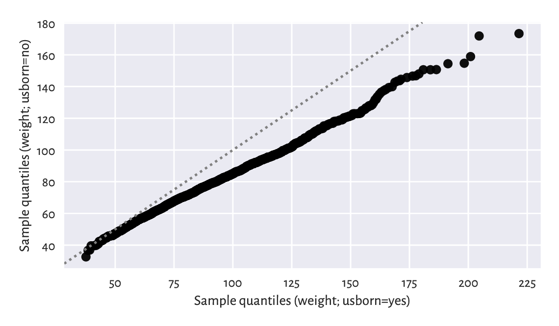
Figure 12.7 A two-sample Q-Q plot.
Notice that we interpolated between the quantiles in a larger sample to match the length of the shorter vector.
12.3. Classification tasks (*)
Consider a small sample of white, rather sweet wines from a much larger wine quality dataset.
wine_train = pd.read_csv("https://raw.githubusercontent.com/gagolews/" +
        "teaching-data/master/other/sweetwhitewine_train2.csv",
        comment="#")
wine_train.head()
##      alcohol      sugar  bad
## 0  10.625271  10.340159    0
## 1   9.066111  18.593274    1
## 2  10.806395   6.206685    0
## 3  13.432876   2.739529    0
## 4   9.578162   3.053025    0
We are given each wine’s alcohol and residual sugar content, as well as a binary categorical variable stating whether a group of sommeliers deem a given beverage rather bad (1) or not (0). Figure 12.8 reveals that subpar wines are fairly low in… alcohol and, to some extent, sugar.
sns.scatterplot(x="alcohol", y="sugar", data=wine_train,
    hue="bad", style="bad", markers=["o", "v"], alpha=0.5)
plt.xlabel("alcohol")
plt.ylabel("sugar")
plt.legend(title="bad")
plt.show()
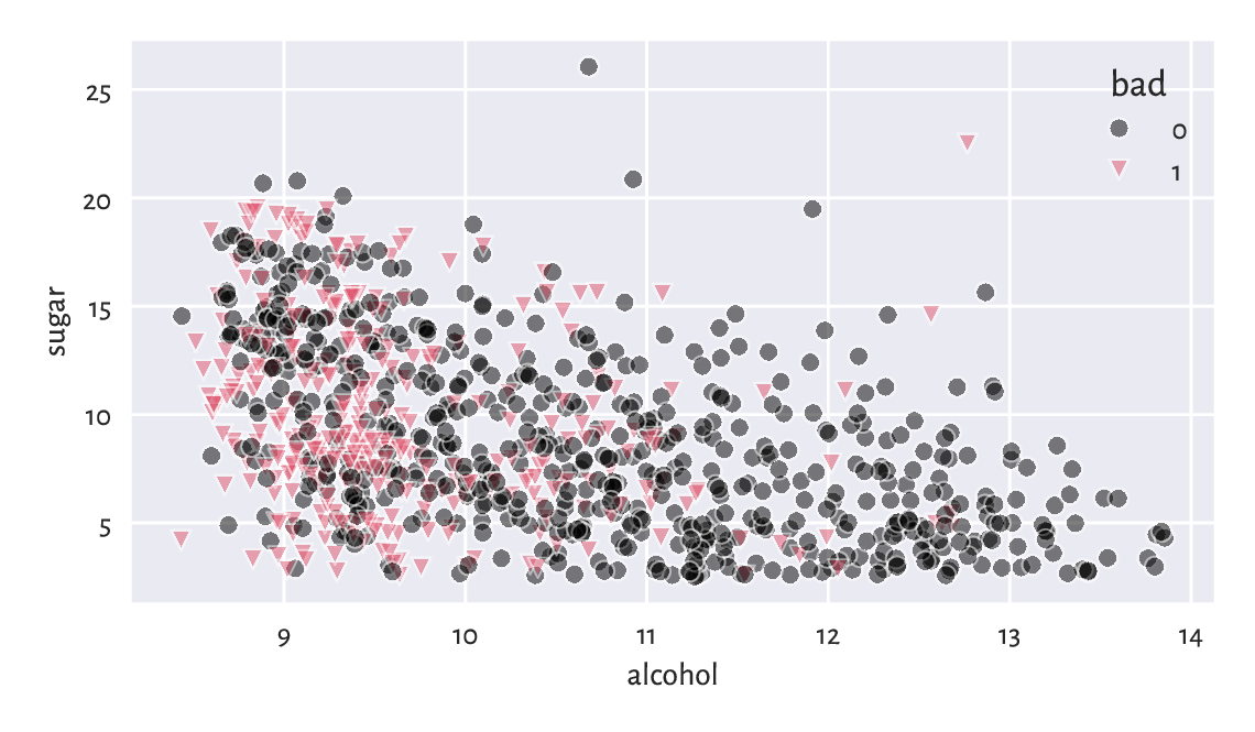
Figure 12.8 Scatter plot for sugar vs alcohol content for white, rather sweet wines, and whether they are considered bad (1) or drinkable (0) by some experts.
Someone answer the door! We have a delivery of a few new wine bottles. Interestingly, their alcohol and sugar contents have been given on their respective labels.
wine_test = pd.read_csv("https://raw.githubusercontent.com/gagolews/" +
        "teaching-data/master/other/sweetwhitewine_test2.csv",
        comment="#").iloc[:, :-1]
wine_test.head()
##      alcohol      sugar
## 0   9.315523  10.041971
## 1  12.909232   6.814249
## 2   9.051020  12.818683
## 3   9.567601  11.091827
## 4   9.494031  12.053790
We would like to determine which of the wines from the test set might be not-bad without asking an expert for their opinion. In other words, we would like to exercise a classification task (see, e.g., [10, 50]). More formally:
Important
Assume we are given a set of training points \(\mathbf{X}\in\mathbb{R}^{n\times m}\) and the corresponding reference outputs \(\boldsymbol{y}\in\{L_1,L_2,\dots,L_l\}^n\) in the form of a categorical variable with \(l\) distinct levels. The aim of a classification algorithm is to predict what the outputs for each point from a possibly different dataset \(\mathbf{X}'\in\mathbb{R}^{n'\times m}\), i.e., \(\hat{\boldsymbol{y}}'\in\{L_1,L_2,\dots,L_l\}^{n'}\), might be.
In other words, we are asked to fill the gaps in a categorical variable. Recall that in a regression problem (Section 9.2), the reference outputs were numerical.
Which of the following are instances of classification problems and which are regression tasks?
Detect email spam.
Predict a market stock price (good luck with that).
Assess credit risk.
Detect tumour tissues in medical images.
Predict the time-to-recovery of cancer patients.
Recognise smiling faces on photographs (kind of creepy).
Detect unattended luggage in airport security camera footage.
What kind of data should you gather to tackle them?
12.3.1. K-nearest neighbour classification (*)
One of the simplest approaches to classification is based on the information about a test point’s nearest neighbours living in the training sample; compare Section 8.4.4.
Fix \(k\ge 1\). Namely, to classify some \(\boldsymbol{x}'\in\mathbb{R}^m\):
Find the indexes \(N_k(\boldsymbol{x}')=\{i_1,\dots,i_k\}\) of the \(k\) points from \(\mathbf{X}\) closest to \(\boldsymbol{x}'\), i.e., ones that fulfil for all \(j\not\in\{i_1,\dots,i_k\}\):
\[ \|\mathbf{x}_{i_1,\cdot}-\boldsymbol{x}'\| \le\dots\le \| \mathbf{x}_{i_k,\cdot} -\boldsymbol{x}' \| \le \| \mathbf{x}_{j,\cdot} -\boldsymbol{x}' \|. \]Classify \(\boldsymbol{x}'\) as \(\hat{y}'=\mathrm{mode}(y_{i_1},\dots,y_{i_k})\), i.e., assign it the label that most frequently occurs amongst its \(k\) nearest neighbours. If a mode is nonunique, resolve the ties at random.
It is thus a similar algorithm to \(k\)-nearest neighbour regression (Section 9.2.1). We only replaced the quantitative mean with the qualitative mode.
This is a variation on the theme: if you don’t know what to do in a given situation, try to mimic what the majority of people around you are doing or saying. For instance, if you don’t know what to think about a particular wine, discover that amongst the five most similar ones (in terms of alcohol and sugar content) three are said to be awful. Now you can claim that you don’t like it because it’s not sweet enough. Thanks to this, others will take you for a very refined wine taster.
Let’s apply a 5-nearest neighbour classifier on the standardised version of the dataset. As we are about to use a technique based on pairwise distances, it would be best if the variables were on the same scale. Thus, we first compute the z-scores for the training set:
X_train = np.array(wine_train.loc[:, ["alcohol", "sugar"]])
means = np.mean(X_train, axis=0)
sds = np.std(X_train, axis=0)
Z_train = (X_train-means)/sds
Then, we determine the z-scores for the test set:
Z_test = (np.array(wine_test.loc[:, ["alcohol", "sugar"]])-means)/sds
Let’s stress that we referred to the aggregates computed for the training set. This is a representative example of a situation where we cannot simply use a built-in method from pandas. Instead, we apply what we have learnt about numpy.
To make the predictions, we will use the following function:
def knn_class(X_test, X_train, y_train, k):
    nnis = scipy.spatial.KDTree(X_train).query(X_test, k)[1]
    nnls = y_train[nnis]  # same as: y_train[nnis.reshape(-1)].reshape(-1, k)
    return scipy.stats.mode(nnls.reshape(-1, k), axis=1, keepdims=False)[0]
First, we fetched the indexes of each test point’s nearest neighbours (amongst the points in the training set). Then, we read their corresponding labels; they are stored in a matrix with \(k\) columns. Finally, we computed the modes in each row. As a consequence, we have each point in the test set classified.
And now:
k = 5
y_train = np.array(wine_train.bad)
y_pred = knn_class(Z_test, Z_train, y_train, k)
y_pred[:10]  # preview
## array([1, 0, 0, 1, 1, 0, 1, 0, 0, 1])
Note
scipy.stats.mode does not resolve possible ties at random: e.g., the mode of \((1, 1, 1, 2, 2, 2)\) is always 1. Nevertheless, in our case, \(k\) is odd and the number of possible classes is \(l=2\), so the mode is always unique.
Figure 12.9 shows how nearest neighbour classification categorises different regions of a section of the two-dimensional plane. The greater the \(k\), the smoother the decision boundaries. Naturally, in regions corresponding to few training points, we do not expect the classification accuracy to be acceptable[5].
x1 = np.linspace(Z_train[:, 0].min(), Z_train[:, 0].max(), 100)
x2 = np.linspace(Z_train[:, 1].min(), Z_train[:, 1].max(), 100)
xg1, xg2 = np.meshgrid(x1, x2)
Xg12 = np.column_stack((xg1.reshape(-1), xg2.reshape(-1)))
ks = [5, 25]
for i in range(len(ks)):
    plt.subplot(1, len(ks), i+1)
    yg12 = knn_class(Xg12, Z_train, y_train, ks[i])
    plt.scatter(Z_train[y_train == 0, 0], Z_train[y_train == 0, 1],
        c="black", marker="o", alpha=0.5)
    plt.scatter(Z_train[y_train == 1, 0], Z_train[y_train == 1, 1],
        c="#DF536B", marker="v", alpha=0.5)
    plt.contourf(x1, x2, yg12.reshape(len(x2), len(x1)),
        cmap="gist_heat", alpha=0.5)
    plt.title(f"$k={ks[i]}$", fontdict=dict(fontsize=10))
    plt.xlabel("alcohol")
    if i == 0: plt.ylabel("sugar")
plt.show()
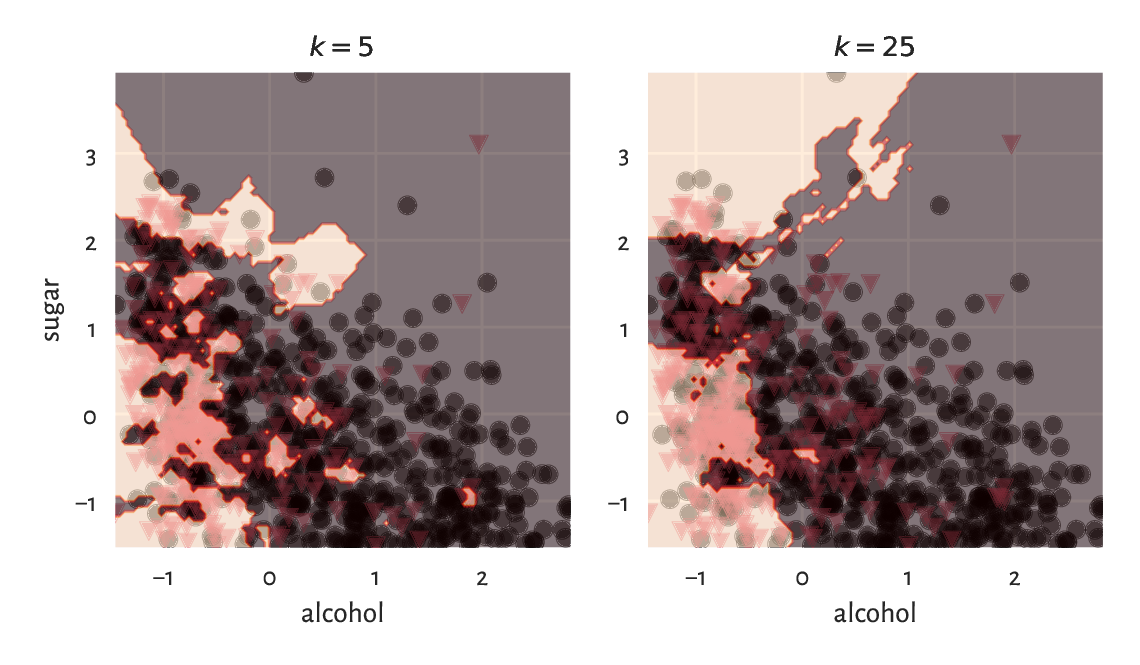
Figure 12.9 \(k\)-nearest neighbour classification of a whole, dense, two-dimensional grid of points for different \(k\).
(*) The same with the scikit-learn package:
import sklearn.neighbors
knn = sklearn.neighbors.KNeighborsClassifier(k)
knn.fit(Z_train, y_train)
y_pred2 = knn.predict(Z_test)
We can verify that the results match by calling:
np.all(y_pred2 == y_pred)
## True
12.3.2. Assessing prediction quality (*)
It is time to reveal the truth: our test wines, it turns out, have already been assessed by some experts.
y_test = pd.read_csv("https://raw.githubusercontent.com/gagolews/" +
        "teaching-data/master/other/sweetwhitewine_test2.csv",
        comment="#")
y_test = np.array(y_test.bad)
y_test[:10]  # preview
## array([1, 0, 0, 1, 0, 0, 1, 0, 1, 1])
The accuracy score is the most straightforward measure of the similarity between these true labels (denoted \(\boldsymbol{y}'=(y_1',\dots,y_{n'}')\)) and the ones predicted by the classifier (denoted \(\hat{\boldsymbol{y}}'=(\hat{y}_1',\dots,\hat{y}_{n'}')\)). It is defined as a ratio between the correctly classified instances and all the instances:
where the indicator function \(\mathbf{1}(y_i' = \hat{y}_i')=1\) if and only if \(y_i' = \hat{y}_i'\) and \(0\) otherwise. Computing it for our test sample gives:
np.mean(y_test == y_pred)
## 0.706
Thus, 71% of the wines were correctly classified with regard to their true quality. Before we get too enthusiastic, let’s note that our dataset is slightly imbalanced in terms of the distribution of label counts:
pd.Series(y_test).value_counts()  # contingency table
## 0    330
## 1    170
## Name: count, dtype: int64
It turns out that the majority of the wines (330 out of 500) in our sample are truly delicious. Notice that a dummy classifier which labels all the wines as great would have accuracy of 66%. Our \(k\)-nearest neighbour approach to wine quality assessment is not that usable after all.
It is therefore always beneficial to analyse the corresponding confusion matrix, which is a two-way contingency table summarising the correct decisions and errors we make.
C = pd.DataFrame(
    dict(y_pred=y_pred, y_test=y_test)
).value_counts().unstack(fill_value=0)
C
## y_test    0   1
## y_pred
## 0       272  89
## 1        58  81
In the binary classification case (\(l=2\)) such as this one, its entries are usually referred to as (see also the table below):
TN – the number of cases where the true \(y_i'=0\) and the predicted \(\hat{y}_i'=0\) (true negative),
TP – the number of instances such that the true \(y_i'=1\) and the predicted \(\hat{y}_i'=1\) (true positive),
FN – how many times the true \(y_i'=1\) but the predicted \(\hat{y}_i'=0\) (false negative),
FP – how many times the true \(y_i'=0\) but the predicted \(\hat{y}_i'=1\) (false positive).
The terms positive and negative refer to the output predicted by a classifier, i.e., they indicate whether some \(\hat{y}_i'\) is equal to 1 and 0, respectively.
\(\hat{y}_i'=1\) |
\(\hat{y}_i'=0\) |
|
|---|---|---|
\(y_i'=1\) |
True Positive |
False Negative (Type II error) |
\(y_i'=0\) |
False Positive (Type I error) |
True Negative |
Ideally, the number of false positives and false negatives should be as low as possible. The accuracy score only takes the raw number of true negatives (TN) and true positives (TP) into account:
Consequently, it might not be a valid metric in imbalanced classification problems.
There are, fortunately, some more meaningful measures in the case where class 1 is less prevalent and where mispredicting it is considered more hazardous than making an inaccurate prediction with respect to class 0. After all, most will agree that it is better to be surprised by a vino mislabelled as bad, than be disappointed with a highly recommended product where we have already built some expectations around it. Further, getting a virus infection not recognised where we are genuinely sick can be more dangerous for the people around us than being asked to stay at home with nothing but a headache.
Precision answers the question: If the classifier outputs 1, what is the probability that this is indeed true?
C = np.array(C)  # convert to matrix
C[1,1]/(C[1,1]+C[1,0])  # precision
## 0.5827338129496403
np.sum(y_test*y_pred)/np.sum(y_pred)  # equivalently
## 0.5827338129496403
When a classifier labels a vino as bad, in 58% of cases it is veritably undrinkable.
Recall (sensitivity, hit rate, or true positive rate) addresses the question: If the true class is 1, what is the probability that the classifier will detect it?
C[1,1]/(C[1,1]+C[0,1])  # recall
## 0.4764705882352941
np.sum(y_test*y_pred)/np.sum(y_test)  # equivalently
## 0.4764705882352941
Only 48% of the really bad wines will be filtered out by the classifier.
The F measure (or \(F_1\) measure), is the harmonic[6] mean of precision and recall in the case where we would rather have them aggregated into a single number:
C[1,1]/(C[1,1]+0.5*C[0,1]+0.5*C[1,0])  # F
## 0.5242718446601942
Overall, we can conclude that our classifier is rather weak.
Would you use precision or recall in the following settings:
medical diagnosis,
medical screening,
suggestions of potential matches in a dating app,
plagiarism detection,
wine recommendation?
12.3.3. Splitting into training and test sets (*)
The training set was used as a source of knowledge about our problem domain. The \(k\)-nearest neighbour classifier is technically model-free. As a consequence, to generate a new prediction, we need to be able to query all the points in the database every time.
Nonetheless, most statistical/machine learning algorithms, by construction, generalise the patterns discovered in the dataset in the form of mathematical functions (oftentimes, very complicated ones), that are fitted by minimising some error metric. Linear regression analysis by means of the least squares approximation uses exactly this kind of approach. Logistic regression for a binary response variable would be a conceptually similar classifier, but it is beyond our introductory course.
Either way, we used a separate test set to verify the quality of our classifier on so-far unobserved data, i.e., its predictive capabilities. We do not want our model to fit to the training data too closely. This could lead to its being completely useless when filling the gaps between the points it was exposed to. This is like being a student who can only repeat what the teacher says, and when faced with a slightly different real-world problem, they panic and say complete gibberish.
In the preceding example, the training and test sets were created by yours truly. Normally, however, the data scientists split a single data frame into two parts themselves; see Section 10.5.4. This way, they can mimic the situation where some test observations become available after the learning phase is complete.
12.3.4. Validating many models (parameter selection) (**)
In statistical modelling, there often are many hyperparameters that need to be tweaked. For example:
which independent variables should be used for model building,
what is the best way to preprocess them; e.g., which of them should be standardised,
if an algorithm has some tunable parameters, what is their best combination; for instance, which \(k\) should we use in the \(k\)-nearest neighbours search.
At initial stages of data analysis, we usually tune them up by trial and error. Later, but this is already beyond the scope of this introductory course, we are used to exploring all the possible combinations thereof (exhaustive grid search) or making use of some local search-based heuristics (e.g., greedy optimisers such as hill climbing).
These always involve verifying the performance of many different classifiers, for example, 1-, 3-, 9, and 15-nearest neighbours-based ones. For each of them, we need to compute separate quality metrics, e.g., the F measures. Then, we promote the classifier which enjoys the highest score. Unfortunately, if we do it recklessly, this can lead to overfitting, this time with respect to the test set. The obtained metrics might be too optimistic and can poorly reflect the real performance of the solution on future data.
Assuming that our dataset carries a decent number of observations, to overcome this problem, we can perform a random training/validation/test split:
training sample (e.g., 60% of randomly chosen rows) – for model construction,
validation sample (e.g., 20%) – used to tune the hyperparameters of many classifiers and to choose the best one,
test (hold-out) sample (e.g., the remaining 20%) – used to assess the goodness of fit of the best classifier.
This common sense-based approach is not limited to classification. We can validate different regression models in the same way.
Important
We would like to obtain a valid estimate of a classifier’s performance on previously unobserved data. For this reason, the test (hold-out) sample must neither be used in the training nor the validation phase.
Determine the best parameter setting
for the \(k\)-nearest neighbour classification of the color variable
based on standardised versions of
some physicochemical features (chosen columns) of wines
in the wine_quality_all dataset.
Create a 60/20/20% dataset split.
For each \(k=1, 3, 5, 7, 9\), compute the corresponding
F measure on the validation test.
Evaluate the quality of the best classifier on the test set.
Note
(*) Instead of a training/validation/test split, we can use various cross-validation techniques, especially on smaller datasets. For instance, in a 5-fold cross-validation, we split the original training set randomly into five disjoint parts: \(A, B, C, D, E\) (more or less of the same size). We use each combination of four chunks as training sets and the remaining part as the validation set, for which we generate the predictions and then compute, say, the F measure:
training set |
validation set |
F measure |
|---|---|---|
\(B\cup C\cup D\cup E\) |
\(A\) |
\(F_A\) |
\(A\cup C\cup D\cup E\) |
\(B\) |
\(F_B\) |
\(A\cup B\cup D\cup E\) |
\(C\) |
\(F_C\) |
\(A\cup B\cup C\cup E\) |
\(D\) |
\(F_D\) |
\(A\cup B\cup C\cup D\) |
\(E\) |
\(F_E\) |
In the end, we can determine the average F measure, \((F_A+F_B+F_C+F_D+F_E)/5\), as a basis for assessing different classifiers’ quality.
Once the best classifier is chosen, we can use the whole training sample to fit the final model and then consider the separate test sample to assess its quality.
Furthermore, for highly imbalanced labels, some form of stratified sampling might be necessary. Such problems are typically explored in more advanced courses in statistical learning.
(**) Redo Exercise 12.16, but this time maximise the F measure obtained by a 5-fold cross-validation.
12.4. Clustering tasks (*)
So far, we have been implicitly assuming that either each dataset comes from a single homogeneous distribution, or we have a categorical variable that naturally defines the groups that we can split the dataset into. Nevertheless, it might be the case that we are given a sample coming from a distribution mixture, where some subsets behave differently, but a grouping variable has not been provided at all (e.g., we have height and weight data but no information about the subjects’ sexes).
Clustering methods (also known as segmentation or quantisation; see, e.g., [2, 103]) partition a dataset into groups based only on the spatial structure of the points’ relative densities. In the undermentioned \(k\)-means method, the cluster structure is determined based on the points’ proximity to \(k\) carefully chosen group centroids; compare Section 8.4.2.
12.4.1. K-means method (*)
Fix \(k \ge 2\). In the \(k\)-means method[7], we seek \(k\) pivot points, \(\boldsymbol{c}_1, \boldsymbol{c}_2,\dots,\boldsymbol{c}_k\in\mathbb{R}^m\), such that the sum of squared distances between the input points in \(\mathbf{X}\in\mathbb{R}^{n\times m}\) and their closest pivots is minimised:
Let’s introduce the label vector \(\boldsymbol{l}\) such that:
i.e., it is the index of the pivot closest to \(\mathbf{x}_{i,\cdot}\).
We will consider all the points \(\mathbf{x}_{i,\cdot}\) with \(i\) such that \(l_i=j\) as belonging to the same, \(j\)-th, cluster (point group). This way \(\boldsymbol{l}\) defines a partition of the original dataset into \(k\) nonempty, mutually disjoint subsets.
Now, the aforementioned optimisation task can be equivalently rewritten as:
We refer to the objective function as the (total) within-cluster sum of squares (WCSS). This version looks easier, but it is only some false impression: \(l_i\)s depend on \(\boldsymbol{c}_j\)s. They vary together. We have just made them less explicit.
Given a fixed label vector \(\boldsymbol{l}\) representing a partition, \(\boldsymbol{c}_j\) is the centroid (Section 8.4.2) of the points assigned thereto:
where \(n_j=|\{i: l_i=j\}|\) gives the number of \(i\)s such that \(l_i=j\), i.e., the size of the \(j\)-th cluster.
Here is an example dataset (see below for a scatter plot):
X = np.genfromtxt("https://raw.githubusercontent.com/gagolews/" +
    "teaching-data/master/marek/blobs1.txt", delimiter=",")
We can call scipy.cluster.vq.kmeans2 to find \(k=2\) clusters:
import scipy.cluster.vq
C, l = scipy.cluster.vq.kmeans2(X, 2)
The discovered cluster centres are stored in a matrix with \(k\) rows and \(m\) columns, i.e., the \(j\)-th row gives \(\mathbf{c}_j\).
C
## array([[ 0.99622971,  1.052801  ],
##        [-0.90041365, -1.08411794]])
The label vector is:
l
## array([1, 1, 1, ..., 0, 0, 0], dtype=int32)
As usual in Python, indexing starts at 0. So for \(k=2\) we only obtain the labels 0 and 1.
Figure 12.10
depicts the two clusters together with the cluster centroids.
We use l as a colour selector
in my_colours[l] (this is a clever instance of the integer vector-based
indexing). It seems that we correctly discovered the
very natural partitioning of this dataset into two clusters.
plt.scatter(X[:, 0], X[:, 1], c=np.array(["black", "#DF536B"])[l])
plt.plot(C[:, 0], C[:, 1], "yX")
plt.axis("equal")
plt.show()
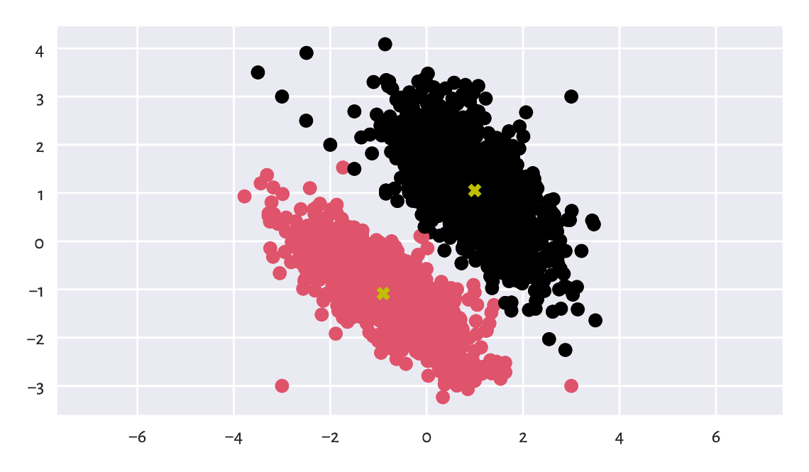
Figure 12.10 Two clusters discovered by the \(k\)-means method. Cluster centroids are marked separately.
Here are the cluster sizes:
np.bincount(l)  # or, e.g., pd.Series(l).value_counts()
## array([1017, 1039])
The label vector l can be added as a new column
in the dataset. Here is a preview:
Xl = pd.DataFrame(dict(X1=X[:, 0], X2=X[:, 1], l=l))
Xl.sample(5, random_state=42)  # some randomly chosen rows
##             X1        X2  l
## 184  -0.973736 -0.417269  1
## 1724  1.432034  1.392533  0
## 251  -2.407422 -0.302862  1
## 1121  2.158669 -0.000564  0
## 1486  2.060772  2.672565  0
We can now enjoy all the techniques for processing data in groups that we have discussed so far. In particular, computing the columnwise means gives nothing else than the above cluster centroids:
Xl.groupby("l").mean()
##          X1        X2
## l
## 0  0.996230  1.052801
## 1 -0.900414 -1.084118
The label vector l can be recreated by computing
the distances between all the points and the centroids
and then picking the indexes of the closest pivots:
l_test = np.argmin(scipy.spatial.distance.cdist(X, C), axis=1)
np.all(l_test == l)  # verify they are identical
## True
Important
By construction[8], the \(k\)-means method can only detect clusters of convex shapes (such as Gaussian blobs).
Perform the clustering of the
wut_isolation
dataset and notice how nonsensical, geometrically speaking,
the returned clusters are.
Determine a clustering of the
wut_twosplashes
dataset and display the results on a scatter plot.
Compare them with those obtained on the standardised
version of the dataset. Recall what we said about the Euclidean distance
and its perception being disturbed when a plot’s aspect ratio is not 1:1.
Note
(*) An even simpler classifier than the \(k\)-nearest neighbours one builds upon the concept of the nearest centroids. Namely, it first determines the centroids (componentwise arithmetic means) of the points in each class. Then, a new point (from the test set) is assigned to the class whose centroid is the closest thereto. The implementation of such a classifier is left as a rather straightforward exercise for the reader. As an application, we recommend using it to extrapolate the results generated by the \(k\)-means method (for different \(k\)s) to previously unobserved data, e.g., all points on a dense equidistant grid.
12.4.2. Solving k-means is hard (*)
Alas, the \(k\)-means method – the identification of label vectors/cluster centres that minimise the total within-cluster sum of squares – relies on solving a computationally hard combinatorial optimisation problem (e.g., [61]). In other words, the search for the truly (i.e., globally) optimal solution takes, for larger \(n\) and \(k\), an impractically long time.
As a consequence, we must rely on some approximate algorithms which all have one drawback in common. Namely, whatever they return can be suboptimal. Hence, they can constitute a possibly meaningless solution.
The documentation of scipy.cluster.vq.kmeans2 is, of course, honest about it. It states that the method attempts to minimise the Euclidean distance between observations and centroids. Further, sklearn.cluster.KMeans, which implements a similar algorithm, mentions that the procedure is very fast […], but it falls in local minima. That is why it can be useful to restart it several times.
To understand what it all means, it will be very educational to study this issue in more detail. This is because the discussed approach to clustering is not the only hard problem in data science (selecting an optimal set of independent variables with respect to AIC or BIC in linear regression is another example).
12.4.3. Lloyd algorithm (*)
Technically, there is no such thing as the \(k\)-means algorithm. There are many procedures, based on numerous different heuristics, that attempt to solve the \(k\)-means problem. Unfortunately, neither of them is perfect for it is not possible.
Perhaps the most widely known and easiest to understand method is traditionally attributed to Lloyd [64]. It is based on the fixed-point iteration. For a given \(\mathbf{X}\in\mathbb{R}^{n\times m}\) and \(k \ge 2\):
Pick initial cluster centres \(\boldsymbol{c}_{1}, \dots, \boldsymbol{c}_{k}\) by sampling \(k\) points from the input dataset without replacement.
For each point in the dataset, \(\mathbf{x}_{i,\cdot}\), determine the index of its closest centre \(l_i\):
\[ l_i = \mathrm{arg}\min_{j} \| \mathbf{x}_{i,\cdot} - \boldsymbol{c}_{j} \|^2. \]Compute the centroids of the clusters defined by the label vector \(\boldsymbol{l}\), i.e., for every \(j=1,2,\dots,k\):
\[ \boldsymbol{c}_j = \frac{1}{n_j} \sum_{i: l_i=j} \mathbf{x}_{i,\cdot}, \]where \(n_j=|\{i: l_i=j\}|\) gives the size of the \(j\)-th cluster.
If the objective function (total within-cluster sum of squares) has not changed significantly since the last iteration (say, the absolute value of the difference between the last and the current loss is less than \(10^{-9}\)), then stop and return the current \(\boldsymbol{c}_1,\dots,\boldsymbol{c}_k\) as the result. Otherwise, go to Step 2.
(*) Implement the Lloyd algorithm in the form of a function
kmeans(X, C), where X is the data matrix (\(n\times m\))
and where the rows in C, being a \(k\times m\) matrix,
give the initial cluster centres.
12.4.4. Local minima (*)
The way the foregoing algorithm is constructed implies what follows.
Important
Lloyd’s method guarantees that the centres \(\boldsymbol{c}_1,\dots,\boldsymbol{c}_k\) it returns cannot be significantly improved any further by repeating Steps 2 and 3 of the algorithm. Still, it does not necessarily mean that they yield the globally optimal (the best possible) WCSS. We might as well get stuck in a local minimum, where there is no better positioning thereof in the neighbourhoods of the current cluster centres; compare Figure 12.11. Yet, had we looked beyond them, we could have found a superior solution.
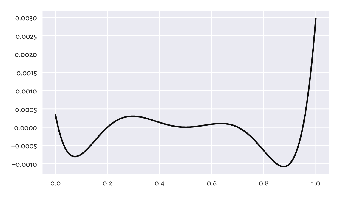
Figure 12.11 An example function (of only one variable; our problem is much higher-dimensional) with many local minima. How can we be sure there is no better minimum outside of the depicted interval?
A variant of the Lloyd method is given in scipy.cluster.vq.kmeans2, where the initial cluster centres are picked at random. Let’s test its behaviour by analysing three chosen categories from the 2016 Sustainable Society Indices dataset.
ssi = pd.read_csv("https://raw.githubusercontent.com/gagolews/" +
    "teaching-data/master/marek/ssi_2016_categories.csv",
    comment="#")
X = ssi.set_index("Country").loc[:,
    ["PersonalDevelopmentAndHealth", "WellBalancedSociety", "Economy"]
].rename({
        "PersonalDevelopmentAndHealth": "Health",
        "WellBalancedSociety": "Balance",
        "Economy": "Economy"
    }, axis=1)  # rename columns
n = X.shape[0]
X.loc[["Australia", "Germany", "Poland", "United States"], :]  # preview
##                  Health   Balance   Economy
## Country
## Australia      8.590927  6.105539  7.593052
## Germany        8.629024  8.036620  5.575906
## Poland         8.265950  7.331700  5.989513
## United States  8.357395  5.069076  3.756943
It is a three-dimensional dataset, where each point (row) corresponds to a different country. Let’s find a partition into \(k=3\) clusters.
k = 3
np.random.seed(123)  # reproducibility matters
C1, l1 = scipy.cluster.vq.kmeans2(X, k)
C1
## array([[7.99945084, 6.50033648, 4.36537659],
##        [7.6370645 , 4.54396676, 6.89893746],
##        [6.24317074, 3.17968018, 3.60779268]])
The objective function (total within-cluster sum of squares) at the returned cluster centres is equal to:
import scipy.spatial.distance
def get_wcss(X, C):
    D = scipy.spatial.distance.cdist(X, C)**2
    return np.sum(np.min(D, axis=1))

get_wcss(X, C1)
## 446.5221283436733
Is it acceptable or not necessarily? We are unable to tell. What we can do, however, is to run the algorithm again, this time from a different starting point:
np.random.seed(1234)  # different seed - different initial centres
C2, l2 = scipy.cluster.vq.kmeans2(X, k)
C2
## array([[7.80779013, 5.19409177, 6.97790733],
##        [6.31794579, 3.12048584, 3.84519706],
##        [7.92606993, 6.35691349, 3.91202972]])
get_wcss(X, C2)
## 437.51120966832775
It is a better solution (we are lucky; it might as well have been worse). But is it the best possible? Again, we cannot tell, alone in the dark.
Does a potential suboptimality affect the way the data points are grouped? It is indeed the case here. Let’s look at the contingency table for the two label vectors:
pd.DataFrame(dict(l1=l1, l2=l2)).value_counts().unstack(fill_value=0)
## l2   0   1   2
## l1
## 0    8   0  43
## 1   39   6   0
## 2    0  57   1
Important
Clusters are essentially unordered. The label vector \((1, 1, 2, 2, 1, 3)\) represents the same clustering as the label vectors \((3, 3, 2, 2, 3, 1)\) and \((2, 2, 3, 3, 2, 1)\).
By looking at the contingency table, we see
that clusters 0, 1, and 2 in l1 correspond, respectively,
to clusters 2, 0, and 1 in l2 (via a kind of majority voting).
We can relabel the elements in l1 to get a more readable
result:
l1p = np.array([2, 0, 1])[l1]
pd.DataFrame(dict(l1p=l1p, l2=l2)).value_counts().unstack(fill_value=0)
## l2    0   1   2
## l1p
## 0    39   6   0
## 1     0  57   1
## 2     8   0  43
It is an improvement. It turns out that 8+6+1 countries are categorised differently. We definitely want to avoid a diplomatic crisis stemming from our not knowing that the algorithm might return suboptimal solutions.
(*) Determine which countries are affected.
12.4.5. Random restarts (*)
There will never be any guarantees, but we can increase the probability of generating a satisfactory solution by simply restarting the method multiple times from many randomly chosen points and picking the best[9] solution (the one with the smallest WCSS) identified as the result.
Let’s perform 1000 such restarts:
wcss, Cs = [], []
for i in range(1000):
    C, l = scipy.cluster.vq.kmeans2(X, k, seed=i)
    Cs.append(C)
    wcss.append(get_wcss(X, C))
The best of the local minima (no guarantee that it is the global one, again) is:
np.min(wcss)
## 437.51120966832775
It corresponds to the cluster centres:
Cs[np.argmin(wcss)]
## array([[7.80779013, 5.19409177, 6.97790733],
##        [7.92606993, 6.35691349, 3.91202972],
##        [6.31794579, 3.12048584, 3.84519706]])
They are the same as C2 above (up to a permutation of
labels). We were lucky[10], after all.
It is very educational to look at the distribution of the objective function at the identified local minima to see that, proportionally, in the case of this dataset, it is not rare to converge to a really bad solution; see Figure 12.12.
plt.hist(wcss, bins=100)
plt.show()
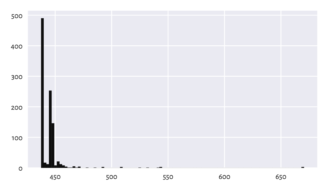
Figure 12.12 Within-cluster sum of squares at the results returned by different runs of the \(k\)-means algorithm. Sometimes we might be very unlucky.
Also, Figure 12.13 depicts all the cluster centres to which the algorithm converged. We see that we should not be trusting the results generated by a single run of a heuristic solver to the \(k\)-means problem.
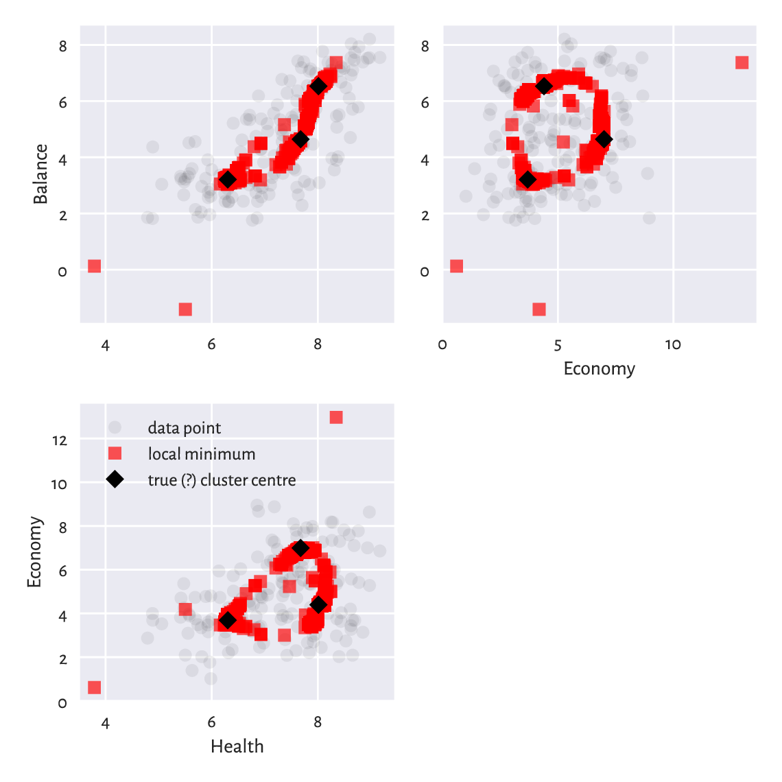
Figure 12.13 Traces of different cluster centres our \(k\)-means algorithm converged to. Some are definitely not optimal, and therefore the method must be restarted a few times to increase the likelihood of pinpointing the true solution.
(*)
The scikit-learn package has an algorithm that is similar
to the Lloyd’s one. The method is equipped with
the n_init parameter (which defaults to 10) which automatically
applies the aforementioned restarting.
import sklearn.cluster
np.random.seed(123)
km = sklearn.cluster.KMeans(k, n_init=10)
km.fit(X)
## KMeans(n_clusters=3, n_init=10)
km.inertia_  # WCSS – not optimal!
## 437.54671889589287
Still, there are no guarantees: the solution is suboptimal too.
As an exercise, pass n_init=100, n_init=1000,
and n_init=10000 and determine the returned WCSS.
Note
It is theoretically possible that a developer from the scikit-learn team, when they see the preceding result, will make a tweak in the algorithm so that after an update to the package, the returned minimum will be better. This cannot be deemed a bug fix, though, as there are no bugs here. Improving the behaviour of the method in this example will lead to its degradation in others. There is no free lunch in optimisation.
Note
Some datasets are more well-behaving than others. The \(k\)-means method is overall quite usable, but we must always be cautious.
We recommend performing at least 100 random restarts. Also, if a report from data analysis does not say anything about the number of tries performed, we are advised to assume that the results are gibberish[11]. People will complain about our being a pain, but we know better; compare Rule#9.
Run the \(k\)-means method, \(k=8\), on the
sipu_unbalance
dataset from many random sets of cluster centres.
Note the value of the total within-cluster sum
of squares. Also, plot the cluster centres discovered. Do they make sense?
Compare these to the case where you start the method from the
following cluster centres which are close to the global minimum.
12.5. Further reading
An overall noteworthy introduction to classification is [50] and [10]. Nevertheless, as we said earlier, we recommend going through a solid course in matrix algebra and mathematical statistics first, e.g., [22, 42] and [23, 40, 41]. For advanced theoretical (probabilistic, information-theoretic) results, see, e.g., [11, 24].
Hierarchical clustering algorithms (see, e.g., [34, 69]) are also worthwhile as they do not require asking for a fixed number of clusters. Furthermore, density-based algorithms (DBSCAN and its variants) [14, 27, 62] utilise the notion of fixed-radius search that we introduced in Section 8.4.4.
There are a few ways that aim to assess the quality of clustering results, but their meaningfulness is somewhat limited; see [38] for discussion.
12.6. Exercises
Name the data type of the objects that the DataFrame.groupby method returns.
What is the relationship between the GroupBy, DataFrameGroupBy,
and SeriesGroupBy classes?
What are relative z-scores and how can we compute them?
Why and when the accuracy score might not be the best way to quantify a classifier’s performance?
What is the difference between recall and precision, both in terms of how they are defined and where they are the most useful?
Explain how the \(k\)-nearest neighbour classification and regression algorithms work. Why do we say that they are model-free?
In the context of \(k\)-nearest neighbour classification, why it might be important to resolve the potential ties at random when computing the mode of the neighbours’ labels?
What is the purpose of a training/test and a training/validation/test set split?
Give the formula for the total within-cluster sum of squares.
Are there any cluster shapes that cannot be detected by the \(k\)-means method?
Why do we say that solving the \(k\)-means problem is hard?
Why restarting Lloyd’s algorithm many times is necessary? Why are reports from data analysis that do not mention the number of restarts not trustworthy?